HOME | DD
 spurs83 — if you can... teach
Published: 2005-07-13 21:08:00 +0000 UTC; Views: 1485; Favourites: 19; Downloads: 88
Redirect to original
Description
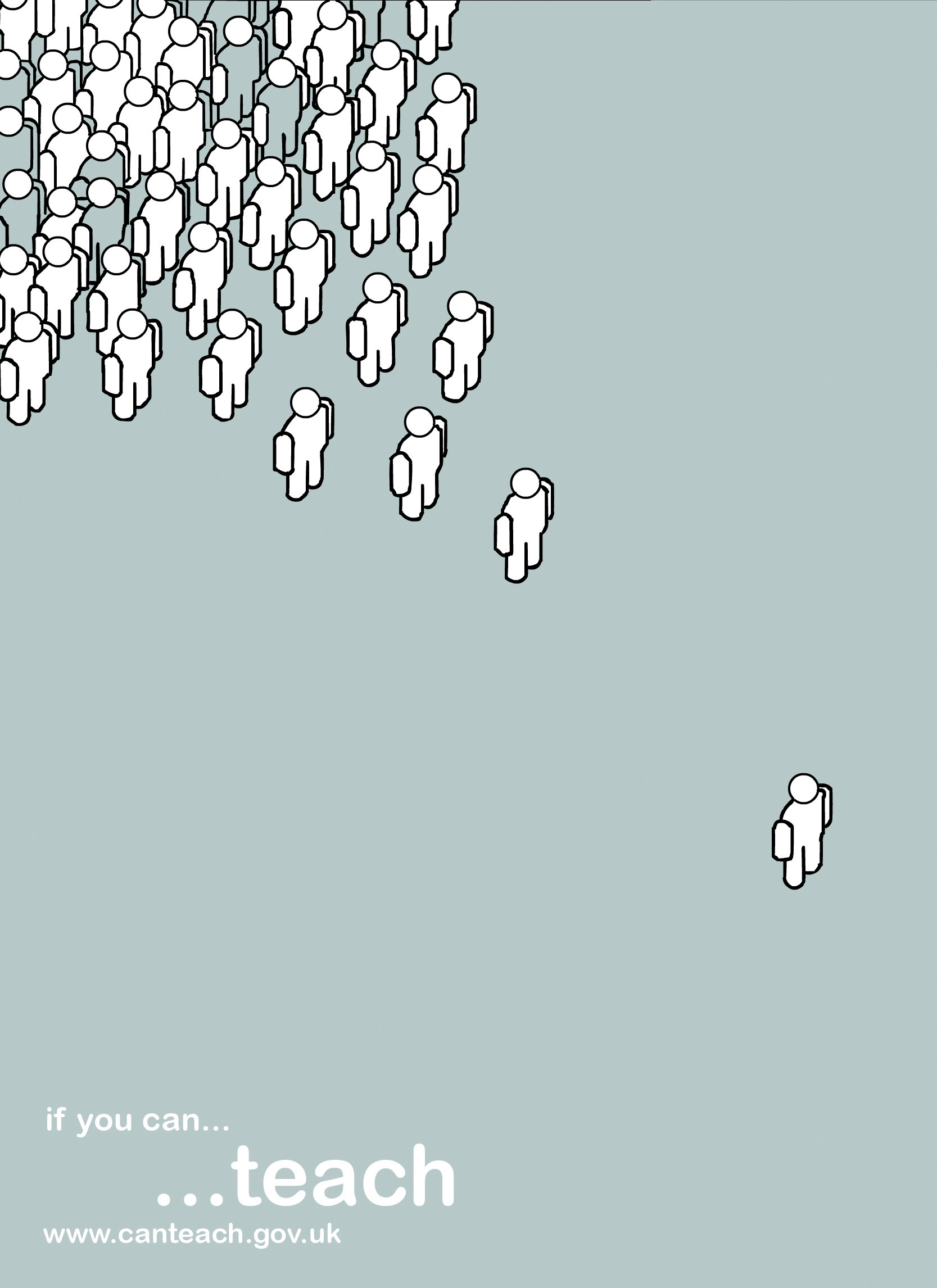
well i really liked the adverts for recruitment for teachers! so i thought id have a go!I thought that portarying a group of people facing this one person could give the impression of "if you can... teach" as in look if these people are willing to listen to you then why not teach them what you know! i wanted to keep it simple not to over complicate things!
type used = ariel rounded
please free to comment and crit!
ps please dont full view its massive for some reason!
Related content


Comments: 32

we have a annual business festival called Manthan,
The theme this year is each one, teach one
can i use your poster with some modification, for the festival by your permission .
👍: 0 ⏩: 1

Hi Yeah sure! let me know how it goes! The only prob is dont have the original source files anymore as i lost all my work a few years back when my comp died on me!
But if you want to take the concept and use it thats fine by me!
Send me some photos of how it looks!
Cheers
Em
👍: 0 ⏩: 0

I love it! One suggestion, put faces or some other indication as to which direction the people are facing because when I first saw it I thought it looked like one person was leading the rest.
👍: 0 ⏩: 0

damn it i cant spot the spelling mistake, oh well maybe i am not one who can teach after all. shit.
i love the poster design by the way!
👍: 0 ⏩: 0

i love the concept, very nicely thought of. the simplicity is done nicely as well as the used of negative space
i do have a criticism. i think it would serve the ad best if the people are done smoothly, as in the lines, the outlines of the people. because right now, it's a bit jagged and that distracts the viewer a bit when viewed at a higher resolution. maybe using illustrator to do this might have been a good idea, but i do understand that you may not have access to that program.
nonetheless, other than the bit of jaggedness of the people, the idea is good. just need to refine it a little bit.
👍: 0 ⏩: 1
hey thanx for the comments thye are real kind of you! i understand what your saying about the lines i do have illustrator but am unable to work it i am useless with it hence why i use flash for any kind of vector work i do! i know the lines are very jaggered this is becasue my hand isnt as steady as i would like to be! but thats something i need to work on as an artist!
thanx for the indepth comment again its nice to have people comment properly rather then this is great or i think you stink  (Wink)")
thanx again
em
👍: 0 ⏩: 0

VERY cool. I like the fact that some people are shaded differently.
~Orion
👍: 0 ⏩: 1
cheers mate! im glad you liked it!
👍: 0 ⏩: 0

How come when you are told not to do something, it makes you want to do it even more? In this case I clicked it. 
👍: 0 ⏩: 1
hey thanx...i think! there is that overwhelming need to do things which we are told not to do! but thanx for the comment anyway!
👍: 0 ⏩: 0

i really like this one as a concept also the simplicity and colors are perfect but when i full screened it i felt that characters needs to be more smooth
overall very good
👍: 0 ⏩: 1
yeah i know! my ability for drawing in flash insnt brill im afraid! i am going to work on this at some point, maybe when i get some spare time! :S
Thanx again for the comment!
")
👍: 0 ⏩: 0

love tthis... also love the london one, battleground, and the one on your featured DEVS!
👍: 0 ⏩: 1
hey thanx hun! thats really kind of you to say!  (Smile)")

👍: 0 ⏩: 1
it's been so long since I DA-ed and to think i was once totally addicted to this! AHahahha.... I'm gonna come more regularly.. need more inspiration!
👍: 0 ⏩: 1
great! im going through my addiction stage now i cnt seem to get away from this place other then when i work and sleep! hehe!
👍: 0 ⏩: 0

this is a really amazing idea:start:
i love ur design

👍: 0 ⏩: 1
again thankyou very much! your comments have made my day! thankyou!

👍: 0 ⏩: 0

i really like this em - nice new way for you - bold and its got a great dynamic!
👍: 0 ⏩: 1
cheers john! i thought i would start to combine all my new found artistic ways into my design work! i hope to continue with this next year at uni! give me an edge so to speak! hehe

👍: 0 ⏩: 0

Splendid piece for sure.
On opening I was actually taken back coz of how fresh it looked
Very pro looking
well done
👍: 0 ⏩: 1
hey thanx hun! im kinda hoping that a project like this will come up next year and i can use some of the work i have done this summer!
Thanx again for the fab comment though ben that means a lot!
👍: 0 ⏩: 0

hey thanx a lot! thats kind of you to say!
👍: 0 ⏩: 0

Cheers hun! thats really kind of you to say!
👍: 0 ⏩: 1

Love it!
Reminds slighlty of iPod adverts but the poster is great, nice colours and good font choice!
Beats comic sans!
👍: 0 ⏩: 1
oh no not an ipod advert! it will have to go! hehe
Thanx chris! i hate comic sans so ariel natural choice!
Thanx again
👍: 0 ⏩: 0

damn good! 

👍: 0 ⏩: 1
hey thanx i know i cnt spell! but as long as my work is all ok im ok with it!
Thanx for the fab comment!
👍: 0 ⏩: 1