HOME | DD
 spyroteknik — . discord .
Published: 2009-05-12 18:49:13 +0000 UTC; Views: 9522; Favourites: 346; Downloads: 0
Redirect to original
Description
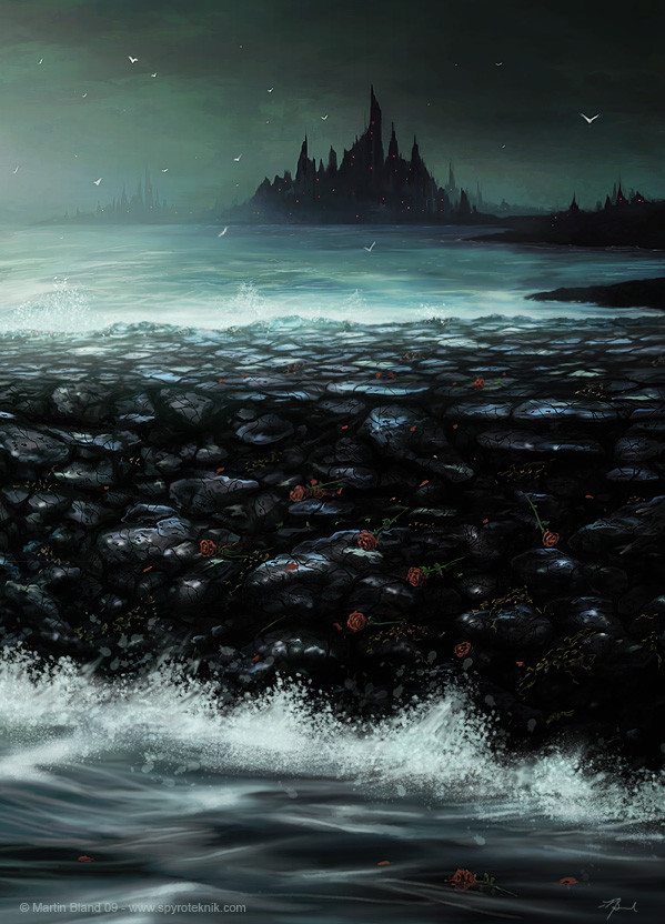
Painter11, too long.wrote a mini review of painter11 in my journal - [link] , first time I've used it since version 6, creature of habit, but, it's fun, and will be an awesome tool when bugfixes hit, new brushes = win, random brushstrokes = fail (sure it'll be temporary though) all in all, nifty.
Huge thx to Eva

Related content


Comments: 60


Although this does exude immense discord, for some reason, I find it to still be a bit Harmonious in a sort of dark and possibly morbid sort of way. Maybe the fact that all of the darkness within it flows together so well. Call that a rather odd observation if you wish, yet I am notorious for finding the Beauty and Harmony in all things, even in the Darkest of the Darkness <3 xox
👍: 0 ⏩: 0


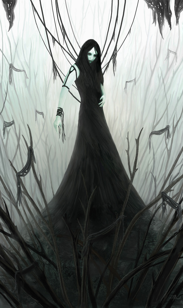
i think that the vibe here is very good,
it reminds me of romanticism in the 19 century!
i loved the flowers, they're a nice touch.
although i would personally add a bit more light to them, it's a bit hard to notice them.
👍: 0 ⏩: 0

This deviation has been featured in my journal. Please let me know if you would like it removed. Find it here--> [link]
👍: 0 ⏩: 0


What inspired this, if I may ask? Because I see a lot of possible references to Stephen King's Dark Tower series. Coincidence?
And in any case, excellent composition and colour choices. ^_^
👍: 0 ⏩: 1

energy drinks & cigarettes inspired this one  (Smile)")
👍: 0 ⏩: 0


Pretty awesome overall, the thing that sticks out is the cracks on the rocks though... to me, they seem a wee bit too sharp unlike a lot of the other detail in the piece.
Still can't believe you got that out of the grey blobs you started with in the mini-review though!
")
👍: 0 ⏩: 1
Yep, my unsharp mask fetish again, tiny touchups in PS should have been avoided tbh, cheers man
👍: 0 ⏩: 0
Gorgeous work! such nice detail to the rocks and the roses. the water looks fantastic as well. wonderful attention to detail
👍: 0 ⏩: 1


I really like this.. it's dark and yet, the flowers add a bit of hope! Yay!
Be well!
~Rori
👍: 0 ⏩: 1


Pixel-Spotlight In reply to spyroteknik [2009-05-13 12:22:16 +0000 UTC]
You're very welcome.
👍: 0 ⏩: 0


Very cool, hope to see more painter work from you
👍: 0 ⏩: 1

Hey, this is wonderful. Your trademark mood is still nailed. I have a hard time finding it when I work in Photoshop. Lucky!
I did a recent write up on the Tinting brush set for the Painter Mag. I learned a lot actually and you may find the Diffusers great for water effects. I never would've touched them hadn't the job come along.

👍: 0 ⏩: 1
will give em a shot next time I fire it up (probably not until they bring out a patch though), back to my usual for a while (I can't really escape it, happens in oil/acrylic too, start off vibrant, degenerate into gloom hehe)
👍: 0 ⏩: 0

Looking just as good as Photoshop. I really never got the fights people have over those two software applications. But I suppose it's in the same league as Xbox fans bitching over Sony fans.
In the end, I just chose the software that makes me most comfortable and stick with it at least until my opinion change on the other ones.
👍: 0 ⏩: 1


| Next =>