HOME | DD
 Starblas — Seriously? - 3rd place
Published: 2014-02-05 18:32:58 +0000 UTC; Views: 6494; Favourites: 205; Downloads: 0
Redirect to original
Description
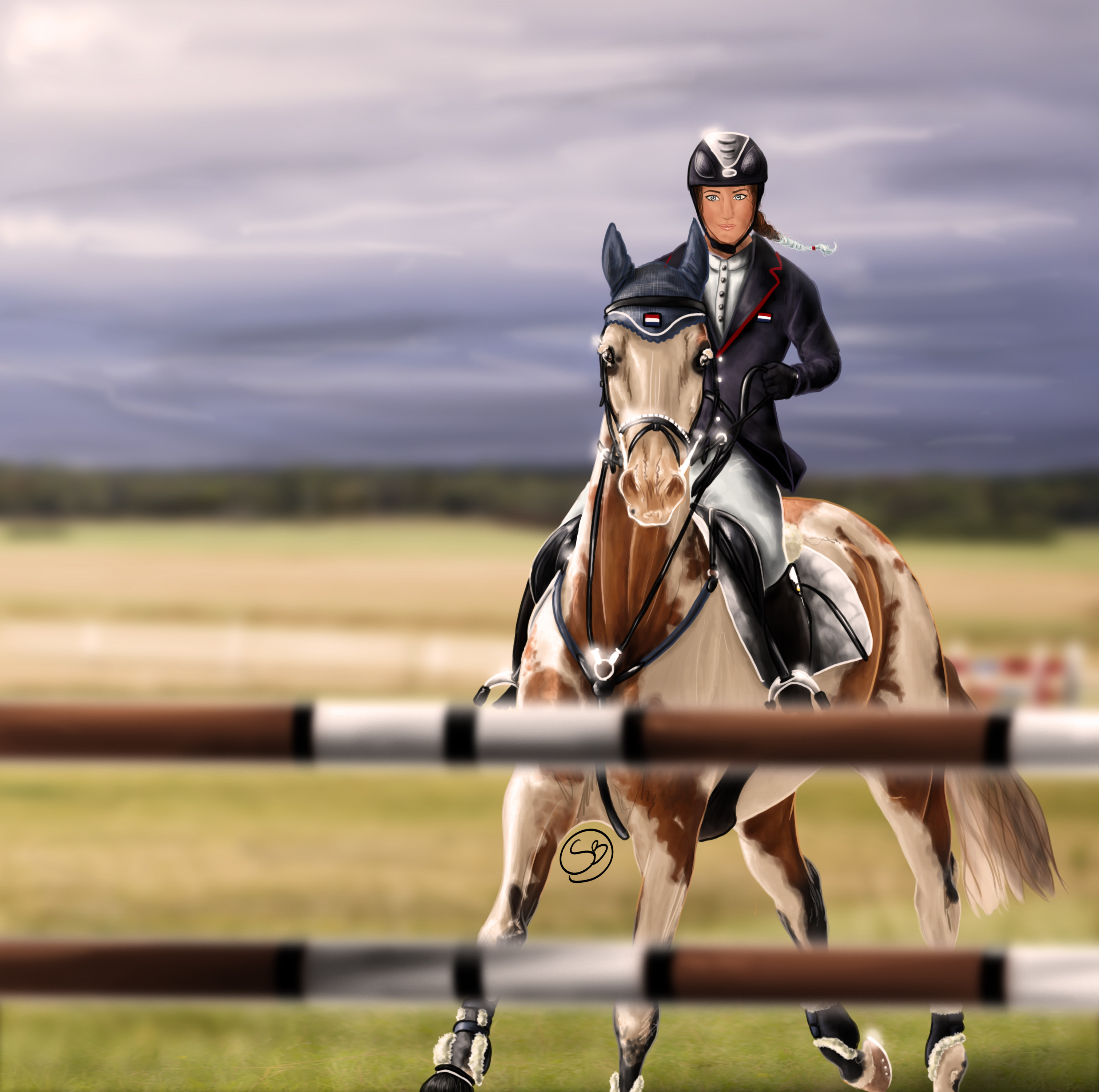
I do not like the rider's face... but hei, she at least have it! 
I LOVE the color of this horse!! Is hard ( and you cannot understand it if you do not draw her
----------------------
Horse: Zud van VillaGana
Rider: Lidia Rossi
Class: Show jumping
Show: First Crystalbian Show starblas.deviantart.com/journa…
Place: 3rd place ( honestly i dont understand how a full detailed shaded pic lost against "simple" shaded images ... but by now i'm used to ...)
Related content


Comments: 55


that's so beautiful!x3 I really want draw like you! you'r sooo good!
👍: 0 ⏩: 1

thanks!
with a lot of practice everyone can!
👍: 0 ⏩: 0

Just to say it is not officially 3rd place ... So you could go up or down I just need to sort out a couple more things :S
👍: 0 ⏩: 1
I saw the result on the journal, ad you should say that they are not officially. And i am still not happy for the result even if they are not officially.
👍: 0 ⏩: 1
well I kinda did, and the results have been updated with my scores, sorry about all this :s
You have gained 2nd place and won:
Large rosette
1 fully shaded headshot image of horse with rosette
1 custom Swedish Warmblood ~ contact Kareh-da-Platypuss for this
Congratulations!
👍: 0 ⏩: 0
Pixeluss [2014-04-24 00:03:02 +0000 UTC]
That's sorta rude, this is a really nice detailed picture though, good job on it anyways!!
👍: 0 ⏩: 1
Pixeluss In reply to Pixeluss [2014-04-24 00:03:42 +0000 UTC]
***What I mean by "It's sorta rude" is that they gave you 3rd ")
👍: 0 ⏩: 1

She was rewarded 2nd place  (Smile)")
👍: 0 ⏩: 0

good work as always
if you only came third i reckon youre not giving your art enough credit, id start entering higher ranked shows
")
👍: 0 ⏩: 0

I really love your painting! but you really should be satisfied with the placing ^^
you can't say that the winner won undeserved. Her "simple" shading requires a lot of effort, too, you can of course tell that everyone put the same amount of effort into their picture

👍: 0 ⏩: 1
i didnt said the 1st place won undeserved... but just that i am not happy with MY result ...
👍: 0 ⏩: 0

I can explain the placing, it was judged not just on art,but other things as well, it had a point system that you can gain points through extra pics and stories, the other entries had extra pics and the winner had two extras and a story, which won them the event in the end :3
👍: 0 ⏩: 0
Judging 2/3 (busy so I will post instead)
Lovely lighting and detail on the horse and well done on those markings! The background and jump is blurred perfectly, making the piece even more realistic.
The face of the rider could have been more refined however.
👍: 0 ⏩: 0
Judging 1/3
Your anatomy is perfect and the shading is well placed and helps to bring the piece together. It is great to see that you used the suggested tack but added things to give your own personal touch. I like the interesting angle and pose you chose as it is a difficult one to draw and shows you have put effort into the piece. The rider and her face are great so don't doubt yourself! She has a nice pose and a happy expression which makes the viewer want to smile along with her! Even though the background is blurred it still shows lots of detail and looks realistic. I can tell you put a lot of effort into this and it has definitely paid off!
The general appearance of the piece is actually more like a training exercise so if you had added a story it could have helped make the picture more serious, added more meaning and showed what is going on at the time. The tail could have been more detailed but doesn't make much of a differance to the picture.
Points given: 71/88 (not 100 due to lack of extra images and story)
You currently stand in 3rd place but it isn't certain yet so stay tuned..


👍: 0 ⏩: 0

Oh my, I love how much perspective you used in this drawing! 
👍: 0 ⏩: 1

omg! that's beautiful
I really love the pose and the mane!
")
👍: 0 ⏩: 1


oh I do understand how hard patterns are to draw I do love all your art though, so amazing!! D:
👍: 0 ⏩: 1
Yay someone who can understand XD
Thank you

👍: 0 ⏩: 0


This is beautiful! Love the pose and the perspective!
Also I love that you added a face to your rider
👍: 0 ⏩: 1

I cannot express how beautiful I think your art is <3 Very good.
👍: 0 ⏩: 1
i love this piece so much! thank you again for entering
👍: 0 ⏩: 1
Welcome! Thank you again!
👍: 0 ⏩: 0

Arhm PLEASE look at my riders faces LOOL XDD
I love the whole picture the horse is so beautiful
👍: 0 ⏩: 1
Thank you 
👍: 0 ⏩: 1
nonononono O.o
They are really realistic I luv your faces
👍: 0 ⏩: 1


| Next =>