HOME | DD
 StarkSCII — So, why did you come?

Published: 2011-02-13 18:24:10 +0000 UTC; Views: 749; Favourites: 54; Downloads: 10
Redirect to original
Description
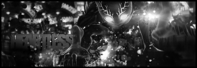
Just passing time~Related content


Comments: 15


I hate it. This is pure crap, LoN...
NO NO! I was just practicing my troll face. ")
👍: 0 ⏩: 0


Awesome again~! Love the pic of Aerith you used and the colours
And those quotes just rock x//D
 (Smile)")
👍: 0 ⏩: 1

I love the quotes too, that's mostly why I make them
Thanks for faving as always, though I think that goes without saying!


👍: 0 ⏩: 1
haha
You're very welcome~!
👍: 0 ⏩: 0

I would hand bucketloads of it out if I could do

👍: 0 ⏩: 0

I agree the lrft is a little too dark....but do I see another face on the left?
overall good though.
👍: 0 ⏩: 1
I'm not sure where abouts you see the second face, but I agree with the light/dark thing.
I wanted to get the contrast idea across, but I think I overkilled it
Thanks for the crit and the fave though ^^
👍: 0 ⏩: 1
I thought there was a face on the left side, but I was mistaken.
👍: 0 ⏩: 0

This sig looks pretty well done, however I think the left side looks a little dark, and the text looks LQ. The lighting's pretty good and the depth is ACE, the coloring is really nicely done aswell. A great job all in all.
👍: 0 ⏩: 1
Yeah, thanks for the darkness comment - I agree with that part.
Thanks for the positive feedback as well! ^^
👍: 0 ⏩: 0