HOME | DD
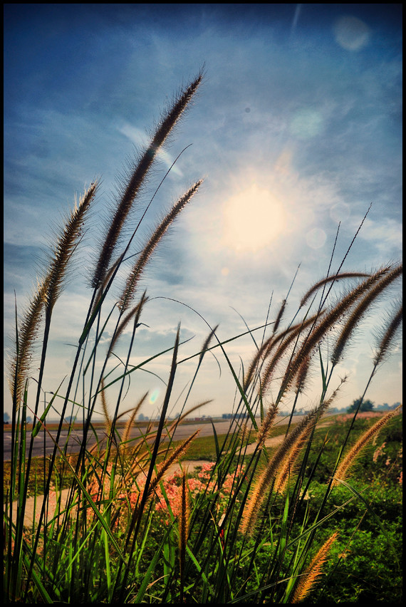
 Starry-eyed25 — In the Wind in Color

Published: 2007-06-27 22:08:19 +0000 UTC; Views: 559; Favourites: 23; Downloads: 0
Redirect to original
Description
I'm considering entering this in the Motion in Nature Contest[link]
I can't decide if I like this shot better in the BW version or in color. Please view both deviations and let me know which you prefer. Also let me know if you think this is worthy of a contest submission. I don't want to submit anything but my best, so I appreciate your comments!
")
Related content


Comments: 15

I love the contrast between the pink of the flower and the blue of the sky. Fantastic shot taken from a great angle!
Another 
The watermark is a tad big and distracting, try making a smaller one. :3
👍: 0 ⏩: 0

 (Smile)")


That's beautiful, I love the angle and how the sun's glaring behind it.
👍: 0 ⏩: 0

very nice capture - love how the light hits some and not others... very good depth
👍: 0 ⏩: 0

Breathateking. The sun in the background is awesome
Reminds me of that version of Fields of gold by Eva Cassidy.
👍: 0 ⏩: 0
Breathateking. The sun in the background is awesome
Reminds me of that version of Fields of gold by Eva Cassidy.
👍: 0 ⏩: 0

such clear and nice colors .. i love this picture
👍: 0 ⏩: 1

Thanks very much for the comment and the fav!

👍: 0 ⏩: 0

Stick with the colored version. The light pink of the plants contrast against the blue of the sky, and it really draws attention to the photo. I think you need a smaller, subtler watermark though. I wouldn't suggest getting rid of it all together -- not by any means -- but the name printed right across the photo is distracting. Great sunburt effect, however, and wonderful angle.
👍: 0 ⏩: 1
Thanks for the comment! I've been toying with the watermark thing for awhile and I haven't been quite sure how to do it. Any suggestions/examples I could look into? I hate having to put one but I've seen too many people get ripped unfortunately. Thanks again for the lovely comment. Its so nice to get comments other than, "Neat!" or "Great shot!"
👍: 0 ⏩: 1
Haha, it's no problem. On the topic of watermarks, I would suggest piling your name (instead of typing it out all in one line, break it up with the first name on top and the last name below it), and blending it into the photograph. If the watermark is more transparent, then it doesn't distract from the photo as much, but you still get the same effect. Hope you get something that works better for you!
👍: 0 ⏩: 0


i like it! and i think i prefer the colored version over the BW
👍: 0 ⏩: 0