HOME | DD
 StarshineCelestalis — Fallout: Equestria Logo without Outline
Published: 2012-07-02 05:16:20 +0000 UTC; Views: 2570; Favourites: 27; Downloads: 89
Redirect to original
Description
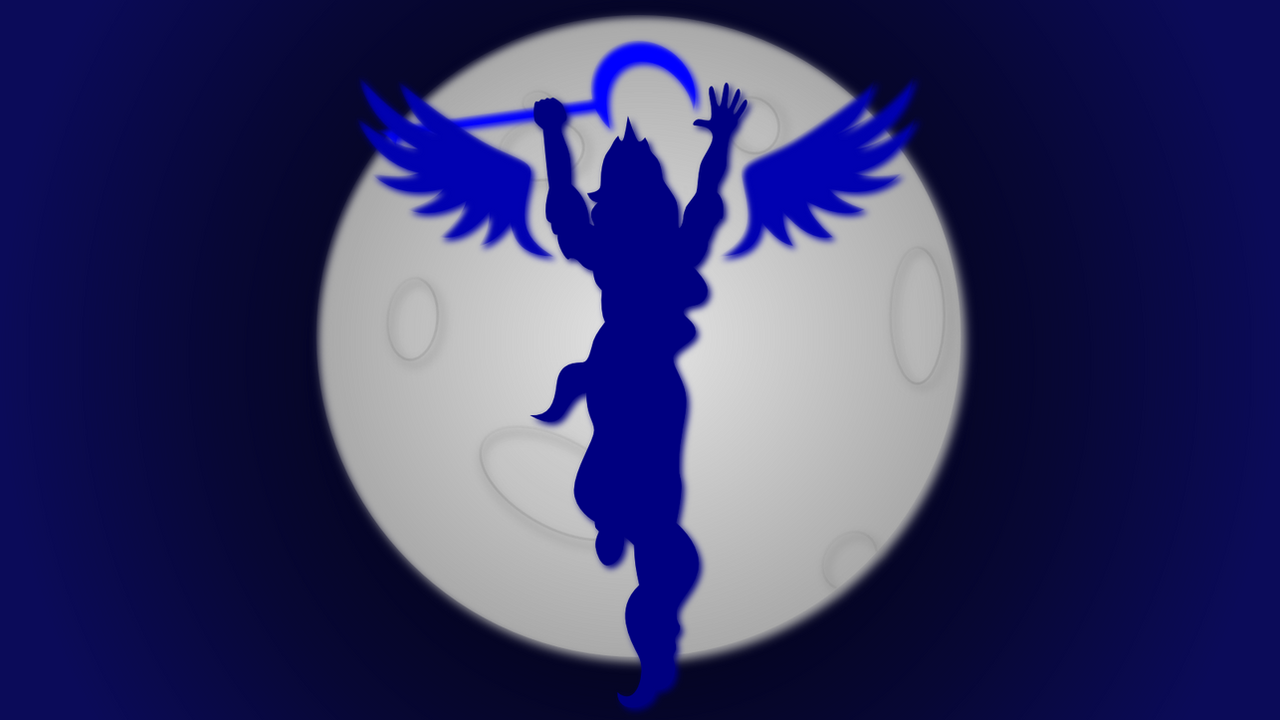
I'm not sure this is still actually needed, but I started so I figured I would post it. Here is the version of the Fallout: Equestria logo without the outline accents. This was made for the book printing as a foil stamp thus it does not have the traditional colors.SVG here: [link]
I don't own Fallout Equestria or MLP:FiM.
Related content


Comments: 6

I'm not sure. I gave this to them pretty late, but to the extent of my knowledge no one else did it. I know that my book numbers and the spine title were the ones used.
👍: 0 ⏩: 1

That's awesome dude!
👍: 0 ⏩: 1
Thanks! They guy running it accidentally lost the original vector files so I re-made them for him based on his PNGs.
👍: 0 ⏩: 0

Absolutely Beautiful, quick question: is the notch at the start of the tail of the letter 't' meant to be there?
👍: 0 ⏩: 1
It was in the original so I left it there, but I really am still not totally sure about it. In the actual font, there is a bit of a curve at the end of the t which is what I suspect that was meant to reflect.
👍: 0 ⏩: 0