HOME | DD
 Statross — Fancy Mask

Published: 2005-12-30 10:23:47 +0000 UTC; Views: 513; Favourites: 5; Downloads: 39
Redirect to original
Description
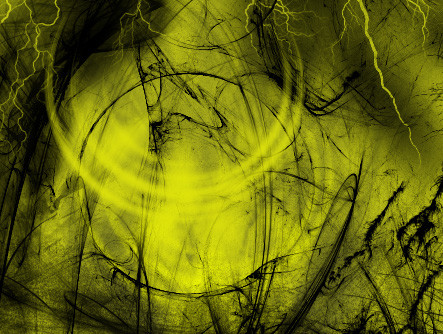
edit: it finaly loaded") and full vuew isnt as essential as it's predecessor
and full vuew isnt as essential as it's predecessor") full view is just too big
full view is just too big")
further edit: ignore the sun
 its obviously got the shiny thing underneath it, its another idea i am messing around with
 (Wink)") i'll fix it for the next submission. that prolly ont be for a while.
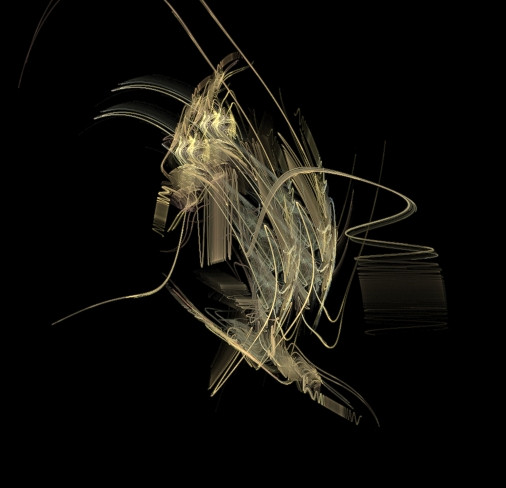
i'll fix it for the next submission. that prolly ont be for a while.also: no i did not copy a picture of jupiter for the red planet
")
i think so far i've spent 2/3 days on this one. yes i know, but i havent done anything like it before
ive only had paint up until 5 weeks agoso far i'm pretty pleased with it. though it is boring and undynamic at the moment. not an awful lot going on and whats that weird bright space thingy doing there?
it's certainly not finished but i like to post stages of things i do (well, meaningful stages anyway). i may make it nigger, or simply shrink everything so i can get more distance between things because there's alot i could add.
not much else to say except this looks awful in the small view thumbnail and looks ridiuclous in full view coz it's so large..i suppose you'll ave to save the picture as and zoom out in fireworks, psp or photoshop. i also dont know how much difference the jpg format will make to it..but meh
Related content


Comments: 7

holy shit thats one hel of a resolution
👍: 0 ⏩: 0

Eventually you achieved. That's truly magnifical, I mean it
👍: 0 ⏩: 0


-------------------------------
The only way to get comments and favs is to give them
So check out 

👍: 0 ⏩: 1

thanks
i like your featured deviation
👍: 0 ⏩: 0

Wow, big. I want to print this out and stick it on my wall  (Smile)")
I love it, but as far as criticisms go...
-The sun looks really veiny and perhaps a /bit/ too violent.
-The moon near the red planet is sort of...elongated.
-The stripe of clouds on the red planet looks very sharp. Not sure if this could actually happen.
And whatever that glowy thing is, I love it too.
👍: 0 ⏩: 1
the sun is rubbish in this one
the moon is meant to be elongated
actualy happen in real life? i'm not sure:/ but i found this great picture of a rock (search "rock surface" on google its on the first or second image page) and i didnt want to ruin its beauty as i was using it.
i used the same thing for the moon but in that i made the coulours less stark, i rotated and duplicated and flipped and filtered until it was a soft enough colour. but yes, i did have reservations about the red planets stark lines. maybe i'll change it
👍: 0 ⏩: 0