HOME | DD
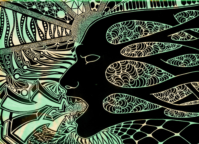
 SteBon24 — Mask
Published: 2008-11-14 22:03:07 +0000 UTC; Views: 728; Favourites: 15; Downloads: 33
Redirect to original
Description
This mask is suffocating...Full view please, for more detail.
Related content


Comments: 15

beautiful line work  (Smile)")
👍: 0 ⏩: 0

Great colour. Great concept. Great clarity in your lines.

👍: 0 ⏩: 1
BTW, I am featuring this piece in my journal. [link]
👍: 0 ⏩: 1

Awesome! Thanks. I've been away for awhile glad you like the piece.
👍: 0 ⏩: 1

Really good, very powerful and the colours fit great.
👍: 0 ⏩: 1

Absolutely beautiful. I love the form and expression. Nice linework and fine patterns. Intense and gorgeous.
👍: 0 ⏩: 1
Thanks. I was really trying to express a certain mood in this piece. Glad it came off as such.
👍: 0 ⏩: 1


I love the justaposition between the 3d and the 2d, and also the colour job! I think that this style is good, because the subtle colour takes away the harsher edge your pictures have in black and white but there isn't so much as to realy blow you away combined with the complex pattern.
How did you do the colour, btw?
👍: 0 ⏩: 1
Glad you like it. I got the idea for the coloring from this creative fellow --> [link] although i did it using photoshop (i believe he uses a different program). Its a pretty simple process actually. I just changed the hue of the photo to whatever color, and then i duplicate the layer and do a different color hue on that. Then i just simply take some abstract brushes and erase parts of the top layer, so that the bottom color shows through. I could have spent more time on the color, but i'm lazy and i think the simpleness of it goes a long way. Maybe i'll add some color to my previous drawings, and use more then 2 colors...
👍: 0 ⏩: 1
'Surrealism4humans'. Y'know, I like that name...
I agree - I don't think this piece needs more colour to add to its impact. It looks great the way you've done it!
I'm looking forward to seeing more of your work in colour!
👍: 0 ⏩: 0

Love it. Looks like something I would have done myself lol
👍: 0 ⏩: 1