HOME | DD
 steiner0101 — Spiderman
Published: 2005-02-06 17:43:21 +0000 UTC; Views: 42537; Favourites: 1062; Downloads: 295
Redirect to original
Description
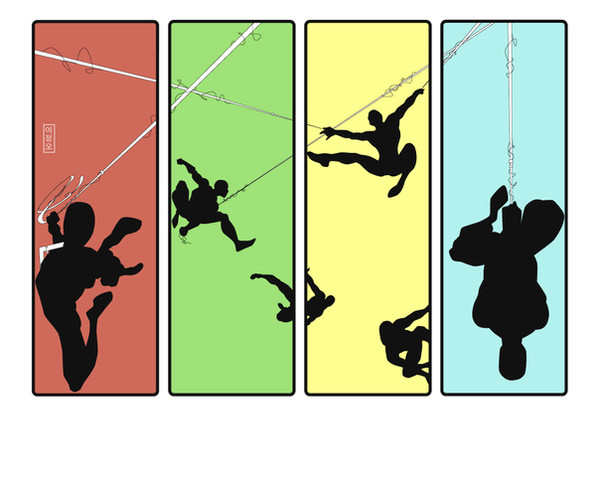
I wanted to do a Spiderman type project so this is what I came up with. I am looking for feedback though so any comments would be great. Thanks.Related content


Comments: 87

 (Smile)")

")

I dunno, I just think this looks real rad.. I'm gonna fav..
👍: 0 ⏩: 0

hey man thats good
ill keep watchng your work !
take care
~Arjay
👍: 0 ⏩: 0
man this is just remarkable *2 thumbs up* by the way his my fave super hero so yea ill be happy is you make more
take care
~ Arjay
👍: 0 ⏩: 0

they're a sense of speed somewhere where i cant find. It so cool it looks like hes so fast hes everywhere at once. also i like your sense and use of colours and spelling spiderman. very cool.
👍: 0 ⏩: 0


wow, amazing job
just one question tho, how did u do the webbing?

👍: 0 ⏩: 0


dude this is freakin sweet they should make an ad with him it lol
👍: 0 ⏩: 0


woah, frekin awesome. i like how the webs go into the other boxes.
👍: 0 ⏩: 0
woah, frekin awesome. i like how the webs go into the other boxes.
👍: 0 ⏩: 0

this looks awesom, its looks so cool. keep it up man!!
👍: 0 ⏩: 0


I love it.
No I didn't think Ipod at first glance.
but after reading some comments I see what they mean.?
I love how this is so different from other spiderman art I have seen.
I think the that why I was attracted to it.
I love how you separated his name.
It made it that much better
👍: 0 ⏩: 0


i love your choice of colors! This is a great project, had to fave.
👍: 0 ⏩: 0


It's really well done. I like that the colors aren't too bright and over powering and that the focus is on the figure itself rather than the color with a cut-out. I know weird, but I like that fact
👍: 0 ⏩: 0


well as soon as a saw it i thought iPod, which everyone else has allready said. way cool though. maybe would've gone with different colors, but you're the artist, not me. and i like it.
👍: 0 ⏩: 1

i know the colors do read ipod. i created it a while back so maybe that was my motive. thanks for the comment though.
👍: 0 ⏩: 0


Very cool. I like the concept you had here, it's really original as far as doing something like this with spiderman anyways. Only thing I might have done is chose some different colors that might be more related to spiderman. Also I'm not sure how you could have worked it differently but I was at first reading the text 'SP', 'ID', 'ER' and I was trying to figure out what they were till I clued in. Haha, I might just be an idiot but I think if you could have some how kept the text together it might have been easier to read.
👍: 0 ⏩: 0

the brighter yellow in the lower spiderman's arm pit is a bit distracting, maybe make it the same as the background

👍: 0 ⏩: 0


ROFL Nice concept. Out of all those who are inspired by Apple's ipod commercial, this is the coolest one yet. XD
👍: 0 ⏩: 1

Hah, great work, very cute. It's kind of like... a Spiderman iPod ad. Very neat concept.
👍: 0 ⏩: 0

Interesting style. I really like the colours you used. Matches quite well, in a sort of minimalistic modern sense.
👍: 0 ⏩: 0

<= Prev |