HOME | DD
 step-2-mii — The Stages of Personality Confrontation
by
step-2-mii — The Stages of Personality Confrontation
by
#splitcontest #digitalpainting #fanartdigital
Published: 2017-04-09 13:01:56 +0000 UTC; Views: 461; Favourites: 16; Downloads: 0
Redirect to original
Description
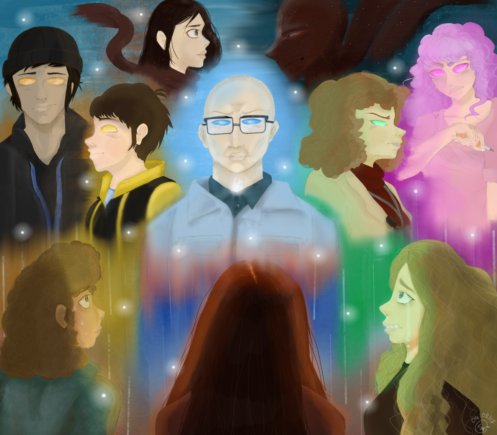
I've been working on this piece for the Split Shattered-Self Contest a whole week. I'm so glad I'm finished with it. This piece explains the circumstances the three victims (girls on the foreground) face with some of Kevin's major personalities (midground). As you can see, the tiny stars scattered on the piece represent each of his personalities, some of which who claim to take leadership. In the end, only one victim is confronted with Kevin's most vile and absurd personality, The Beast. (Representation of glowing crack opening an unknown force) I wanted to draw an analysis of how I thought some of his personalities would look in person... I hope you all enjoy my piece.Related content


Comments: 8

Hi there! I'm from over at ProjectComment
While I haven't seen the movie I would still love to give some feedback on the art itself. Scattered throughout I've provided links for references that I hope you can find useful!
The very first impression I get when looking at this is that it has a very cinematic feel, which makes sense... it is for a movie. Though, this is hindered somewhat by the composition. It feels very much claustrophobic, though not in an effective way. Take the posters for Star Wars, this one for Rogue One is a great example of developing visual storytelling about the relationship dynamics of characters and the good and bad dichotomy. To help improve this, it would be great to see a canvas ratio that is longer and rectangular, which would allow for more room to tidy up the composition. For example, you could have Kevin scaled larger like Jyn in the SW poster and have the personalities shadowing like Darth Vader's mask and have the victims below, dwarfed by his intimidating and manic power that is key to his character and the power he holds. Right now that potential to show his centric role is lost because the eye cannot distinguish where it should be looking, mine ran allover the piece, not really knowing what it was meant to be seeing. This suggestion is by no means the only correct composition, but a way of looking at the piece as storytelling. The way you have the characters placed right now is not bad. It does follow the segments seen in the rule of thirds but the rule actually encourages the imbalance as long as it adheres to these quarters as shown in the examples the article provides. In terms of the painting itself, your anatomy is a bit off in places, I know this is a part of manga styles but even exaggeration follows a uniformity of proportion. The colour is a bit confused in places but I do like the overall dynamic of the piece's scheme, it makes the viewer feel disorientated by how erratic he is. You have made a piece that clearly carries a sound knowledge of art theory and great ideas, I hope that I have helped and please feel free to ask for any clarification. I am NOT an art guru haha... these are just my observations to help you improve!
👍: 0 ⏩: 1

Thanks very much for your feedback. I tried to go within the limit of pixels the contest required. I'm also trying to improve on my manga styles as well as my realistic styles. I was worried about the proportion on my speed paint video for this entry, so I made the characters smaller to fit the screen, though I can see where there may be some claustrophobia in some places. I'll think about that when I'm doing my next piece. Thanks again for your wonderful feedback and cool links... ^^
")
👍: 0 ⏩: 1
No worries! Keep on arting
By the way, with the pixel limits, you could always do the piece really big and then scale it down to the restraints. Good luck with the competition!
👍: 0 ⏩: 1

This drawing is amazing. I can see you worked extremely hard on it and it looks fantastic. Though the background colors could use a bit of work. I think it is just a tad to much color . Also the colors on they eyes are a little weird but that's me. I would also work on hair because the hair doesn't really look real to me but it's fine if you ask me. All in all a great picture. Hope you win the contest!!!!!!
👍: 0 ⏩: 1
Thanks for the feedback... The colors in their eyes represent their personality. You should see the movie. It's scary good... ^^ I tried on their hair, which was pretty last minute, but I'm glad you like it... I love the feedback.
👍: 0 ⏩: 1