HOME | DD
 stephchard — Steph
Published: 2008-03-24 00:49:23 +0000 UTC; Views: 1089; Favourites: 50; Downloads: 15
Redirect to original
Description
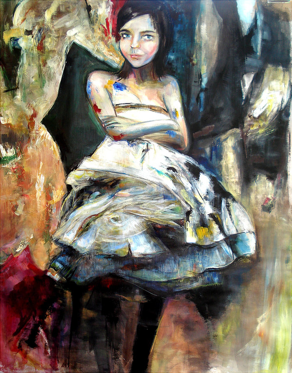
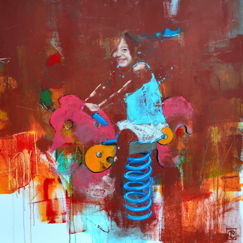
Acrylic on Craft PaperMy assignment for Uni was to show a place that was special & significant to us - and this is mine. No denying that.
Self Portrait in my world.
Related content


Comments: 16


Excuse the cliche, but you're just so supremely effing talented. I've always wished I could paint, it's so much more expressive than markers & pencils. Thanks for sharing sweetie.
👍: 0 ⏩: 0

beautiful! I like the rough painting style ")
Well done!
👍: 0 ⏩: 1
 (Smile)")

Love how everything just flows together!! Awesome painting!!

👍: 0 ⏩: 1


love it.. great color choices; as far as a critique goes I would say that it looks a bit "flat" ... the tones and light in the fore-ground (her legs) is exactly the same as the mid-ground (the main subject)
This would not be a big deal but since you showed light/tone/color changes in her neck it gives the rest of the piece a slightly "unfininhed" look .... If you lightened the neck to match the rest of the piece it would not interfere with the style and/or overall composition.
a lovely piece
👍: 0 ⏩: 1

thanks very much for that. they were good points to consider..you're right about the neck, it does seem out of place now that you pointed it out.
👍: 0 ⏩: 1
it's still a lovely piece; the "flatness" is a definite style ... (I may have said this before, but ...) your color is spectacular, and the composition is great, I think you are just a little caught between what you want to convey and what you think you "should" be painting.
👍: 0 ⏩: 1
thanks. i also think because i usually paint in oils and this is really the first time i've used acrylics in an entire painting, i didn't really know how they'd go. i guess i painted with them like i would oils thinking the colours would come up with more depth than they did. hence the 'flatness'.
👍: 0 ⏩: 1
that is the thing that both awes and scares me about oils (and the reason I don't usually care for acrylics) ... much admiration for those such as you you actually know how to use oils! I need to get my butt in gear and practice more at it
👍: 0 ⏩: 0

This is great.
You've managed to work those acrylics
👍: 0 ⏩: 1
p.s. The paint smudges make it perfect!
👍: 0 ⏩: 1
p.p.s on your arms i mean.
👍: 0 ⏩: 0