HOME | DD
 StephenSchaffer — I NEED YOUR HELP
Published: 2011-05-03 15:03:24 +0000 UTC; Views: 977; Favourites: 34; Downloads: 0
Redirect to original
Description
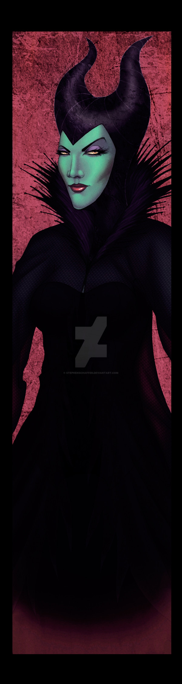
So I was tinkering with my Disney Villains piece and I wanted some help. I'm pretty sure the piece is fine the way it is (given all the hullabaloo) but when I switched monitors recently, it doesn't look as sexy as I originally painted it.So here is a "new" version of one of the characters, and I wanted to know if you all think it looks better than the original version as seen here:
Please be advised, this will not be up forever so if you fave it, it might not be there when you go to look for it...
Thanks for the assistance.
Related content


Comments: 25

Fantasic one of the Mistress of all evil
👍: 0 ⏩: 1


the nostrils are too apparent, it's just a taste matter, nothing anatomically wrong!
 (Smile)")
👍: 0 ⏩: 1
")


It's subjective, it's got better contrast, but I like the original one better

👍: 0 ⏩: 1

Hm. Well, I think they both look great, although I like the clothes on the original better. I think it just depends on the person which one they like better.
👍: 0 ⏩: 1


I'd say leave it as is mate... if you tried to print this, i'm sure the clothes would just be black all over basically! I like the misted look of the original in comparison to the higher contrast on this.
Stop messing with it haha!
👍: 0 ⏩: 1

*Hmmmm*
*ponders both*
I kind of like the more obscure look of the new one. It adds to the fadeout effect.
👍: 0 ⏩: 1

i think its better. the only thing i see that could be changed, is that you cant see any details on the clothes now. making them slightly more visible would be better, imo.
 (Wink)")
👍: 0 ⏩: 2

I agree. I like the look of the new one, but I think since it's darker it's harder to see the details on the clothes.
👍: 0 ⏩: 0

If you zoom in on it you can see the detail but it is lost on the normal view.
👍: 0 ⏩: 1