HOME | DD
 StephenSchaffer — Thor + Loki by SpiderGuile
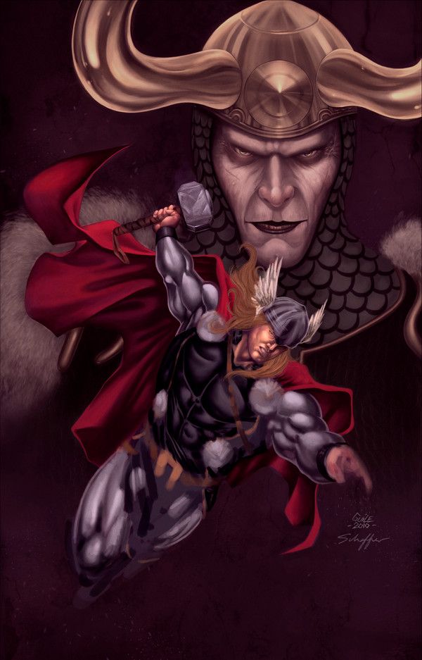
Published: 2010-05-15 20:22:03 +0000 UTC; Views: 5349; Favourites: 110; Downloads: 224
Redirect to original
Description
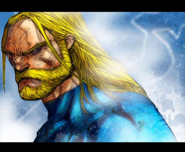
Please read: [link]So here it is in all its unfinished glory. I really wanted this piece to be spectacular, but unfortunately I ran out of gas trying to complete it. I don't want to make excuses, but my current work schedule only allows for sporadic art-making and I was never able to fully immerse myself in the piece. In addition, having not painted in 4 months during my hiatus really left me lacking in the skills/confidence department. And let me tell you, this piece had just about everything possible go wrong with it. Photoshop crashed so many times I lost count. I had to repaint whole sections because of this. The damn gold on Loki's head took a bajillion hours to get right. I don't like Thor's face at all. But having said all that, there are parts I do really like, and my fav is probably Loki's face because I spent so much time on that as well. Again, folks, please don't hate me, I really did try to knock this one out of the park, but alas, it just kicked my ass. I am confident however that the next one will be better and if nothing else, finished!
Lines -
Colors -
Characters © Marvel
Textures from: [link]
Brushes from: `DanLuVisiArt
Tools: Photoshop CS
Time: TOO FUCKING LONG...!
Related content


Comments: 13

This is unfinished business but this is so goddamn great!!!
I'll be in the waiting line to watch your next masterpieces, Steve!
")
👍: 0 ⏩: 1
my pleasure, mon frère!
 (Smile)")
👍: 0 ⏩: 1

I like it, unfinished as it may be. But I agree with Cyberborg, mainly with his second point: A stronger light source would improve this piece.
👍: 0 ⏩: 1

Hate you? (other than in that, "Gawd-dam, He did that better than me" kind of way..). Naw man, not even close...
But I feel you,... I have been there so many times that it's not funny. I have Rubbermaid totes FULL of unfinished work...
Anyway, This is good stuff! Using your fight metaphor, I would say that you are "nursing a busted nose, and a swelling eye," but the 'other' guy is having trouble just standing up or remaining conscious so you haven't lost yet.
Loki's face and Thor's cape are really well rendered and for me, the vest is amazing, (you outdid yourself there).
I know that you aren't done but I am gonna offer an opinion/Critique.
The composition and balance in the overall image is good, but I see two things that I think maybe throwing you:
1. You seem to be trying to paint using sometimes contradictory approaches/styles.
I think that you are trying to serve two masters. You are starting with/working from a comic reference, but you are also using the rules and techniques of more "formal" painting, and I have found that using the techniques for both at the same time can be a pain. The way something is rendered "under" ink lines is not the same as when it is painted freeform, and the two are seldom interchangeable.
2. Not enough strong or specific light source(s). The light is too even
If I give this image the "squint" test, all parts of your image look too evenly lit (and flat). --The things in the background or that are in the shadow areas are just as bright and detailed as the light areas, and you seem to have some areas catching highlights that should not --like Thor's left cheek, or the underside of his arms.
To my eye those two things are compressing all depth out of the image and distorting your work, and introducing little flaws that can get on your nerves while you are working on it yet you can't always "see" them. For example, Loki's helmet and face are detailed but his face does not feel full or menacing, and his helmet feels like a flat cutout rather than a dome with giant horns protruding out from it
Think of the embossing effect, --like on a birthday card.
I know that I have similar issues from time to time, and I often over-render areas and/or add in unnecessary details that I "think" should be there rather than what really would be there if I was looking at a photo instead of my imagination, and then I unconsciously resist changing or removing those areas because "I worked so hard on them".
I have resumed practicing the timed sketches and drills that I did while in college, to re-train my brain to render forms correctly without thought so I can concentrate on other details, and I have been studying artists (Renior, Wrightson, Frazetta, and Alex Ross, etc.) who are very strict with their use of light and shadow in order to get myself out of the rut of using comic books or magazines (with their magic-everywhere/studio lighting) as reference.
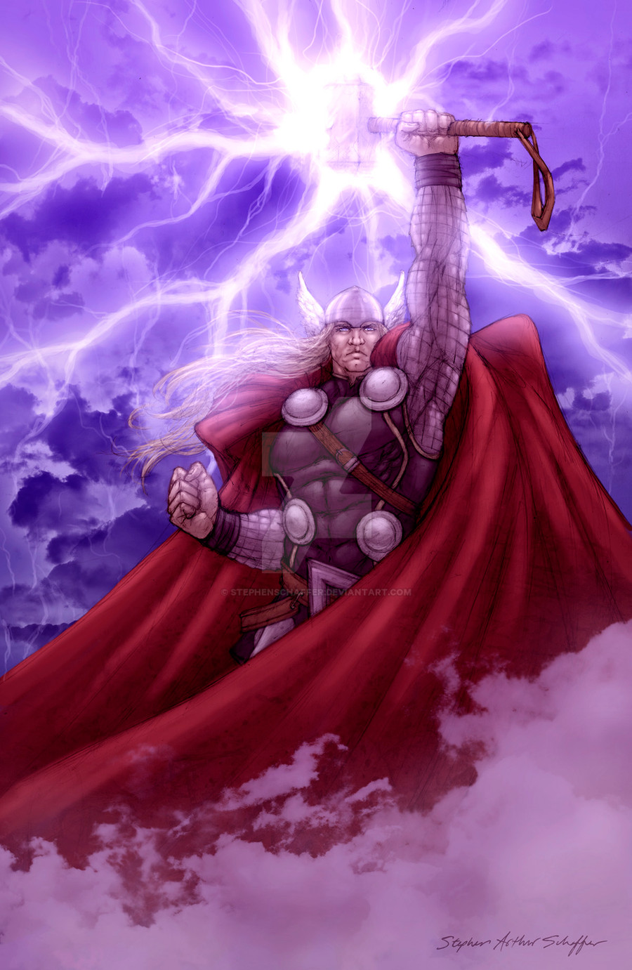
One usefull drill is doing 5-min drawings while squinting at the subject to get just the shadows and the form down A.S.A.P without bogging down on the details. I did two quick studies here [Link] and here [Link] using the same images you used. I opted to use the lightning bolt as the sole light source but I would used those drills if I was painting a similar image to yours. It would save some pain because I could concentrate on the lit areas (where the viewers' eyes would fall) and the forms will "pop" out of (and where appropriate, sink into) the background automatically and correctly. Most importantly it prevents a common artist mistake I often make, --of rendering parts of the piece in isolation and then having mismatched shades or poor contrast later, because I didn't have all of my highlight and shadow positions for the whole piece locked down before I had put hours into the details.
You may want to try that out and see if it helps. You can even do the drill on a separate layer of this piece (provided your PC can handle it) to see if and where you would make adjustments.
Applying more chiaroscuro (contrast) to the image by modifying the lighting could be a simple alternative to scrapping the whole thing and starting over
👍: 0 ⏩: 1

Thanks, man. I appreciate the critique. My goal was to have the lightning bolt be the strongest light source, but I never quite made it there. Loki was supp to be almost ephemeral in the bg, kind of hovering over Thor as this eternal antagonist who just never goes away. But I do see what you mean about it looking flat, that's something that I always struggle with. Recently I've been using rim lights as a temporary solution, but again, never quite got there with this piece. Thanks again.
👍: 0 ⏩: 0


