HOME | DD
 stephgallaishob — Sehrat2013-P6-couleur
by-nc-nd
stephgallaishob — Sehrat2013-P6-couleur
by-nc-nd
Published: 2014-04-28 08:43:10 +0000 UTC; Views: 681; Favourites: 7; Downloads: 0
Redirect to original
Description
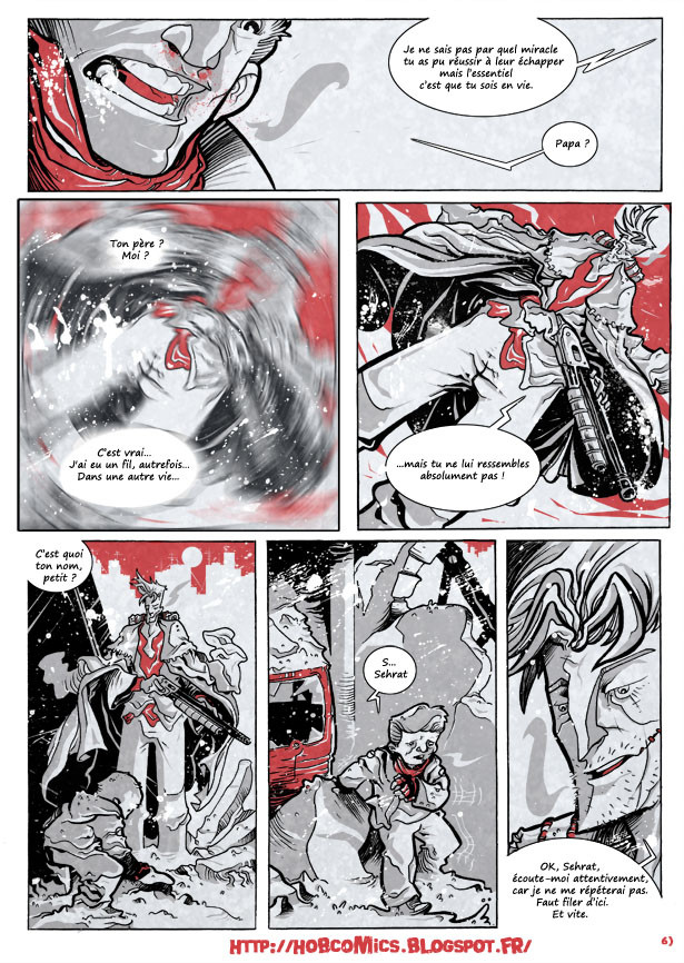
Page 5 : stephgallaishob.deviantart.com…
Page 7 : stephgallaishob.deviantart.com…
Les autres planches sur : www.facebook.com/sehrat2013
Et en HD sur : hobcomics.blogspot.fr/p/sehrat…
Other page on : www.facebook.com/sehrat2013
and in HD on : hobcomics.blogspot.fr/p/sehrat…
Related content


Comments: 14


Impact
i love the line work and the balance of spot color/grey/black (especially love the use of reds in the background/sky).
my single nit-pick is about panel number 2 ~ if you are going to do the blur effect, you could maybe move it off-center of the character's crotch; otherwise it creates a weird focal point. this is emphasized by the fact that the two panels (2 & 3) are exact matches (which always screams cut & paste and makes me look even more critically at the image). if you are going to do a cut & paste, perhaps play with the sizes of the images which might be more interesting to the eyes and also solve the crotch problem. unless, of course, you don't think the crotch is a problem ~ ha!
take anything i say with many grains of salt ~ i offer this small critique as a student learning the art from others who already have a very strong grasp of sequential storytelling.
and i am sorry my french is not good enough to write, so hopefully english is okay.
👍: 0 ⏩: 1

Thank you very much to have taken time to write this criticism.
I appreciate enormously
For the panel 2, I have to admit that it is the one most doubt of which I have.
Effectively, I have little to use the simplicity by copying then by deforming the image but I wanted exactly an effect of immediate enter the moment when the person sees vague and the moment when his sight clears up.
I make a note of your remarks and I would make try to try to change that
Still thank you
👍: 0 ⏩: 0

Sacré style! Le choix du rouge dynamise vachement la lecture!
👍: 0 ⏩: 1

Ca marche bien à part la case traitée avec photoshop : l'effet n'est pas évident à la main mais il jure avec le reste. C'est dommage parce que part ailleurs tu arrives à faire des effets graphiques sur d'autres pages/cases qui sont très réussis !
Pour le lettrage, voir ma critique sur la page 7.
👍: 0 ⏩: 1

Bon par contre, je sais pas quel âge est sensé avoir Sehrat, mais je me rends compte que l'autre l'appelle "petit" et "gamin" et je pensais que c'était un adulte petit face à un autre adulte très grand...

👍: 0 ⏩: 1
Bah , c'est un gamin d'une dizaine d'année( je dirais 13-14)
Au vu de la taille, si c'était un adulte , il serait tout de même assez petit , non ? Et du coup, l'Homme, ferait un peu géant ou Sehrat un peu nain ( au choix) ^^
Pour moi, il ne fait tout de même pas adulte même si pour autant , il n'a pas le visage d'un bambin non plus, je te l'accorde
Tu est la première à me faire cette réflexion donc je sais pas , j'ai peut être pas assez de recul mais bon comme ça fait 30 pages qu'il est dessiné comme ça , on va dire " trop tard" loool
👍: 0 ⏩: 1
Ben je pensais que c'était un nain en fait. Mais clairement trop tard oui, le principal c'est que ça plaise aux éditeurs si tu passes par là
 (Wink)")
👍: 0 ⏩: 1
ha ce truc du nain ^^
Tu me diras, ça peut être original.
Bizarre mais original
👍: 0 ⏩: 2
")
Ceci dit , blague à part? Je pense que cet effet vient du fait que je pousse un peu ses traits de visage.
Moi j'aime bien mais je suis pas le meilleur juge pour dire ce que je pense de mon propre travail.
Peut être que je devrais un peu atténuer ça
Je vais y réfléchir en tout cas (parceque bon, ça m'emmerde quand même un peu lol )
👍: 0 ⏩: 0

Cela ressemble beaucoup. J'aime votre style de dessin. Belle utilisation de la ligne et la couleur.
👍: 0 ⏩: 1
Merci beaucoup.
C'est le genre de commentaire qui fait toujours plaisir  (Smile)")
👍: 0 ⏩: 0