HOME | DD
 StephOBrien — Protection in Panic

#underfell #undertalefanart #underfell_sans
Published: 2018-07-27 09:16:47 +0000 UTC; Views: 623; Favourites: 17; Downloads: 5
Redirect to original
Description
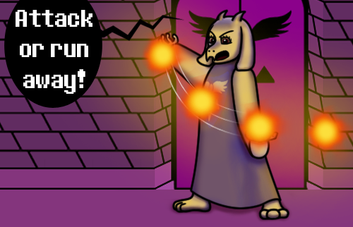
Last weekend, I stumbled upon an art contest and decided to participate. This scenario takes place in another Undertale AU called "Underfell", which is basically an edgier and more dangerous version of Undertale.The monster hiding in Sans' sentry station is the contest owner's original character, and she's having a panic attack - which is a perilous situation in an alternate universe where showing vulnerability can get you attacked.
Luckily for her, she's got a skeleton friend who will hold her hand and drive away potential threats with terrible puns.
This took forever, but I'm happy with the result. It was nice to spread my wings and push the limits of my artistic ability like this, and I finally took a lot of people's advice and started using more clothing folds. I probably made Ink's arms a bit too small, but I had to cram them into that little sentry station and make it feasible for her to clamp one of those hands over her torso.
My favorite part of this picture is Ink using her giant claws to hold Sans' teeny tiny baby hand, haha.
Here's a version without the dialogue: www.deviantart.com/stephobrien…
If you want to help me share art and stories faster, get early access to completed projects, and get exclusive access to works in progress, please consider supporting me on Patreon . If you want to help me without the monthly commitment, you can also support me with a one-time donation on Ko-fi.
Commissions
Get my art on physical items via RedBubble and Society6 .
Related content


Comments: 11

Hello, I'm from ProjectComment
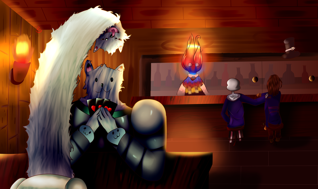
I like the background reason for such a conversation and why they’d want to off put the character in hand from staying around. I like how everything here is a bit gloomier to show that this world is a bit darker, not to mention the creature under the counter is holding the hand of the skeleton guy while he perspires. It shows that he’s nervous and he’s trying ot off put the guy away, that’s great. The sweat also looks rendered nice as well.
The shading and detailing on Sans and the character under the counter look great- I like how it gives them a 3d look, making them not look as flat. However I feel that the character that is supposed to be flames should have a bit more highlights, or in a sense give off the look of flames. Maybe add reflected light around the post and sans to help show this? They look a little flat compared to the other two, so adding in this highlight would help with that.
It’s kind of hard to see were the text bubbles are leading to, and who is speaking. I know you’re trying to get that dark bubbled look, which I presume is from the game and it does clash a bit with the background. Maybe reposition the bubbles a bit, or brighten the background sky a bit to help us to clearly see the tails of the speech bubbles. Also while on dark, Sans’s jacket looks a bit too black, maybe add in some highlights to help shape it a bit more.
Overall you did a good job here. I like how you have rendered the character’s expressions in this, it’s easy to see that something is happening here. The text in the word balloons are easy to read, and you try to capture that look and feel from the game a bit. Also the different text does help a bit distinguishing who’s speaking what.
Keep up the great work.

👍: 0 ⏩: 1

Sorry for the late reply, and thank you very much for the feedback!
I had some trouble drawing flames for the purple character, so thanks for the advice! I did have them cast a bit of a glow on Sans, but maybe I should've made it stronger and more noticeable. It doesn't help that when I upload pictures to the internet, they end up looking darker than they were in Photoshop, so you're probably seeing fewer or weaker highlights than I saw while I was drawing this.
Maybe I should've positioned the first speech bubble on the left of the screen, and the second one in the middle. I was trying to keep the speech bubbles from dominating the image and distracting from the characters, but perhaps I should've prioritized clarity over that.
Thanks again for the compliments and advice!
👍: 0 ⏩: 1
You're Welcome, glad to be of help.
👍: 0 ⏩: 0

Hey so I'm here for projectocomment , sorry for my English mistakes if I do
So I have mixed opinion on your art. There are stuff I like ,like your character in the bottom, he is painted greatly, i particularly like the shadow he has on the top of his head (and the contrast), tha chara design seems pretty cool too and we can feel he is in "3D". however the 2 other characters seems flat, you have to improve painting volumes. The painting of the chair seem irrealistic with light perfectly in the middle. Try to think: how many lights are there? Where do light come from? If you answer these question your art will greatly improve!!
Now the background...why did you choose a blue dark background like this, it does not match with your brown at all! And plus your background is void? where are your characters? In a space-time vortex? You should not be lazy detailing it more! If you carry about these advices, i guarantee you will improve a lot. Just continue working!
 (Smile)")
👍: 0 ⏩: 1
Thank you very much for the advice! I'm not sure what you mean by "painting volumes"; could you clarify?
The light source is supposed to be pretty much directly behind the characters, hence the chair having the light in the middle.
As for the background... I'll admit I wasn't quite sure what to do with it. The room in the game I'm depicting doesn't show the far wall, so I had no reference to work from. I used the colors from the visible wall, and because there's a waterfall nearby, I made it look misty. I'll admit I do tend to get lazy with my backgrounds; by the time I'm finished putting so much detail into the characters, I've often reached the point where I don't want to work on the picture anymore, haha. >_<
👍: 0 ⏩: 0

hey dude, this is pretty cool! i dont know much about undertale or underfell (i played the original game, but only when it first came out and i dont remember anything about it) but you arent here about that, lemme get onto the crit! first, heres the things with sans. since hes looking in front of him (kinda to the side), you wouldnt be able to see his eye or mouth like you do here, and his pupil makes it look like he's staring at the top of the little hut they're in. think about sitting in a classroom with a desk in front of you, and a guy in front of you talks to the guy to his right. you wouldnt be able to see his face. faces are fun to draw, though!!! if you wanted to draw a face though for fun on this piece, what i would suggest is sans facing the opposite direction in his chair, but with his eyes facing the other guy. another thing is just my personal kind of opinions, but i dont really like how shiny everything is, but i like the textures on the coat ruffle and the oc's ears/hair. hope you like this crit!
👍: 0 ⏩: 1
Thanks for the feedback! I did have a really hard time drawing Sans' face at that angle, especially without a visible spine to give the viewer some perspective on how far his head is turned, and now that you mention it, his pupil is a bit too high. Oops!
I'm still working on finding a balance between making the highlights strong enough to be visible, but not strong enough to be shiny or make the fabric look like plastic. >_< It doesn't help that the internet insists upon making images darker when I upload them compared to how they look in Photoshop, which makes it hard to judge what the uploaded end product will look like.
👍: 0 ⏩: 0
Seriously, what is people's problem with puns?
Folds are good and so are sweat drops on Sans' head and flames (oh, those star pupils in fiery eyes!) and scared OC.
👍: 0 ⏩: 1
I know, right? And they keep feeling the unique need to lampshade it - I mean, almost no one says "no joke intended" or "no simile intended", but people often say "no pun intended".
I also find it strange that Sans is often portrayed as using puns as his sole sense of humor, while Papyrus is portrayed as always hating puns. Papyrus tells more puns than Sans, and his are more smoothly woven into his dialogue. My guess is, Papyrus actually likes puns - he just hates it when they're done poorly, because he has STANDARDS. Sans, meanwhile, is at his funniest when he's using types of humor other than puns - I think he just told bad, forced puns beside the conveniently-shaped lamp to make Papyrus vacate Frisk's vicinity.
Thanks for the compliments! I do particularly like those star pupils.
👍: 0 ⏩: 1
Yes. I consider them sign of eloquency and creativity and pleasant decoration of speech and source of fun. And the bad ones are so bad, they are good and beg to be used.
That is admirable observation. I think you are onto something.
👍: 0 ⏩: 1
I don't think I've seen that view of puns before, but it makes sense.
Thank you. Out of all the people who assume Papyrus hates puns, I wonder how many have called his phone in every room. If one hasn't done that, I could see how one would miss the fact that he uses puns himself. Though, reducing Sans' sense of humor to exclusively puns seems lazy and unobservant to me.
👍: 0 ⏩: 0