HOME | DD
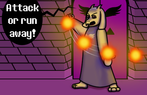
 StephOBrien — Why would anyone pass up an opportunity like this?

#flowey_the_flower #undertalefanart #undertaleflowey
Published: 2019-01-18 00:53:53 +0000 UTC; Views: 543; Favourites: 39; Downloads: 14
Redirect to original
Description
Sometimes, Flowey makes evil faces while telling people that killing them is an opportunity no one would pass up. And sometimes, I draw those faces and like the way they turn out.
This fearsome face will appear in the next page of my Undertale webcomic, Just Cause.
If you want to help me make art faster, get early access to completed art, and get exclusive access to works in progress, please consider supporting me on Patreon . If you want to help me without the monthly commitment, you can also support me with a one-time donation on Ko-fi.
Related content


Comments: 45

From ProjectComment
Although this is quite a small piece, i think it's also quite well made. I quite like the soft shading you used for the petals and stem; I think it works out quite well.
In the eyes and the teeth the images feels a bit flat to me though. First of all, the the surrounding slight grey of the eyeballs is a bit too bright, it looks nice regular shadow that doesn't match the lighting you're going for with the rest of the image. I think you were going for an effect like in this image: tse1.mm.bing.net/th?id=OIP.kro… since if it were actual shadow it would mostly be directly beneath the eyebrows and not really on the bottom of the eyes. If you were going for a similar effect to the image I just linked I would recommend making it darker and more distinct from the white of the eye. Especially with a white face it adds to the contrast surrounding the eyes, making them pop more and appear more creepy. Also by making the eyeballs slightly darker than pure white you can actually make highlights on them. Keep in mind that brightness is not necessarily caused by just pure white or pure black, but more so the contrast that white or black has with the surrounding area.
Also his teeth seem quite dark. I've read the discussion you had on this subject before, so I'll try to add to that debate. Sure, it might not be realistic lighting, but in art you're able to bend the rules a bit for artistic license. I'm guessing you're going for a scary atmosphere in this image and the darkness of the teeth is taking away from the scariness, since teeth are a major focus in terms of scare factors. Second, if realism is what you're concerned with; consider that the eyes, the face and the teeth are all basically the same hue/shade in your image (all basically (close to) bright white). Yet the face is rather mid-toned, with the teeth dark-toned and the eyes very bright. This is not very consistent. I'm not saying that making them all the same shade would be better (it would be more realistic in terms of lighting); making the eyes and teeth stand out more is some artistic license you can input to make the image pop more and to get a better response from your audience. You don't even have to make the teeth very white either, you can leave them the same basic shade as the face, but by adding some kind of shine or reflected light you can still add to the contrast in the teeth; that would even add to the information you're presenting about them.
The background is quite difficult to pierce; I gather from your description that you intended it to be dark, but the doorway took me reading about it and then looking closely for it to finally spot it. Especially compared to the bright whites and saturated colors of Flowey the background is absolutely invisible, so try either adding some light to it through a slight gradient or adding some thicker lines to the doorway to make it stand out more, otherwise it just looks like a black fill.
I hope this comment will help you further along; it's a nice small piece.
👍: 0 ⏩: 1

Thank you very much for the compliments and the nuanced, specific advice! You make some very good points about the shading on the eyes and teeth, and I appreciate that you took the time to read the other discussion I had on the subject of teeth so you wouldn’t be repeating the same advice.
For the eye shading, my intention was that the eyebrows cast a shadow over the tops of the eyes, and the curve of the eyeball caused the bottom of the eyes to be shadowed, but in retrospect, there should probably have been a shadow over the whole eye, with a glow in the middle to make it pop.
The background did present a dilemma, since I was trying to balance realism with staying true to the game. I did add a slight gradient, but things always seem to display darker when I upload them to the internet, so I should’ve made the gradient lighter and more pronounced.
Thanks again for your help. Have a great week!
👍: 0 ⏩: 1
You're very welcome! I'm glad my comment was helpful to you!  (Smile)")
👍: 0 ⏩: 0

Hi! I came from ProjectComment , and I'd like to say a few things.
First off, I really love this piece. While Flowey isn't my favorite character, you captured him pretty well!
I'd like to say, with your shading, it's very soft. Maybe for the more upper petals ( since it seems like the light source is coming from above) to give it more of a sharper shade. As well with the face, the most upper bits should be more bright. This includes his upper mouth, since it seems to be shaded.
To add to that, the teeth shouldn't be such a dark grey. The shading on the upper teeth is fine, but there should be some yellow/white colour for the rest of the teeth. Otherwise, it looks too dark.
The colour balance is good, but like I said with the upper lighting to make it more sharp. This'll give the image more colour instead of looking too dark.
With this facial expression, it matches very well with the evilness Flowey has. Although, try giving variety in his teeth. Make some sharp, dull, short, and long to give a real example of teeth. Also, I've noticed with this piece that your lineart is a bit more squiggly than with your other pieces. It's more around his mouth and eyes, but I can't see anywhere else ( the bottom petals have a smooth line compared to that around his mouth and eyes).
As of that, that's all I have to say. You did a really good job with this piece and I really like it! Continue to improve and draw, and I hope you have a lovely day.
👍: 0 ⏩: 1
Thank you so much for the compliments and advice!
A bit of sharp shade on top of the petals sounds like a good idea, though I'm not sure how to make the most upper bits of the face brighter, given that the uppermost parts are white. I tried making the upper mouth brighter, but it ended up looking like a duck bill, haha.
This is probably the part where I learn something new about shading, because I'm a bit unclear regarding why the lower teeth should be lighter. They're shadowed by both the face as a whole and the upper teeth, as well as being set farther back in his mouth - wouldn't that make them darker? What am I missing?
I was aiming to imitate one of his talking sprites in this picture, hence the straight teeth, but a little bit of variety would've probably improved the effect. I'm not quite sure what you mean about my line art being "squiggly", but I'm hoping that's a good thing. There are a lot of slopes and contours on the talk sprite I based this on.
Thanks again! I hope you have a lovely day, too.
👍: 0 ⏩: 1
No problem!
Ah, I see. Did you try also blending the white with the area? That might help.
Okay, so this requires more of a visual. If you go into a room- lets say, a bathroom- where the light shines overhead, grab a mirror and do the biggest grin you can. You'll see that there's still some light able to pass, giving your teeth a lighter shade. The shade should be soft here. Try it yourself, it'll make more sense.
By this, I noticed your flower petals ( where I could see the lineart that is) was very smooth. It wasn't rough and almost rush-looking ( like you rushed the lineart). Not noticable unless you look reallly hard, but I just noticed it quickly whn I kept glancing back to comment. I could show you where.
👍: 0 ⏩: 1
I'm not quite sure what you mean by "blending the white with the area". Do you mean fade from white to shadow less abruptly?
I tried standing in front of the mirror like you suggested. When I stood in front of it in the usual position, with the counter between me and the mirror, you're right - my bottom teeth were lit, because the light source was ahead of me as well as above. But when I leaned in so that the light source was almost directly above me, as it is above Flowey, my lower teeth were in shadow. I also have to keep in mind that in the picture with Flowey, there is no mirror in front of him to reflect some of the light back at him, which further diminishes the amount of light being cast on the lower parts of his face. All in all, it's a good suggestion if the light source is ahead of the subject, but when it's directly above, the lower teeth are shadowed.
To make sure I understand clearly: are you saying the lineart being smooth makes it look rushed?
👍: 0 ⏩: 1
Yes~! Exactly what I was trying to say~!
You're welcome~! At least you did try it, which is good. But I understand what you're saying now.
No, I'm sorry it came out like that.
What I'm saying is, in some parts, the lineart is smooth, and it looks fine. But in few other areas, it looks less smooth- almost like it's a different texture/brush.
Like, when I'm seeing the flower petals, it looks bold and smooth, but for his eyes and mouth, it looks rough.
Did you use a different brush when drawing his petals and his face? Because that's what I'm seeing.
Like here. This was snipped from the bottom petals. See how smooth it seems to be?
And here. These were snipped from his eyes. See how rough it seems to be?
Now, when I looked closely at the petals, it looks to me great time and care went into drawing it. When I did the same with his face, it looked more rough and slightly rushed.
👍: 0 ⏩: 1
Ah, that would be because the petal lines were made with the pen tool, while the eye lines were drawn freehand. It's REALLY hard to get a perfectly smooth line while drawing freehand in Photoshop 7.0. Thanks for the clarification.
👍: 0 ⏩: 1
Ah, I see.
But you're welcome
👍: 0 ⏩: 0
Those white eyes... Are they closed lids or actual terrible horrible absence of iris and pupil? And my, my, is he scary. I bow ti shading in this. I can't decide is these teeth, or carnivorous pointy teeth would be scarrier, but I am having wonderful Monster Clown impression.
👍: 0 ⏩: 1
Those are blank, white, open eyes. Some of Flowey's talk sprites don't have black pupils, so I figure he can deactivate them at will, Sans-style.
Thank you for the compliments.
👍: 0 ⏩: 0

Oh my gosh! Flowey is SO creepy when he makes this face!! You did a great job creating the effect--the whole thing makes me uncomfortable--which is the whole point of Flowey! As for the lighting--you did a great job creating the look of a small spotlight from above. It makes the whole piece look even more eerie and creepy^^
👍: 0 ⏩: 1
Thank you so much for the detailed compliments!
👍: 0 ⏩: 1


that's awesome! you are an undertale fan too?
👍: 0 ⏩: 1
Thank you! Yes, I am - this picture is a panel in an upcoming page of my ongoing Undertale fan comic.
👍: 0 ⏩: 1
Feel free to check it out if you like; the link is in the description.
👍: 0 ⏩: 0
Mission accomplished.
👍: 0 ⏩: 1

He couldn't have. If you have no soul you have no refl
👍: 0 ⏩: 1
Haha, good point. Although, if that were the case, you'd think inanimate objects would be invisible in the mirror, and our reflections would be naked.
👍: 0 ⏩: 1
*clap clap clap*
I love talking SCIENCE with people.
👍: 0 ⏩: 1
Because this is definitely the very hardest of sci-fi.
I think I also recall hearing that the "no reflection" myth was influenced by the silver in mirrors. Silver was believed to be toxic or repellent to evil creatures, so the silver in the mirrors caused those mirrors not to show their reflection. Not sure whether that's accurate or not, but it seems to make sense.
")
👍: 0 ⏩: 1
Ah, the one I thought was that mirrors show you your soul. That's why vampires have no reflection!
👍: 0 ⏩: 1
I suppose it could be that different myths use different explanations, or maybe the silver thing was just someone's fan theory. I'm not sure.
👍: 0 ⏩: 1


If you want to go for an even more menacing approach, try enlarging flowey's face and change his petals from being around his face to acting like a collar on an non-existent neck. Looks great on it's own!
👍: 0 ⏩: 1
Thanks for the compliments and suggestion! I was aiming to imitate the canon talking sprite from the corresponding part of the game in this panel, but I can think of a point later in the story where the "collar of petals" look will fit perfectly.
👍: 0 ⏩: 1
Glad I was able to help! Looking forward to seeing it!
👍: 0 ⏩: 0

You inspired me upon this hour, an devious little flower, i wonder what lies beyond.
Evil BeautyTo this I say to the fearsome flower,
you be one without a dower.
Your petals golden atop your ivory tower,
framing a smile upon this hour.
Harbouring my doom,
in its dreadful power. The golden petals are the perfect frame for the ivory marble smiling face. It creates a focal point that makes it hard to look away from the abyssal white eyes. Framed by darkness one could stare endlessly to all eternity. The shadows are perfect making the flower feel like its an object in front of me rather than a picture on the screen. Perhaps add a dash of highlight on the teeth. The atmosphere feels like i hit a bad end in a story, i feel as though my time would end if i looked at the flower, a strong will would definitely be needed to escape if it is a trap. Sense it is taking place in a cave perhaps add some barely noticeable texture to the background so it feels like a dark cave. Eyes will slowly adjust to darkness so some texture will be barely visible. Sense there is also a minor source of light around the flower perhaps add some more noticable texture near the flower as a soft reflection of the light. Just some things to think about. The flower is very detailed a touch more texture to the background i believe would tie it in. Would love to see a much larger version of this detailing the flowers place in the scene.
Your my first comment on Project Comments.
👍: 0 ⏩: 1
Thank you so much for sharing your poem! I checked it out and left a comment.
I really appreciate your in-depth and detailed feedback and advice. You put a lot of thought into that!
I think I need to start drawing things lighter than I think they should be, because there is a BIT of texture in the background, but every time I upload something, it shows up darker on the internet than on my computer. It makes it really hard to tell what the correct amount of darkness is while I'm working on the picture.
👍: 0 ⏩: 1
You can preview in browsers, this will show you what the image may look like when viewed through a browser. I agree it can be hard to tell, i had the same problem with one of my own designs.
Thank you for leaving a comment it is very appreciated.
👍: 0 ⏩: 1
Thanks for the additional advice. You're welcome for the comment!
👍: 0 ⏩: 0

That's some pretty sick shading there!
Great job!
👍: 0 ⏩: 1

He is a cutie!! Love the yellow petals on the black back drop. You did a wonderful job on the face!! Did you mean for the face to have the shape of a molar tooth? Very nice contrasting colors and love the wide devilish grin!!
👍: 0 ⏩: 1
Thank you so much! I didn't really intend for his face to look like a tooth, though I did notice it, haha. This expression was modeled after one of his in-game talking sprites.
👍: 0 ⏩: 1
Everyone needs a happy molar!! LOL
You are very welcome!!
👍: 0 ⏩: 0