HOME | DD
 StepOutandBeYourself — 56

Published: 2004-09-08 06:55:15 +0000 UTC; Views: 100; Favourites: 0; Downloads: 11
Redirect to original
Description
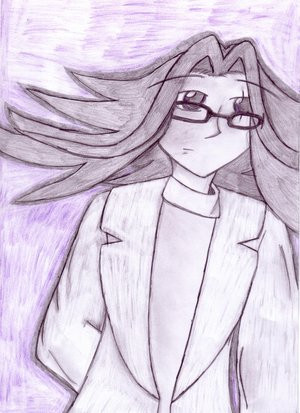
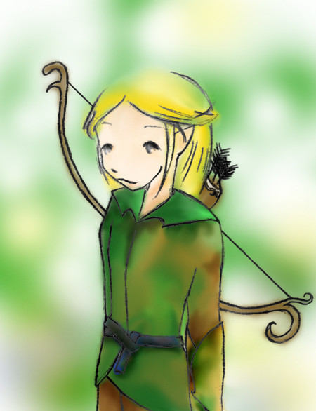
Submitted by member ~oompaloompasarecoolDescription: i have no title for this. the file itself was called 56 as result of random typing.
ok. don't laugh at me. this is my very first completed painting done in its entirety in photoshop cs. [hey i said no laughing] with my lovely tablet . yep. after weeks of practicing and whatnot, i came up wth this. well, i haven't been working on this for weeks, more like two-three days, but i have a bunch of other unfinished ugly things that led to 56's creation.
i need lots of work. but i need all of your help. tell me what you think is wrong with this, because obviously theres plenty to burn me with. so burn away. i need it.
the brushes used for the background were made by vered and insomniac. you can ask find their links in one of my journal entries. it's names brush links or something. or if you're too lazy to go and see, you can just note me or whatever.
oh yeah. and please full view. this is the first time i've ever emplored you guys to fullview, so please do it. pretty please? ??
tell me what you think. please....
EDIT: ok. i reworked it. argh the ear was so annoying. i had to make it smaller, and it still looks oversized. oh well. i hope it looked better than before. and thanks to everyone who helped me!
may i remind you to fullview? please?
sorry for reuploading
Related content


Comments: 3

 (Smile)")

ok this is gonna hurt a bit but u said u wanted to get this criticised....so here it goes...first off for a first time id say this is great....we just have some tiny human drawing tidibits to work out though....for one thing...her head is way too small in comparison to her face...give the human race some more credit...our brains take up more space than that...dont worry people usually do have a tendency to flatten the head a bit...second...the neck...not too far off but enough to say "that doesnt look right" its too thin...yes her heair covers up a whole lotta of it...but its still to thin....next...her face is very flat on the "paper"...it seems her left eye is almost on the same plane as her ear...also her nose is a bit flattened...i like the lips they're done very nicely...ok...now from the neck down...i can tell that you didnt spend much time at all there...u were probably relieved to finnish the face and wanted to get this piece done...so it was most liekly a bit rushed...spend as much time on the body as u did on the face...as it wont seem as flat and formless as it does now...very nice work....keep on praticing...cant wait to see what u'll be submitting in a few months
👍: 0 ⏩: 0
