HOME | DD
 steve0 — kinda shiny
Published: 2002-02-02 02:26:21 +0000 UTC; Views: 1896; Favourites: 18; Downloads: 123
Redirect to original
Description
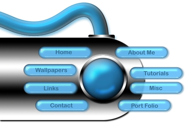
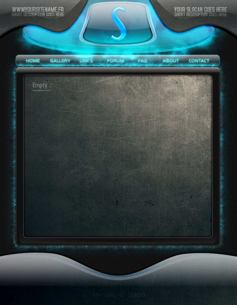
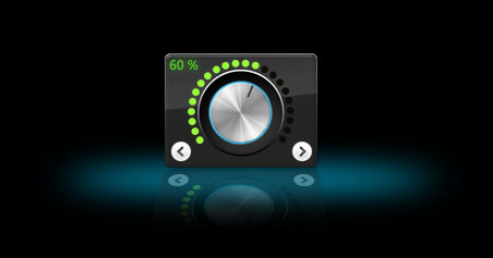
one of my first photoshop interfaces cause im use to 3d max...please give me some feedback and any suggestions would be cool
Related content


Comments: 11

Looks good to me, always love the aqua/plastic/bubble type themes. Looks like something from www.phong.com however.
Good job nevertheless!
👍: 0 ⏩: 0

Good for a beginner but the chrome bar does not look 3d... just looks flat.
100% Photoshop [ Love Box ]
-----
TJ_Combo - He dreams it, he designs it!
👍: 0 ⏩: 0

Simple, clear and bright. Only the buttons could have been aligned a little more. Nice.
👍: 0 ⏩: 0

Those chrome bars... you need to extend those Other wise its pretty good i think you should u should get a different texture to it looks kinda fake Nice work man.
👍: 0 ⏩: 0

I will agree with everyone else in saying that you should extend the chrome bar so that it is behind all of the buttons. Also fix the spacing. If you used a bevel on the chrom back then making the buttons ink in is easy. email me at phpbeam@xoasis.com if you want to know. Other wise really good, and I hope you come out with another.
what life brings............is what it brings you
👍: 0 ⏩: 0

I love the gelly buttons!!
The chrome-like stuff looks really fake, though, and the wire doesnt do it for me...
I love the buttons though!
👍: 0 ⏩: 0

yeah thanks 4 the feedback ill get to the tweaking
I love multimedia but i aint gay!
👍: 0 ⏩: 0

yeah i like it. the spacing on the buttons is a big throw off if you look for that detail. but over all i like it alot its a very good start for one of the first photoshop interfaces. i would also suggest extending the edge of of the bar cuz not many people will like the buttons hanging off. but good keep adjusting it.
👍: 0 ⏩: 0
thanks man i see what ya mean...well i knew the buttons on the left were off but i submitted anyway......oh well and im working on a flash version (this is all mostly testing and stuff)
I love multimedia but i aint gay!
👍: 0 ⏩: 0

You have the start of a good one here... first off the links to the right that hang off break the unity of the design to me. I'd go ahead and extent the bar beneath, on out so they don't hang off. Also, space them evenly like the left is. The 2 middle ones are too close. As sort of a finishing touch, try to make them look a bit more embedded into the bar thing. That's just some suggestions, but you really have a great start here. I hope I helped!
👍: 0 ⏩: 0

egh ... reminds me of a piece from guistuff.com
anyway, i would change the font and think again about the buttons on the right, they're sort of 'hanging', and i doesen't look all that good ...
and the tube on top should be ... hm, maby textureised or something?
and i believe 'portfolio' is one word, not two ...
👍: 0 ⏩: 0