HOME | DD
 steve0 — Where art meets
Published: 2004-07-18 08:03:18 +0000 UTC; Views: 1019; Favourites: 8; Downloads: 160
Redirect to original
Description
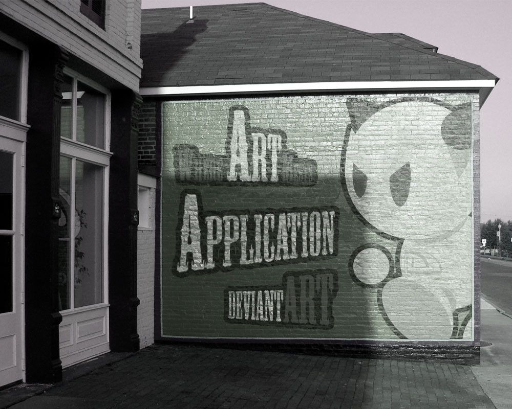
I just wanted to do somthing devart related and something to do with blending so yaeh. this is what i came up with.stock by
Related content


Comments: 31


👍: 0 ⏩: 0

wow...
you did a very good job with the texture and shadows...
... very nice
 (Smile)")
👍: 0 ⏩: 0


At first I saw this and was like... WHOA
I was thinking that this was like outside some sort of DA HQ.... rofl
It looks so amazingly real.. gah
AMAZING JOB!!!
👍: 0 ⏩: 1

 (Wink)")


thanks again mate. ")
👍: 0 ⏩: 0


thankyou. i wanted it to look real as possible
👍: 0 ⏩: 1

=^.^= you have achived your goal!
👍: 0 ⏩: 0


Wow this site should pay you for doing stuff like that
👍: 0 ⏩: 0

Recommending this to all the staff members I know, so they can see it. THis is GREAT!
-Dusty
👍: 0 ⏩: 0


cool nice job. you blended very well looks like you painted directly ont he wall.
👍: 0 ⏩: 0

This piece has its own little bit of charm; the banner isn't consistant with the same grays that appear in the picture, which may be a slight problem, however italso makes sure the viewer sees thsi first as its not congruent with the rest of the piece.
The shadow on the banner is very well done,and the composition was very well thought out. It even looks like someone just placed this tarp banner on the side of a house.
The only drawback is the white lining around the banner; perhaps little tie offs at the corners would make that lining make a little more sense.
Even though this just was for fun, its a cute concept and well done.
👍: 0 ⏩: 1

number one, i don't think it's a banner, it's looks like it was painted right onto the bricks. and number two, steve0, you can still see the coca-cola ad in the reflection of the window, but i liked how you made the ad green and white in the window instead of having it just black-and-white.
very cool! i like.
p.s. why do people have to leave it to a 15 year old to see the little obvious stuff like that... just makes me wonder. *shrugs*
👍: 0 ⏩: 2
thanks heaps mate. i missed the reflection ")
👍: 0 ⏩: 0
I'm glad you shared your opinion, the artist specifically asked me to share mine, i've done so. If you disagree with it, that's your perogative. And its good to have these opinions as what one person sees as obvious is not always obvious to another and vica versa since 'obvious' is in the eye of the viewer. I'm just trying to be helpful to sharing my opinion to someone who asked for it.
👍: 0 ⏩: 0

Thats very cool you should email this or note this too one of the staff! Just so they couldnt get a kick out of this ya know? Its cool!
👍: 0 ⏩: 0


Looks quite realistic, and the art on the wall itself is great.
👍: 0 ⏩: 0
