HOME | DD
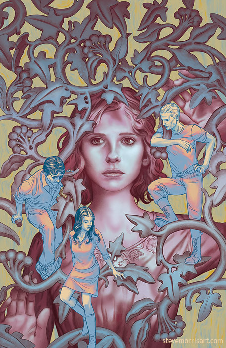
 StevenJamesMorris — Cover for Buffy the Vampire Slayer, s10 issue 9
Published: 2014-08-13 19:46:26 +0000 UTC; Views: 3632; Favourites: 157; Downloads: 48
Redirect to original
Related content


Comments: 15

I love the art nouveau foliage in this one (Buffy looks somewhat like a Symbolist angel but still very much like "herself".) What is the specific inspiration for this design?
👍: 0 ⏩: 1

Thanks! I like using stone tracery/masonry when I can, like on the trades for season 9 of A&F. In this case the tracery was symbolic of a barrier of Buffy's problems that she's held behind, while being unaware of her friends and what's going on with them...at least I think that's what was in my head at the time. The specific design of the tracery is of an ivy plant, which I thought made sense with the way I wanted the tracery to scroll. The rest was just playing around to see what worked...although Buffy's rendering is a little smoother (airbrushed looking) than I like...It seemed right at the time, but later on I wished I had made her less polished.
👍: 0 ⏩: 1
Given how much I love antique architecture, graphic design, etc, you're speaking my language here. I've especially enjoyed your comments on your blog about the various sources of inspiration for your designs. In this instance, the tracery in your design reminds me very much of neo-Gothic stonework circa 1880 - 1900 that I see on some public buildings here in New England.
The design reminds me superficially of Phil Noto's cover for S9 #10 in terms of emphasizing Buffy's problems and the circular composition but your's is a more lighthearted design and very much in keeping with the tone of the season. "the barrier" here is a fragile one, the implication being it's one that Buffy and her friends will be able to break through or climb over.
// although Buffy's rendering is a little smoother (airbrushed looking) than I like...It seemed right at the time, but later on I wished I had made her less polished. //
A bit more textured? I hadn't thought of it until you mentioned it but now I can see that yes, she has somewhat the quality of a statue here herself, carved of the same marble as the tracery, but that's also because she slightly resembles a pre-Raphaelite angel or Madonna.
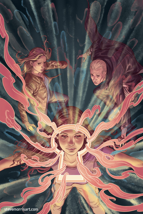
BTW I recently saw your cover of S10 volume 5 on buffythecomicsslayer's tumblr and this is one of my favorite depictions of Buffy on any of the comics covers so far: buffythecomicslayer.tumblr.com…
I love the detail of her tearing up a little.
👍: 0 ⏩: 1
Yeah the gothic-revival styles from the Victorian period are very cool, there is some crazy porcelain and ceramics from that period. The cover was very much focused on pretty/decorative/detachment rather than heavy/emotive, and to some extent I just thought it would look cool
Yes, more texture maybe in showing some bit of brush stoke effect, just so it does look like she got the Vaseline-on-the-lense treatment. I think the problem I was having was that I wanted her smooth with a little texture but the strokes I tried to add made her look older, so I erred on the side of smooth rather than possibly looking worn out.
Thanks! When I started that cover I wasn't so crazy about it bc I was afraid it was a little boring, but it was one of those that the rendering made up for the less imaginative concept and I really like it now. I think under lighting her face always works well bc it's evocative of the show, which often had some level of under lighting on faces.
Thanks for your thoughts and comments!
 (Smile)")
👍: 0 ⏩: 1
"less imaginative"? No, not in the least. And beautifully rendered, you're right to be pleased with it.
Thank you for your thoughtful replies!
👍: 0 ⏩: 0

Whoa, that's awesome! T'is a really captivating picture that makes people stop to admire it. Well done!
👍: 0 ⏩: 1


I am just watching the series again and great to discover this pic. They all look so lifelike here!
👍: 0 ⏩: 0


Very nice, reminds me of James Jean's works! great job
👍: 0 ⏩: 0


")

