HOME | DD
 stipend — comrade

Published: 2013-08-13 07:13:03 +0000 UTC; Views: 359; Favourites: 13; Downloads: 0
Redirect to original
Description
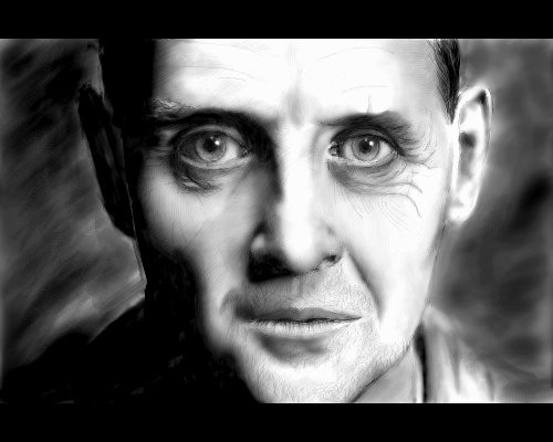
drawn in krita on linuxRelated content


Comments: 19


thanks & me too! lately i've been so light with shading, it would be a good if i could be more consistently dramatic
(it's as if i'm afraid of ruining work... but i mainly work digitally, i have the power of layers and undo!) lol
👍: 0 ⏩: 0

I definitely like the shadow effect on this one ")

👍: 0 ⏩: 1
thank you!
i'm glad it's not overdone (got to the point where i didn't want to work on it anymore and stopped) i'm fortunate it's not underdone lol
👍: 0 ⏩: 0
i'm glad there is improvement! thanks bro
i need to work on improving background skills too (yours are so amazing!)
👍: 0 ⏩: 1

Thank you man but istill have a long way to, sometimes is just venture to the uknown!
Make lines, try try try! Lol...
👍: 0 ⏩: 1
yw  (Smile)")
👍: 0 ⏩: 0

Love how you handled it fading into shadow! Very hard to pull off right!
👍: 0 ⏩: 1
thanks for noticing! i agree that there is definite improvement in that regard
a good "before" example would be this where the shadow on her face doesn't work

👍: 0 ⏩: 1
Oh yea, deff better this time around lol I like how you lost the edge in this one, I think that helped a lot.
👍: 0 ⏩: 0
hehe thanks
👍: 0 ⏩: 1
Cool! i really like how he comes from the shadows. nice, sharp, contrast.
👍: 0 ⏩: 1
thank you
(perhaps his eye could use more definition,
but i kinda like how his ear stands out)
👍: 0 ⏩: 1
Hmm I can see that. Maybe softening the sharpness of the contrast to the eye would help, or bringing more finishing detail to it.
👍: 0 ⏩: 1
i could always edit the submission with an update!
(and bug y'all with a newer and improved version)
 (Wink)")
👍: 0 ⏩: 1