HOME | DD
 stmark — Twins

Published: 2006-03-29 19:41:34 +0000 UTC; Views: 8366; Favourites: 205; Downloads: 74
Redirect to original
Description
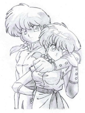
I only coloured this so I'll ignore any posts that star of with "nicely drawn" etc.There was this contest by [link] (that's where you want to write "nice drawing") so I figured that I might as well train my cg skills. I'm not really that good since I haven't CG:d all that much but I definately managed to improve myself while doing this (compare with my other CG:s and you'll agree). Since it's a contest you get to see how other people have tackled the picture aswell so I really enjoyed doing this. Took forever though... I used a mouse since I don't have a tablet...
")
I named it twins because "contest art" sounded kinda boring and in my CG I sorta made them twins
") .
. All comments are welcome and if you want to point out any tips then be my guest.
Related content


Comments: 28


This is cute. Lol it reminds me of me and my twin brother.
👍: 0 ⏩: 1


This pic is fantastic... The way you coloured it is perfect, the characters match with the colours you used, great! +fav!
👍: 0 ⏩: 1

Thanks for noticing
👍: 0 ⏩: 0

*o* You've gotta love everything about this picture... the outfits, the background, the colours... wow. It's beautiful !

👍: 0 ⏩: 1
Thank you! I especially put a lot of effort to get get the colours right so it is nice to hear I you like them
👍: 0 ⏩: 0

Waaaii! Since you gave me such nice comments, I'll comment on yours too!
First off.. I absolutely ADORE the background. It looks like a picture to me, so please tell me if I'm right or not. My main reason for saying that, is that if you zoom in really close, not even the 1 pixel size brush could make something that intricate. Then again, I used a picture for mine, so I can't really complain.
As for the colors... I absolutely love them! Green is, of course, my favorite color, so naturally I'd love the color choices! The shading looks nice, particularily on their clothing. The added texture effect on everything really brings out the depth in the depiction. My only real complaint with the shading is their skin... Although you created the lighting well, in the sense of, shadows on the opposite end of the light source, you still didn't factor in a couple things. First off, the human body is not flat, it has curves, dips, valleys, and hills. Wherever a hill appears, there will be a shadow on the opposite end. For the most part, since you excluded that, the skin takes on a flat appearance. Let me give an example. Let's take the girls' nose and lips. Since they jut out from her head farther than the rest of her face, they will therefore produce shadows. Since the light source is coming from the left, then the left side of her nose (our right side) would be in shadow, while her right side would be lighter. Same for the lips, and her torso. Other than that, I find the shading to be quite well done! Far better than I did, in the short ammount of time I had.
I particularily love how you did the wall! It looks so real, I almost feel like I could reach out and scrape my knee on it. That is one (of many) areas I feel I would have done better on if I had more time. As it is, it was half way through the 30th before I even GOT to the wall, so I didn't have much time to put into it. I still think I did an average job, but nowhere near as good as some people, such as yourself. I think you have a great chance of winning, as do some other artists. One final word of advice... the leaves, they look too... shallow to me. Same thing with their skin, you need to take into account how the leaves bend, twist, and thus, produce light areas and darker areas. That means that the veins of the leaves would be darker in shade, while the areas not occupied by the veins would be lighter.
Well... I had fun typing that, and I hope you have fun reading it.


👍: 0 ⏩: 1
First off, thanks for such a detailed reply! Don't get a lot of those so it is appreciated.
Indeed it is a picture in the background... well it's a part of a picture at least... but not just any picture. I took this picture myself when I was in Japan. Then I messed around with the colours a lot to get the right feel to it
Noticed the things you commented on about the skin. I'm not quite happy with that part og the colouring for the reasons you mentioned, well spotted  (Wink)")
You're right on about the leaves. I kinda rushed that part and that's why they didn't turn out so good.
So thanks for the comment again, like I said, much appreciate it!
👍: 0 ⏩: 1
......N-n-nihon?!! ......
It takes a lot of practice. For me, I actually worked the opposite way. I had the ability to shade according to elevation, but not according to surface. What I mean by that is, I was able to easily shade the tip of her nose brighter, while the recesses of her eyes darker, but I had a problem with shading on the opposite surface of the light source. Funny... how we shaded in the opposite ways...
Yeah.. I had the same problem. I worked hard to make the leaves as best as I could, but it was the last day, so I had to rush it too. What I REALLY hated about mine, more than anything else, was the wall. I hated how it came out. I had shaded it a little bit... but in the end, since it was the evening of the 30th, I was forced to just put some lighting effects (courtesy of PS) to "shade" it. Since the lighting effects don't really take into account the surface of the object, or the depth, it ended up looking very flat. Huh... I never really thought of them as her wings, more like... a pole thing that's attached to the back of his arm. Heh... guess you learn new stuff each day, ne?
And, you're quite welcome. I always loved typing out long comments like that, though I am often too busy to take some time and actually do it....
")
👍: 0 ⏩: 1
It was actually a good thing that we shaded in "opposite ways" because that way we were able to learn from each other
I like writing long comments too but like you I rarely have enough time for it. It's difficult enough having time to check my devart account regularly
👍: 0 ⏩: 1
Hehe... yes... it is always a good thing, to learn.
I try to check it each day, because if I don't, I usually get over 70 messages a day, and those rack up faaast!

👍: 0 ⏩: 1
Heh. Oh! I developed a new shading technique!! I'll illustrate it in my upcoming journal... You should check it out!
👍: 0 ⏩: 0

I love the coloring and the background...it's very skilled done...Wow...I'm completely stunned....
👍: 0 ⏩: 1

I really love this version if the drawing (Smile)")
👍: 0 ⏩: 1
Why thank you, I checked out yours too. You're actually better at shading than me, so I'm honoured
👍: 0 ⏩: 0

you can tell you took your time with coloring this. every detail stands out from it. Great job!!
👍: 0 ⏩: 1
Thank you! I'm glad you say that cuz it's true. It really did take quite a while
👍: 0 ⏩: 1
You did a very great job! If only you would color for me!
👍: 0 ⏩: 1
He heh, I wish I'd have time (I'm a very busy guy). In that case I just might
👍: 0 ⏩: 1
i know what you mean. Im only get paid 100$ a week so far, so i couldn't pay you yet. But i'm getting a childrens book published right now, so if i get paid alotta money... maybe then...?
👍: 0 ⏩: 0

nice colouring!
i like the way you´ve put it together. keep it up!
👍: 0 ⏩: 1
Thank you! I'll try... I'll try
👍: 0 ⏩: 0

OMg...this is breath taking. The colors, the background...Wow...The dude is hot and the girl is beyond cute. This is brilliant. The colors match so nicely.
👍: 0 ⏩: 1
Thank you very much! I spent a lot of time mixing with the colours. Feels really good hearing that they match
👍: 0 ⏩: 0