HOME | DD
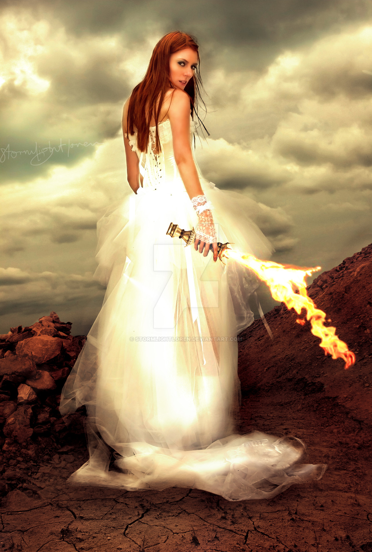
 stormlightloren — Conqueror - Fire
Published: 2011-02-19 14:37:23 +0000 UTC; Views: 2014; Favourites: 41; Downloads: 0
Redirect to original
Description
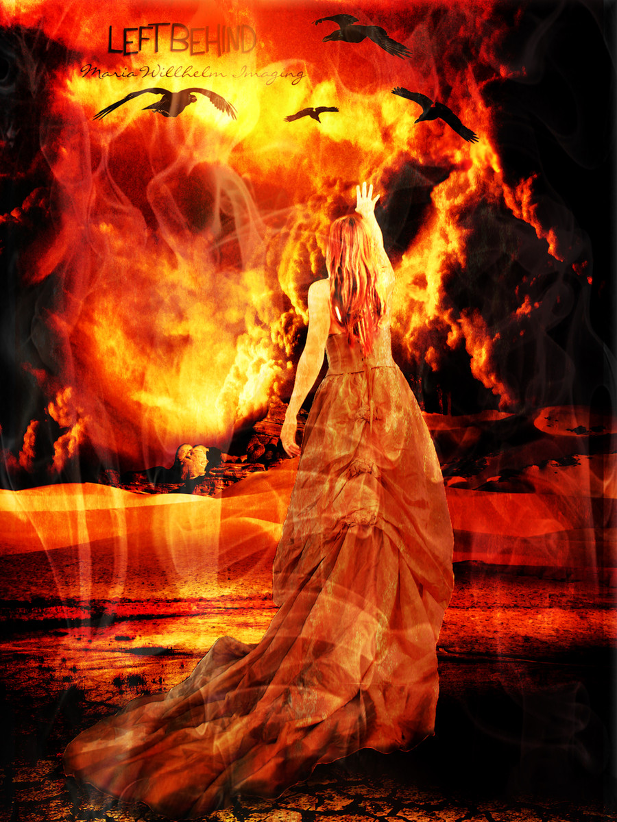
For the contest 'Fire of Vengeance' atI was already maniping the girl when I saw this contest. Then I was looking at images of fire and saw one and it reminded me of the sithras and yeah.... very inspirational end to my complaint of having no inspiration.
To improve my photomanipulation art skills I have started a series of seven artworks like the one above,
based on the seven sithras in the game Darkfall.
So please critique - I am doing these specifically to improve, hopefully the last one looks really awesome.
A sithra is an elemental weapon, and like a cross between a whip and a lightsaber.
Fire sithra.
I am also kinda basing the landscapes from Darkfall.
And in Darkfall the sky is rarely ever blue!
This one does not look anything like as good as I had hoped and I will be working on improving it.
Stock images used:
Model(and sky): [link]
Rock Piles: [link]
Ground: [link]
Fire(Main shape): [link]
Fire(Extra on top): [link]
Handle: [link]
There are parts where her dress blends with the sky, I think maybe I should make her stand out there more.
She has plain white all over her, so I will bring back a bit of the shapes of the dress there maybe.
The whole picture just looks kinda boring in a way, like it needs more detail or something but I don't know what.
And the light source isn't definate enough, I don't think it's wrong, just think that if it had more definition I could give it more dramatic lighting and maybe that is what it needs.
Can anyone notice anything else that I've missed?
Or do you disagree or agree with anything in particular that I've mentioned above?
Related content


Comments: 20

Overall

Vision
Originality
Technique
Impact

a.deviantart.net/avatars/c/r/c… " alt=" " title="Critique-Requested"/>
The first impression one gets from viewing this image is quite entrancing. Your choice of stocks is fantastic , and the flaming sword/whip really catches the eye. The colors are soft and enchanting , and the extraction of the model is well done therefore quite beliveable.Particularly where you can see the rocks through the sheer toole of this lovely young "conquerer"'s dress....And , well for the most part , everything is well blended and thought out.
Now for some areas that could use improvement.
1st , the flames . Though belivable in color and density , they lack a true sence of burning . One suggestion would be to add some embers/sparks or whisps of smoke emenating from them.Also , such fire fouls create a bit of glow on the womans dress ,which appears to be missing and which brings me to #2.
2nd the shadow of the dress on the ground behinde the girl it too wide , making it appear to be floating above the ground instead of trailing on top. The shadow should be dynamic , in that it is stronger where it is closer to the source (the ground in this case, and gets weaker as it comes away.Here it should be weaker because of the sheer material , but much closer to the outline.
3rd and finally , though your model extraction of the model is very good , it could use a bit of retouching/repainting/sharpening , on the edges that have been erased away just a little bit too much.
Overall , this is a very good beginner manipulation , you should be proud , and I for one look foward to watching your growth in this artform. Good luck with them all.I hope this helps my friend e.deviantart.net/emoticons/h/h… " width="15" height="13" alt="

👍: 0 ⏩: 0

There's a story in this picture, from one of the infinite parallel universes. I'd say it's dramatic enough without more effects. The expression on her face is telling me she just laid waste to a small army with that fire-sword, as if it were nothing to her. It's good to have a protector. Maybe a few spatters of blood on the dress would make it less "boring" to you. It can be hard to see in your own work, when you have spent so much time on it, what smacks a total stranger in the face. In writing, it is often helpful to put things in a drawer for a while, then come back after some time away, and look at your work with a fresh perspective. Stay devious.
BTW, the landscape looks unmistakably Martian to me. Something I didn't quite catch at first. Nice touch.
👍: 0 ⏩: 0

Great work! Sorry about the delay in me being able to pop over and have a look!! Thanks for using my stock!

👍: 0 ⏩: 0


Your wonderful work has been featured in my journal : [link]
Thanks a lot for using my stock
 (Wink)")
👍: 0 ⏩: 0


 (Smile)")

Oh I like it. She's so sensitive and dangereous. It's amazing she shares these two feautures. And colours are nice for eye.
👍: 0 ⏩: 1

Thanks for the nice comment

👍: 0 ⏩: 1
No problem! <3
👍: 0 ⏩: 0


Thank you that't what I was really hoping for
")
👍: 0 ⏩: 0

