HOME | DD
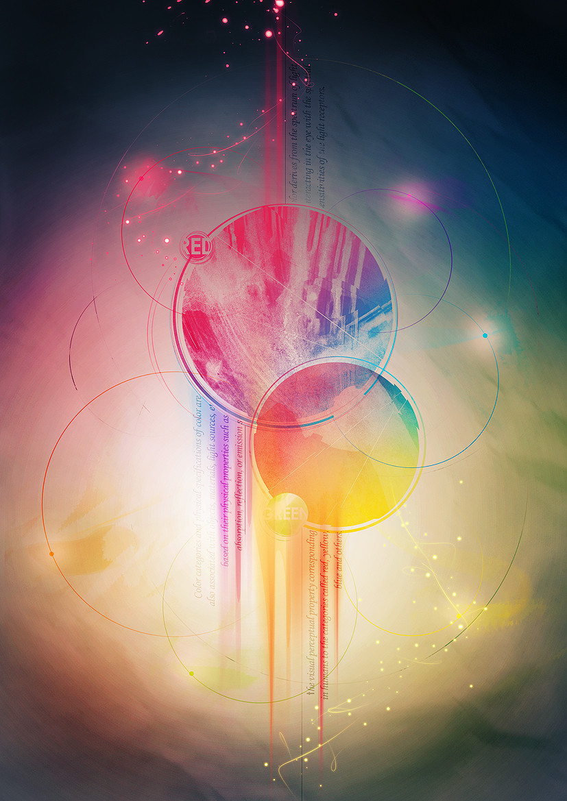
 Street-FX — Definition of Color
Published: 2008-10-18 11:59:18 +0000 UTC; Views: 4083; Favourites: 70; Downloads: 761
Redirect to original
Description
Just testing something butI dont like this anymore.
-Experiment Failure
Related content


Comments: 17

Great work and nice colors.
Maybe the fonts at the center are slightly weird but this is definitely NOT a failure.
👍: 0 ⏩: 0


 (Smile)")

Faliur?
Hardly!
This is close to prefect!
All you need is some tweaking here and there. Basically, the typo needs some work. I think you should ditch the "red" and "green" circles and try and get the text in the downward strokes to blend better and also have them line up with the strokes a little better. Personally, I don't think readability is the most important value of the text, I think it works better as a texture at the moment. But other than that, frankly, I love it.
👍: 0 ⏩: 0


Nothing wrong with it at all bro. I think it's great.
I like the clarity in your work. And there's NO such thing as a failed experiment. Believe me.
👍: 0 ⏩: 2

Ah...haha thx for the compliment.
👍: 0 ⏩: 0

I hate texture on circles , but everything else is amazing
👍: 0 ⏩: 1
Some hate it
Some like it
Thx anyway.
👍: 0 ⏩: 1
Ye true.But that's my oppinion
👍: 0 ⏩: 0


yes man, u failed!! 
👍: 0 ⏩: 1
nah u didn't. its a sweet work
👍: 0 ⏩: 0