HOME | DD
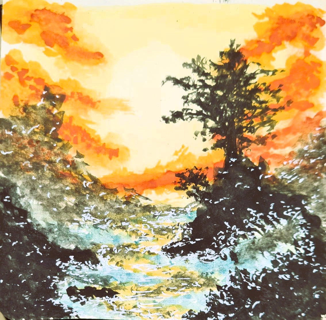
 StrideOStyle — Pines of the Roman Hills

Published: 2013-12-27 03:44:47 +0000 UTC; Views: 335; Favourites: 14; Downloads: 1
Redirect to original
Description
An Freshman year drawing I did. I tried to put realism in to this. And I think I did an good job at it. I like how I did the grass and the trees the most.Related content


Comments: 11

Hi! I'm Foxy from ProjectComment ~
Ok, so I want to begin by saying that while I see a lot of potential for this piece, I can’t see much in terms of the details of it. A lot of the forms blend together into a shapeless mass upon first viewing, and I feel as if this damages the impact of the piece quite a bit. This is particularly a problem with the trees, as the canopy blends into itself and the trunks have little to no variation in shape, texture, or value (shading) to distinguish them from each other. Similarly, the river blends into the grass a bit (value wise), but I was able to discern the two textures and separate them. To remedy this, I would suggest doing value and shading studies – set up an object and sketch it, focusing less on the shape and mass, and more on the form, lighting and values. Start loose and then refine and blend (I suggest charcoal but you can use graphite too). Experiment with the lighting too, if you can! Also, be sure to use references and thumbnail your drawings, even if its realism. It can help you experiment with the shapes and forms that best compliment the composition of your piece (it’s a practice I would encourage most artists to get into anyway). But, most of all, don’t be afraid to get a bit dark with your lines to define and shade things.
Although I started with the negatives this time around, I do wish to say that I like a few aspects of this piece. I think the houses are cute – compositionally, where you drew them helps rest the eye, and it really draws the center as the focal point. The forest and river really help to frame the houses, and by extension, the piece itself; move over, as EshiSnu said, the composition makes it seem as if the viewer is a person looking on from across the river – and there’s something very charming about that idea! And though I critiqued how the grass and river blended together, I do like the texture of the grass and how you were able to add a subtle movement to it, almost as if it was blowing in the wind. It looks so soft. ^^
Overall, while I feel that there are a lot of weaknesses, its nothing that time and practice of techniques won’t help to improve! Keep up the good work and love what you make. I apologize if this critique came off as too harsh.
Good luck and I hoped this helped!
~Foxy
👍: 1 ⏩: 1

Oh my gosh! Thank you for your critique! I’m sorry that this replay has taken so long; I’ve been very busy over the months and couldn’t reply to anyone, but thank you. I drew this way back in 2011, when I was 14/15 years old. This was one of the first drawings that I truly attempted realism.
Looking back on it, I now know the importance of shading. I appreciated your honesty, and critical comment of my piece. I agree with your words about shading, shapes, and forms are one of the most important points of any drawing. Experimentation is the soul of any, to all great works of art. Your words make me think of how to approve my artwork; I’ll keep your thoughts in my head when I make my artwork from now on.
Thank you again, and have a bless day.
👍: 0 ⏩: 0

Hi, I am from weekly commenting.
Right off the bat, I can't help but notice the two structures in the middle of all the huge trees. The perspective of this make it look like there is a person across the river looking at the scenery. Giving it a nice long landscape view. As far as the composition goes, I think it works. It looks like the image is broken into thirds, fore ground (river bank), Mid ground (the other side of the river bank and two buildings), and the background (the trees). In that respect, I think it looks balanced.
However, I think, that the foreground, mid ground, and background, look a bit flat. The thing that stands out the most are the tops of the trees and that can make the top of the picture seem top heavy. I think that is because, the tops of the trees are the darkest part in contrast to the rest of the picture. I think if you added more shadows and darken other various places to play up the textures on the trees, ground and grass, it would help to balance the picture visually.
You have very smooth line work and I noticed that you used different directions which, help to add more texture and break up the image into sections visually. I also like the details in the buildings. You can clearly make out every thing. If I may make suggestion, because your lines and blending is so soft and smooth (which is a nice skill by the way) many people have a hard time blending so smooth. I feel you have a good skill for that. But, because this is nature and the woods, I think you could have more fun having messy lines and rougher edges to bring out the natural textures in the ground, trees and dirt.
One thing you could add, if you wanted, would be to make the bottom half of the picture, get a little bigger as it reaches the bottom edge. Starting from the river to make it seem like image is getting closer to the viewer as if they were there in real life.
I hope my comment was helpful in some way. But, over all, I think this not a bad picture at all. It looks quite calm and relaxing.
👍: 1 ⏩: 1
👍: 1 ⏩: 1
👍: 1 ⏩: 0


Nice work here. I never really was good at shading myself and you did a good job here. Though I think you can make the trees a little smaller though. They can still be big but they're unrealistically huge here.... unless you wanted them to be that big.
👍: 0 ⏩: 1
Thanks, I see what you mean by the big trees, they are rather large, though I suppose when I was drawing back in 2011, I wanted to make the trees large, as to invoke a primitive, and large-scale feeling with the drawing.
I'm now getting better at scaling and perceptive, I'm trying to use measurement now.
👍: 0 ⏩: 1
Good. Just keep improving and working on your art. You'll get there.
👍: 0 ⏩: 1