HOME | DD
 stripedwine — CTHS 01-03

Published: 2008-04-25 04:02:34 +0000 UTC; Views: 5796; Favourites: 65; Downloads: 50
Redirect to original
Description
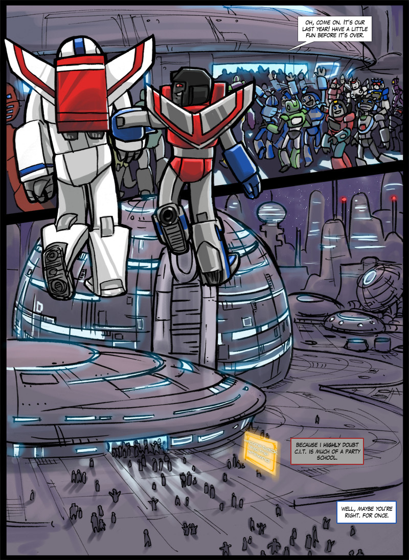
Holy dear mother of god this took me so long to do.SO LONG TO DO.
SO
LONG.
TO DO.
THAT IS NOT INCLUDING ACTUALLY DRAWING IT. THE TIME IT TOOK ME TO CLEAN IT UP AND COLOR AND DO TEXT... WHAT... 6? 7 HOURS? SOMETHING LIKE THAT. IT DOESN'T EVEN MATTER ANYMORE.
AUGH.
It looks really really pretty though. D:
And do you have any idea how hard it is to draw wide shots of cityscape? It's like, ridiculous. I had to seriously think about how I wanted this Cybertron to be, though. Is it floating aimlessly through space, or is it orbiting something? Does it have an atmosphere? Et cetera, et cetera. I eventually decided to let it orbit some kind of star, and also give it a little atmosphere. Because honestly, having it be night time 24/7 would not only get disorienting after a while, but also become a pain to draw.
So now I get to go back and recolor page 3 too, because that one still shows a night sky. And I might as well redo the first page because it looks like crap compared to these now.
Someone kill me.
That was a lie, actually. I'm having a lot of fun doing this comic.
P.S. I have the next real page ready to be colored and stuff, I just have to wait for my wrist to cool down after this.
P.P.S. I fixed up the last page too. GO LOOKIT. :3
===================
Page 02: [link]
Page 04: [link]
===================
DON'T FORGET TO FRIEND CTHS ON LIVEJOURNAL: [link]
Related content


Comments: 26


XD I watched a cheapo movie about hazing the other day about a sorority haha
Good thing I saw it or I wouldnt have understood this!
👍: 0 ⏩: 0

The lighting effects are awesome in this. I envy you more now for being able to redo that entire page like this @_@ Definitely worth it. Cybertron looks a lot different in this page, and I like it.
👍: 0 ⏩: 1

Aw, thanks! Yeah, I blame it on the OCD..
👍: 0 ⏩: 0

Wow! Another fantastic city shot! The effort put into this page definitely shows.
👍: 0 ⏩: 1

This is quite the improvement! I loved your first pages, mind you, but wow. It's pretty apparent that you put some thought into this.
I love the new angles, and Skyfire's grumpy face. Poor guy has one retarded best friend.
And your wide-shot is gorgeous, I like the layout of the city and the lighting, the roadway with the cars speeding around is a lovely touch.
SCUZE ME WHILE I NOM ON YOUR DELICIOUS ART HERE.
👍: 0 ⏩: 1
Well, as soon as I started to think about how much better they could be, my perfectionist side kicked it into high gear and told me that the first few shitty pages would make all of it look shitty and I could do better so DO FUCKING BETTER YOU HORRIBLE ARTIST OR ELSE NO ONE WILL LIKE YOU AND YOU WILL DIE POOR AND ALONE so I proceeded to redraw them at metaphorical gunpoint.
Also, I had a lot of fun drawing him tired and grumpy.
UR ESKEWZED <33333
👍: 0 ⏩: 0

The lighting and city scape are made of so much awesomeness. It looks really nice, and I love how you can tell what time it is by the angle of the light. The dialogue's great too. ^w^
Oh, and bonus points for Screamers shadow on the building.
👍: 0 ⏩: 1
Oh my god, I love light so much. It's so difficult and fun to work with.
<3333
👍: 0 ⏩: 0

Oh hell, this is gorgeous. D: Skyfire rubbing his optics in the first panel is totally well-executed and you can feel the "I am tired and not really looking forward to this" aura oozing off of him.
And it makes me absurdly happy that Starscream's feet are still pointing outward in the re-done version.
👍: 0 ⏩: 1
xDDD
Of course he's gonna look awkward flying. He doesn't have his alt mode license yet!
👍: 0 ⏩: 0

")

")
👍: 0 ⏩: 1

I like it. I liked the original, but I have to admit this one is a whole lot better. The last panel of the original could even be touched up (given a lighter sky and all) and be used as the first panel of a page in between this and page 3 if you wanted the conversation between the two to last longer. The look on Screamer's face is good, plus do you really want to give up on the poor little Energon poptart?
I look forward to the next page you do, plus a friend of mine has some interesting ideas for some things like the DMV. I'll tell you about it in the next note.
👍: 0 ⏩: 1
Yeah, it's tough to figure out just how long I want to drag this one out. I guess I have a skewed perspective, personally, because I feel like it's taking forever to get through this? Rofl, I went and read through them all, so I know it's not, but it feels that way when I draw 'em and stuff. I've got an estimate of 15 pages for this "episode", but we'll see.
And I'd love to hear more ideas. Lemme write up that note for you...
👍: 0 ⏩: 0

Wow great page! I especially like the first panel, Skyfire looks so groggy in it
 (Smile)")
👍: 0 ⏩: 1
I think that one's a lot better than just showing his backside again. ^^
👍: 0 ⏩: 0

your backgrounds are amazing! i could seriously pick up a thing or two from you

👍: 0 ⏩: 1


OJEZE, THE AWESOMENESS IS BURNING MY EYES.
I luff it. VERY muchly. 
👍: 0 ⏩: 0