HOME | DD
 strohat — fallse start

Published: 2004-05-16 17:43:38 +0000 UTC; Views: 4428; Favourites: 86; Downloads: 571
Redirect to original
Description
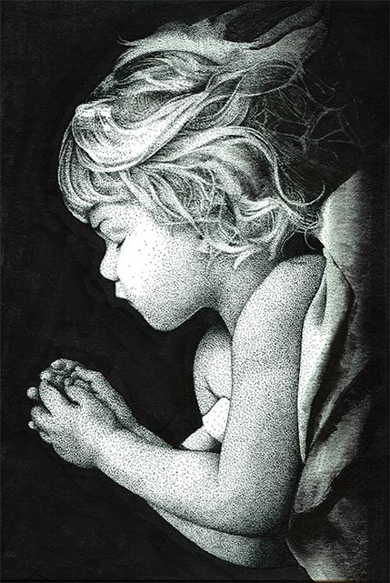
colored pencil, ballpoint, yellow grease pencil, sharpie, prisma marker8.5x11 inch cardstock
(got kind of uninspired on this one. quickly filled in the border to be done with it. might add more to refine it later)
Related content


Comments: 74

This beautiful deviation has been featured in the news article "Fantastique: The Explosive & Extraordinary" --> [link]
If you like the article, and want to promote your deviation, I invite you to fave the article by pressing the 
Have a fantastic day!

👍: 0 ⏩: 1
 (Smile)")


Holy damn. Finally someone doing something cool with colored pencils and markers.
👍: 0 ⏩: 0

The detail is splendtabulous. Reminds me of Penacillin.
👍: 0 ⏩: 0

C'est belle!!!!! (This is beautiful!!)
By the way, when I say things in french, I really and truly mean it!!
👍: 0 ⏩: 0

i really love this! This must have taken you a lot of time I guess.
👍: 0 ⏩: 1

actually this one not as much time as others, maybe worked on it about a week
👍: 0 ⏩: 0

Wow, I loves it, what can I say, you ROCK! 
👍: 0 ⏩: 0

hey, nice job i really like the .. shine to it and the demension is great i also love the colors good job once again its amazing
👍: 0 ⏩: 0

i see stuff like this all the time, i try to trace it down or draw it out, but it never comes of as well as it does here. fucking cool, great use of stuff and whatnot. im just completely blown away and realise i need to surf this place more often.
thanks.
👍: 0 ⏩: 1
thank you.
i don't really see the stuff, i just draw from within, i have this idea that i'm going to draw something really great someday.
👍: 0 ⏩: 0

This is so awesome! The detail just blows me away... I really love your use of color.
👍: 0 ⏩: 1
thanks so much!
nice to hear from you on this one.
👍: 0 ⏩: 0

Great color, detail, and concept. 


👍: 0 ⏩: 1
my head spins drawing this stuff, i might have to try drawing something with some sanity to it someday, eh, maybe not.
👍: 0 ⏩: 0

OMG this is amazing those colors are so powerful and pretty!! nice work man!! really nice

👍: 0 ⏩: 1
thanks for that, glad you think it looks powerful, that's cool.
👍: 0 ⏩: 0

Beautiful! Only one "l" in false, btw. This is a lot brighter than a lot of your recent pieces, yay!
👍: 0 ⏩: 1
i spelled it that way because i started out with fall colors, just trying to be clever.
thanks though.
👍: 0 ⏩: 0

It looks beautiful though, with such warm, rich colors! This time I see a bucket of the most curious seashells known to mankind, probably from that surreal laguna that you once drew.
👍: 0 ⏩: 1
i love yer comments, thanks so much
👍: 0 ⏩: 0


I just wanna say that this piece is great.
But mainly i wanna say that you are a great artist.
The reason why you will always get respect and the compliments you deserve is because you really appreciate the comments on your work.
To me it makes me an even bigger an seeing how you have commented back to everyone who commented on your work.
Really great.
👍: 0 ⏩: 1
i know when i leave a comment it's nice to hear a response, so i just think it's the right thing to do. it's nice to hear you think i'm a great artist, i feel like i still have a long way to go, lots to learn, i'm still teaching myself how to draw i think.
👍: 0 ⏩: 0


I wish I could get into that colorful little messy world to explore it further!
")
👍: 0 ⏩: 0

Egad . Beautifully coloured (I seem to say that about all of your work,but it's true)
👍: 0 ⏩: 1

awesome piece, i like the negative space. maybe you were just uninspired, cause subconciously you thought it was finished? who knows, anyway great composition, negative space is good.
👍: 0 ⏩: 1
thanks man. i never really think of compostion that much, i just get lucky i think.
👍: 0 ⏩: 1
i never think about it either until the end, or when i'm looking at someone elses.
👍: 0 ⏩: 0

you pass off the minimal border as a cop out but i like it. it's tastefully pulled off and makes some nice breathing space.
👍: 0 ⏩: 1

very nice, looks like there is a figure in there or something.
👍: 0 ⏩: 0


this one is still amazing and absolutely beautiful but its not as crisp and clear as some of your other works... but its beautiful
👍: 0 ⏩: 1
thanks!
not as crisp and clear, yeah, i think it's because i was trying to draw faster on this one.
👍: 0 ⏩: 0

 (Wink)")
do you think this one's clean or would be better if cleaner? wasn't sure, i'm kinda slow sometimes.
👍: 0 ⏩: 1

this one is cleaner than others but can be cleaner in my opinion
👍: 0 ⏩: 0

I can see the origins from your other version of fallse start in this- I like what you did with the orange and yellow background. My eye is really drawn to the bottom of the picture where the aquamarine contrasts so nicely with the orange. My only criticizing comment is that I would have put a little more aquamarine and seafoam furthur up in the picture. The purples and shapes make the picture feel a lot different from the bottom.
👍: 0 ⏩: 1
yeah, i see what you mean. when i started this one i had the idea to only use browns and black. the other colors came to me later. so the blue and green was kind of an afterthought. thanks for the tip though, maybe later i can add a little more to the upper half, i think its funny how some of my other peices look different from top to bottom. something to do with the brain i guess.
👍: 0 ⏩: 1
I think it could just be a simple distraction- when I start doing something with no idea what I'm doing they evolve a lot as they progress- and when you look from starting point to finish it's kind of boggling.
👍: 0 ⏩: 0

| Next =>