HOME | DD
 strongstuff — the shining commission

Published: 2009-02-14 02:48:08 +0000 UTC; Views: 36999; Favourites: 1077; Downloads: 0
Redirect to original
Description
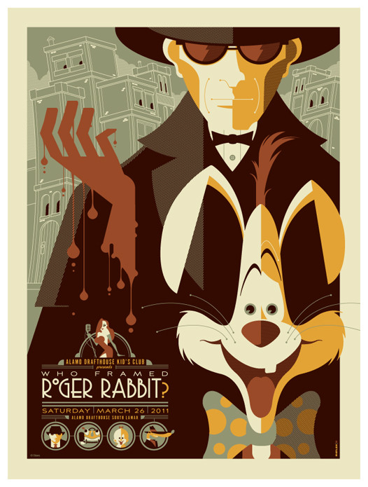
this was for a bloke in the UK who saw my dawn of the dead poster and wanted me to work up something similar for the shining.i initially wanted to have jack's face in the negative space of the door, but i thought it was somehow more menacing with the main focus just on the hatchet and typography.
Related content


Comments: 103

Awesome work, probably my favourite film, if its rereleased, this should be the poster!
👍: 0 ⏩: 0


That is such a great mix of letters and the wooden doors to make a title. This is awesome, man! Excellent! What program did you use?
👍: 0 ⏩: 0


Amazing! I like the lack of a face, actually. It adds to the frighteningly bizarre atmosphere the film has. You never know whats going on or what's going to happen.
Good job!
")
👍: 0 ⏩: 0

genius design, I love how you were able to integrate the major scene from the movie with the creepy twins and the title carved into the door!
👍: 0 ⏩: 0

if this was a poster I'd buy it and mount it on my bedroom wall.
kick-ass, love it.
👍: 0 ⏩: 0

Thats amazing! I love this movie. Jack's face could be on the reflex of the hammer D:
Anyway, nice job!
👍: 0 ⏩: 1


Whoa, this is awesome. I'd love to have this one the cover of my book instead of that dull photomanipulated picture.
👍: 0 ⏩: 0


")

i'd love to oblige, but commissions are one of a kind...once i finish one i won't sell prints of it...
👍: 0 ⏩: 1

TOOOTALLY understandable...dammit!
 (Smile)")
👍: 0 ⏩: 0


I think Jack's face would've been a bit much - it's a staple that we're all familiar with so it's not really needed for something like this ^_^ - I just love the negative spacing for the title - just brilliantly done sir

👍: 0 ⏩: 0


Another awesome picture for another awesome film... Great job again, especially because you have such a great perspective on this one, being off to the side. It adds a lot of depth to the whole thing. This one is bursting with awesomeness.
👍: 0 ⏩: 0


I love the stylized boxes of shapes and scenes of the movie, very clever. Nice idea with the door-text, although it took me a while to find "the" among the splinters. I'm glad you left out the face; although Nickolsen's facial expressions through the movies are great, that face is over-used in about everything Shining-related.
👍: 0 ⏩: 0

This is ace. The film is mint, and this really does it justice. I'd love it if this was the DVD cover.
👍: 0 ⏩: 0

Love this movie! Its nice to see a different take than the 'Here's Johnny' face.
👍: 0 ⏩: 0


Great concept. I love the composition and how you've worked the spaces to spell the logo without it being super obvious. on the same not I like that you've left the face out cause the axe is enough to tell the story.
The strip of blurb at the bottom with the icons is great too.
👍: 0 ⏩: 0

thats really great! are you thinking of doing a print? dan
👍: 0 ⏩: 1
love to, but it's a commission...so it'll be a one-off, never to be printed again.
👍: 0 ⏩: 1
well its a fantastic job! keep it up!
👍: 0 ⏩: 0


I'm sure someone's already compared you to Saul Bass, Tom, but I must say, your work is marvelous and absolutely retro it's glorious. Keep it up.
👍: 0 ⏩: 0

You chose very well. I like the fact that you left his face out. It also subtextually implies that the house is what is the source for the menace.
I LOVE!!!! how you incorporated the maze and the twins. Coool.
👍: 0 ⏩: 0


I half expected you to do another "Friday the 13th", but completely forgot about that when I saw this.
Nice touch with the Eisner-placement letters.
👍: 0 ⏩: 0


If I had a time machine I'd grab you go back to before these were made and make a killing.
👍: 0 ⏩: 0


Very cool! I did a very similar one-sheet comp for the movie "The Strangers" once. It even had one of the masked killer's face in the hole like you mentioned in your comments. I love the little bits at the bottom... very nice touch. Oh! and I just noticed the word 'The' spelled out in splinters.
👍: 0 ⏩: 0
| Next =>