HOME | DD
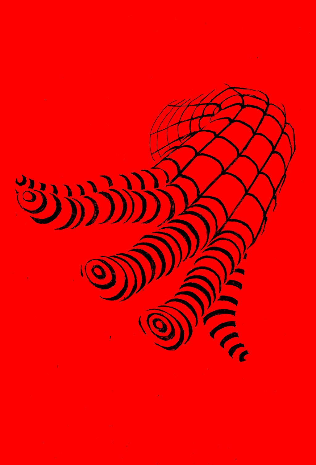
 StudioCombine — Minimal 1
Published: 2013-07-04 22:17:40 +0000 UTC; Views: 2056; Favourites: 96; Downloads: 0
Redirect to original
Description
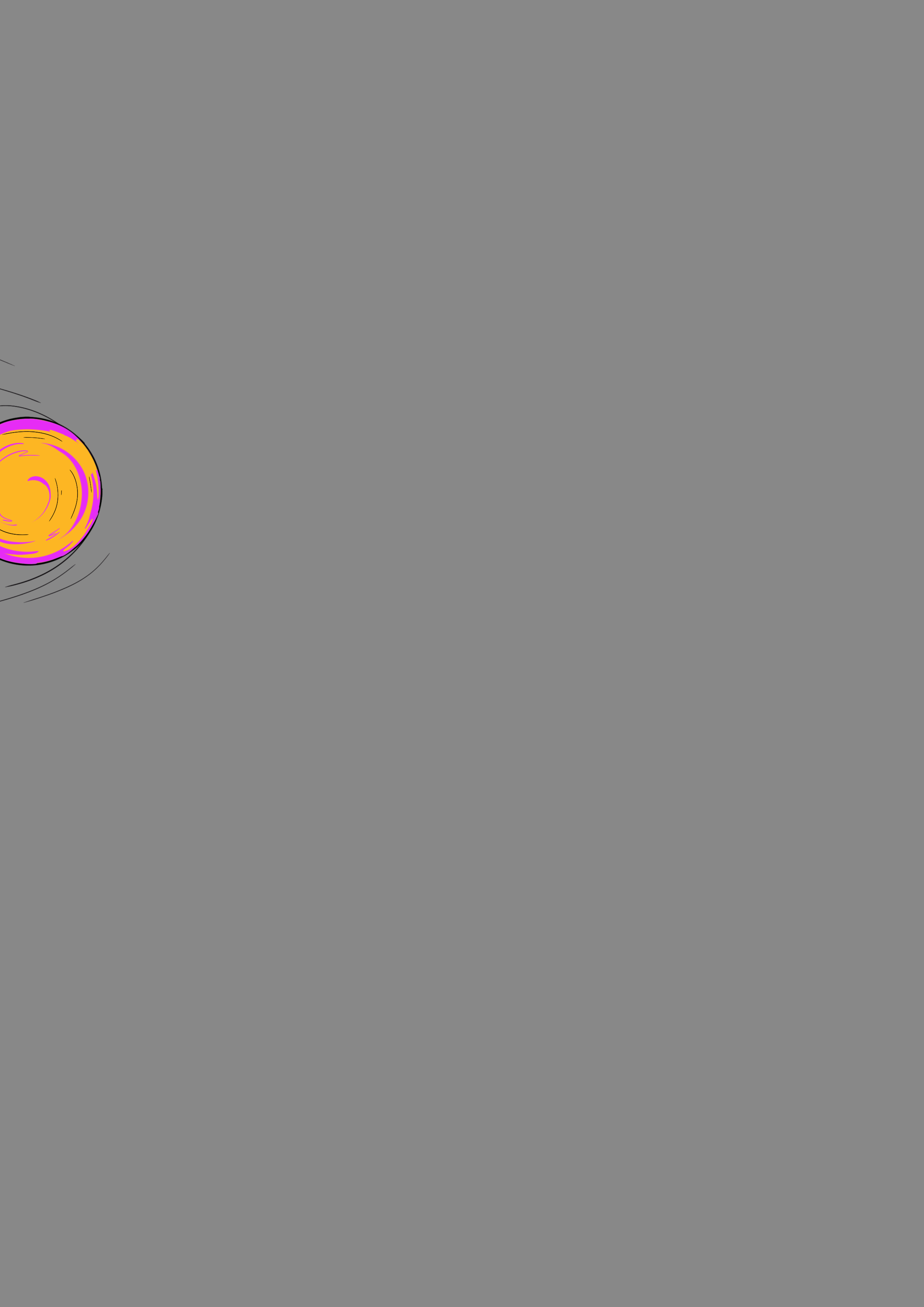
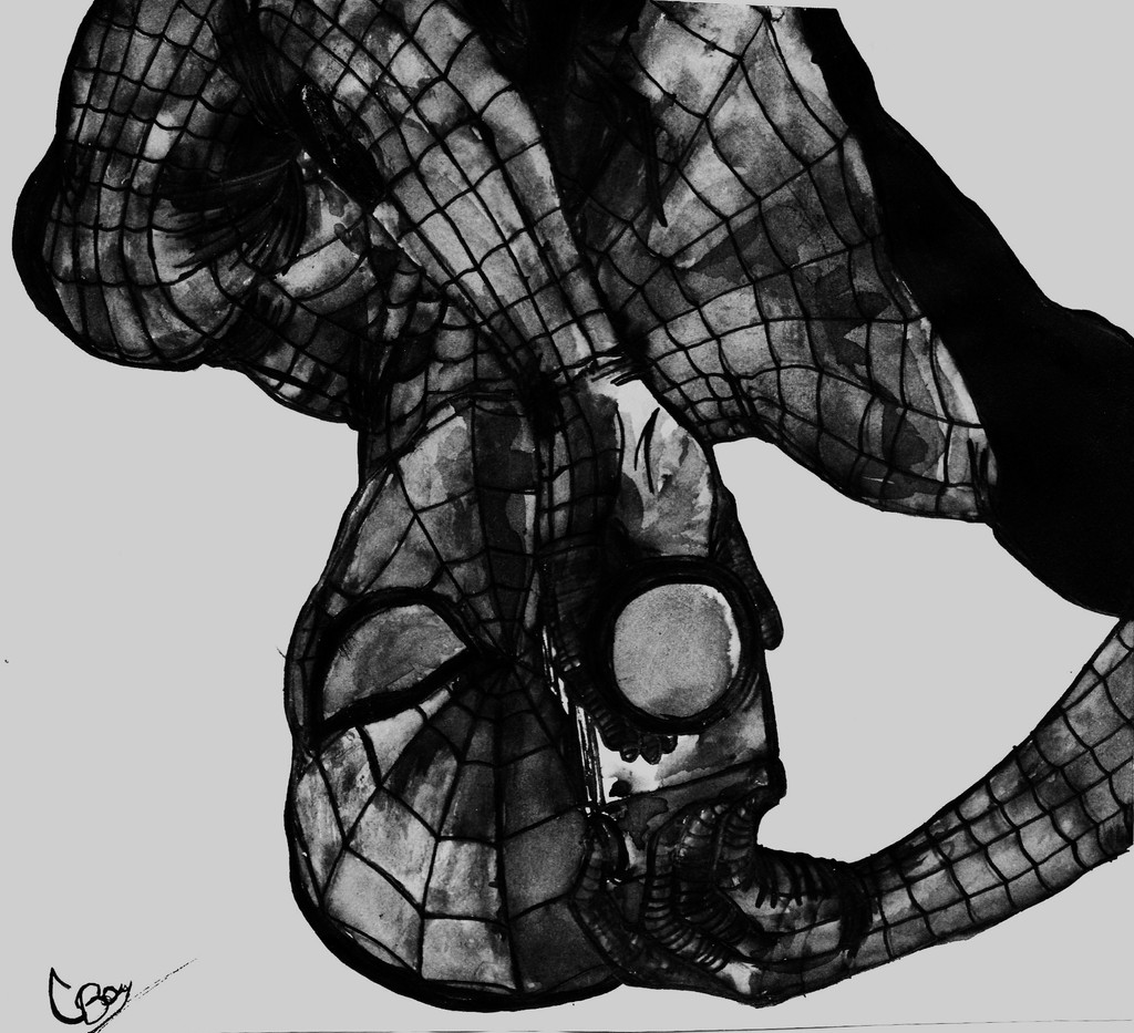
Very much inspired by the work of and , I decided create my own spin on superhero minimalism. I've found minimalism to be great way to look at well-known characters in a new and creative light, by reducing them to their most basic design features.This is what I'm talking about:
Yes it's not very clean. Ideally I would like to do this in vector graphics, but alas, don't know how! This was sketched in pencil, gone over in biro and then manipulated in GIMP.
Related content


Comments: 33


tried to but copyrights prevent it. sorry man.
👍: 0 ⏩: 0


Awesome use of negative space...very creative. So simple it's brilliant!
👍: 0 ⏩: 1
That's exactly what I was going for: creating the figure of the hand using negative space. Yes it is simple and was fun to see it slowly come together.
👍: 0 ⏩: 0

Hey that is very kind of you. I like it too, it is something different for me, and really like the simplicity of it.
👍: 0 ⏩: 0

You've hit on what is for me the crux of my current situation. I've created designs for most of the well-known characters of the Marvel Universe. One can easily and artfully reduce Doc Ock, Thing, Dr. Doom, Wolverine, or Storm to a quickly recognizable shorthand, but the same recognizability doesn't exist for Terrax, The Owl, Bushmaster, or Firestorm. So I grapple with the extent to which my task as a minimalist artist changes when I move on to those lesser known characters. These other characters DO have basic design features, but is simply shaping and presenting those enough?
It's good to have you in the fold.
👍: 0 ⏩: 1
I see your predicament. On some level, minimalsim works on the viewer having prior knowledge of a certain character. The interest factor comes in when that original design information is presented in a novel way. That idea falls apart if the viewer doesn't know 'the original' that has been minimalised. There's basically no frame of reference, so the novel aspect, essentially the artist's input, cannot be appreciated.
Personally, if you feel you've reached this point, it could be a great opportunity to revisit characters. I mean, I've drawn Spider-man loads of times, but the challenge is still there every time, either to explore the character more or just represent them differently.
👍: 0 ⏩: 0
Thanks! I was hoping to get your opinion on this. Still debating whether this is minimal or pop-art, but this is more or less the way I'll be going with these.
👍: 0 ⏩: 1
I'd lean toward calling it pop art, but I don't know that it matters.
Touch and thrilled to be identified as inspiration.
What do you teach? Studio art? Graphic design? Something else?
👍: 0 ⏩: 1
"touched"
(I teach too.)
👍: 0 ⏩: 1
I'm a Biology teacher!
👍: 0 ⏩: 0
Thanks. Was actually considering doing Deadpool next.
👍: 0 ⏩: 1

!!! Wow That would be awesome !
👍: 0 ⏩: 0

Very cool man. Instantly recognisable while nailing the minimilistic look (did I spell that right ")
👍: 0 ⏩: 1
Thanks. I am so looking forward to doing more of these. And the spelling is close enough! (Couldn't help it, I'm a teacher!)
👍: 0 ⏩: 1
Cool man, I'll keep an eye out for more then. I knew I'd bugger that one up, I'm usually a bit of a spelling and grammar nazi myself usually
")
👍: 0 ⏩: 1
My pet peeve is the proper use of apostrophe's.
👍: 0 ⏩: 1
Haha. I'm more against the incorrect use of they're, there and their or your and you're.
I won't whinge too much though as I know I am far from perfect.

👍: 0 ⏩: 1
snap! but I think I'm in danger of exposing myself as a snob....
👍: 0 ⏩: 1
I was going to wait until the first Ashes test was over before I started calling you names mate
👍: 0 ⏩: 1
Haha! Ok but i hope it's worth the wait? It is currently poised nicely...
👍: 0 ⏩: 1
Maybe after the 2nd test then...

👍: 0 ⏩: 1
 (Smile)")
👍: 0 ⏩: 1
I think I might be mate, Aussie cricket is a shambles at the moment
")
👍: 0 ⏩: 1
it's a shame to be honest. this doesn't feel like the huge event it should be.
👍: 0 ⏩: 1
Spot on mate, we had given up any chance of winning well before the team had flown over
👍: 0 ⏩: 0