HOME | DD
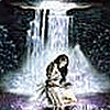
 Stygma — Quiet time
Published: 2013-01-28 04:37:30 +0000 UTC; Views: 4094; Favourites: 187; Downloads: 46
Redirect to original
Description
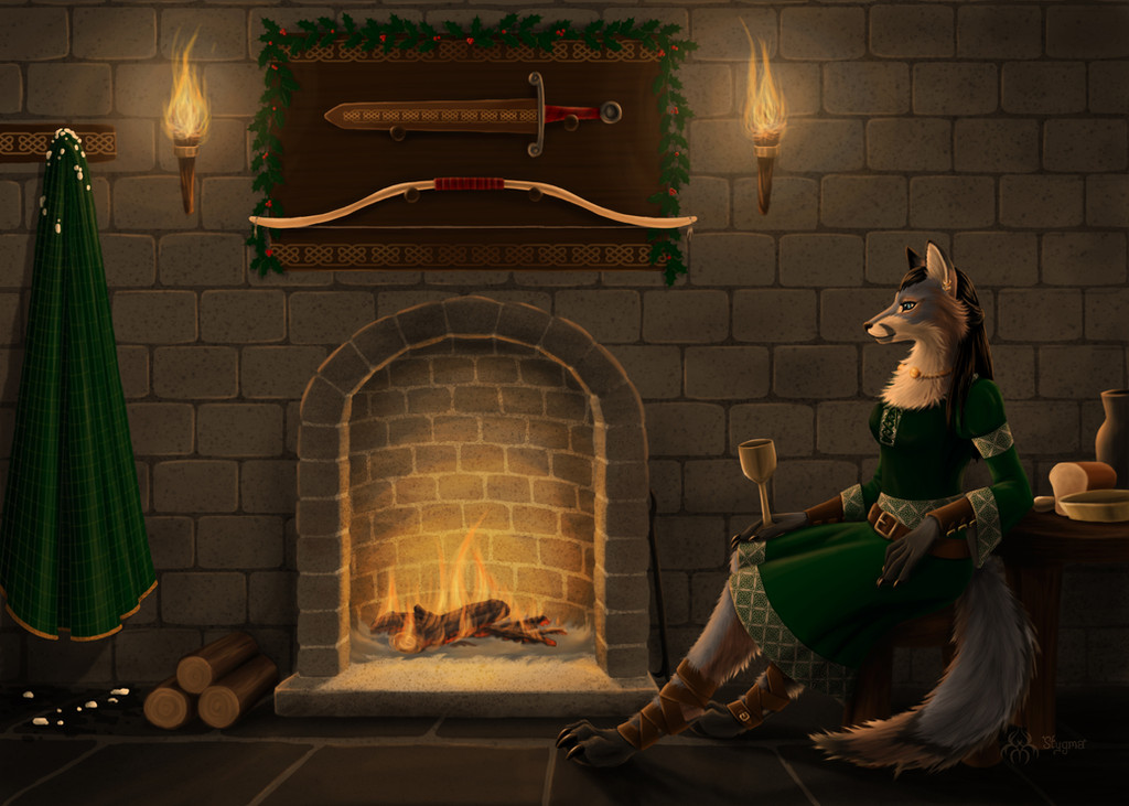
This is for *AlcyoneSong , for the #Anthro-Fantasy-club exchange.
It's Yule time and Marwynn is having a quiet time by the fire. Maybe she's waiting for a special someone or just cooling down (or warming up) before the big party.
*AlcyoneSong made my character Blackbones! I love it! So much details! And I like how wolfy he looks!
Credits and stuff:
Photophop CS5 / Wacom Intuos 4 / About 40 hours
Brushes used:
Painting - [link] by ~yumedust
Painting - [link] by *AlectorFencer
Holly - [link] by *Tempestazure
Celtic symbols - [link] by ~redheadstock
Rock texture (I used stars... lol!) - [link] by ~KeepWaiting
Special thank you to *francis-john for this tutorial: [link]
And now that I'm done with all the official stuff...
OMG! Would you look at that!!!! It's the best time I've ever painted! How is it ever possible!!!! SQUEEEEE!

Character © *AlcyoneSong
Art © =Stygma
Related content


Comments: 85

Thank you for your comments!
Yes, there's an unseen source of light behind the Marwynn. I was hoping to give the feeling the room was much bigger, but I totally lack the knowledge about composition. As for depth, I'm working now a new version with minor touch up. It seems that more contrast make the artwork less flat.
Flat is one of my main problem  (Smile)")
Thank you so much for your comments. They will help me pinpoint my problems and search for more tutorial to help me improve!
👍: 0 ⏩: 1

Well I'm glad I was able to help, I can't wait to see version 2

👍: 0 ⏩: 1
I won't be able to fix the composition, but at least the contrast and some details!
👍: 0 ⏩: 1
If you at least pull the wall back a bit, so the floor looks deeper, that should help a little
👍: 0 ⏩: 0


Originality
Your work is wonderful I wish I could do something as good as this. I love your style the colors especialy the shading. You seem to be pationate about anthro/furry artwork. You put 40 hours into this I mean wow but it was all worth it because you have a wonderful masterpeice in your gallery I hope you keep on making this wonderful artwork. (Since this isnt enough words going to put random words at the bottom of this)
Love,
StarBurst-Arts <3 e.deviantart.net/emoticons/b/b… " width="15" height="15" alt="
")
(random words aa a aa a a a a a a a a a a a a a a )
👍: 0 ⏩: 2
Thank you so much for your critique!
👍: 0 ⏩: 0
You are very welcome
👍: 0 ⏩: 0


Love your enthusiasm. This is indeed a great art work. I love the peacefulness of the overall background, and the character sitting comfortably awaiting for something
special or just having a relax moment of rest. The color green is often associated with the sentiment of growth and healing, while the color brown is often associated with the sentiment of being down to earth. And the color grey is often associated with the sentiment of being solid. I love the display of the sword and bow on the wall, which may suggest she is probably a huntress or awaiting someone special who happens to be the owner of that room, and is probably in for a pleasant surprise.
The gentle look of her blue eyes and expression, shares a welcoming warmth about her. Even the softness of the fire seems to express that gentleness.
I like how there is evidence of snow on the coat she was wearing, which shares a brief background story to this pic. I can almost imagine the sound of
cackling fire in the background. Overall a very heartwarming art work nicely done.
I happen to have this gift for interpretation. In which I can read art like a driver can read a stop sign. XD I discovered this gift back when I first joined DA in mid
commentary and decided to combine it with my writing skills to help support my fellow artist here. It's allot of fun and a great way to connect with artist on a deep and artistic level. I learn allot of cool things through interpretation, and also learn much of myself in how the art makes me feel. Anthros are very fascinating creatures, that are fun to draw. The imagery of animals really brings out a powerful personality of a character in the most interesting ways imaginable. The genre of fantasy have always been one of my favorites, next to science fiction, and is like a gateway to endless possibilities. All of this I've learned from studying and interpreting art works, and it has been educational, inspiring, enlightening and thought provoking. Which also reminds me of one way that art could best be defined, and that is that art is simply, provocative. More intimately, art speaks a very powerful and visual language that words could hardly express, and shares a story, history, emotions, concepts, and perspective of the artist in ways that would not be normally perceived any other way.
...Oh hey! I found more visual elements here cool! Delving even deeper, I noticed the geometric patterns of diamond shapes on her dress. I get this sense of wisdom and experience from this. As though the interlocking of the pattern is like an interwoven build of piecing things together, which may suggest that she is a deep thinker. Quiet time is a great opportunity to reflect on things. Now I look to the patterns on the wall mounts and that on the coat, then I look to the walls and floor itself. And though it's all part of the medieval setting there is also an unconscious awareness of foundation. The word foundation seems to be written all over somehow, and it's from a solid foundation that anything built can surely last. Hence I now look back to the grey color of her fur and the white. The grey being of a solid sentiment and the white as a great compliment of softness. There is also a pattern on the sheath of the sword that shares that similarity as well. I think it's pretty deep, because it visually shares that sense of fortitude, built from a solid foundation. And that pretty much concludes my interpretation. Awesome! I had fun with this one. ^^
Well hope you enjoyed the read. Soft classical music is pretty well suited for the process of this art work, I can imagine. Music is a great source of artistic motivation.
👍: 0 ⏩: 1
When I draw someone else's character, I let the character tell me a story and I try - like all artists must do - to paint the feelings. I also made some research for this one since it was very specific about the era and place. I really put a lot of effort in this painting. I don't usually have this kind of time. And I don't always have a strong connection with characters like I had with this one.
Thank you for your well thought comment. I appreciate a lot!
👍: 0 ⏩: 1
Your very welcome. ^^
Having enough time to put into drawing is indeed very challenging, since
we're living in a world that is so demanding of our time and energy. As
an artist myself, it can be rather frustrating. XD
I mean one can only imagine how much more can be accomplish if only we
had that liberty to invest in our passion. I wish I was just as consistent with
making art. I could barely get several sketch work done. XD
But, one day it will be made possible. We all have to find what works best for us. I guess. ^^
👍: 0 ⏩: 1

Gah this piece is really wonderful - such a sense of atmosphere! I can just hear the fire crackling and feel the warmth.
👍: 0 ⏩: 1

This is absolutely gorgeous! I love the fur detail! ♥
It's so much better than mine! I hope I can learn from you ; v ;
My best attempt xD : ( )
Do you have any speedpaints of this style that I can observe from afar? x'D
👍: 0 ⏩: 1
Haha! No! I don't have any videos!
I've learned a lot watching sugarpoultry 's live stream. Here is one of her video: www.youtube.com/watch?v=tHphxM…
Fur needs a lot of patience. I don't do art like Quiet Time very often but it needs a lot of free time which I don't often have!

👍: 0 ⏩: 1
Thank you! And thank you for the llama! ♥
👍: 0 ⏩: 0

this is so pretty, I love the delicateness of her fur! perfect blend of wolf and animal anatomy too, not to mention the expression is great! nice work!
👍: 0 ⏩: 1
Thank you! I don't often have time for such detailed art. Hopefully, it get easier with more practice!

👍: 0 ⏩: 1
You're welcome! I'm sure that it does get easier after a while, and you learn so much that way!
👍: 0 ⏩: 0


Commented to grant your wish!
I love the contrast of light and shadow.You use the heck out of a limited color palette and she looks lovely in her dress. The dress itself is very beautiful,well detailed,accurate,and has very real looking wrinkles and folds.I love the Celtic motif and feel.Nice job on the little details such as the holly and logs.Some elements could be integrated better,for example the flames and snow do not fit with the rest of the picture but this is truly a quality piece!
👍: 0 ⏩: 1
Thank you! Your comments are highly appreciated!

👍: 0 ⏩: 1
Very welcome,I love comments too
👍: 0 ⏩: 0
You are one multi-talented artist, and I love that about you!

👍: 0 ⏩: 1

I saw you had wished for more critiques at #dAWishingWell . So I am hoping to share some much needed love.
This piece looks straight out of a professional story book. The lighting is wonderful and your eye moves continuously around the piece. Excellent job.
👍: 0 ⏩: 1

((Critique to help fullfill your wish from #dAWishingWell ))
I really like the atmosphere of the piece, its very cosy and warm. Marwynn looks very regal as well. I like the pattern on her dress and the fur, it looks very soft and welcoming! Also the background is nice, simple, but at the same time, tells a story!
I think you can improve on Marwynn's dress. By that I mean only the folding. I'd suggest a bit more wrinkling on the sleeves, stomach and a bit on the skirt. The piece where the weapons are hanging looks a bit flat, but could be fixed by adding more shadow.
Other than that, I really like the warmth of the artwork. ^u^ Hope I helped~
👍: 0 ⏩: 1
Thank you! Every comment is helpful! I'm glad you took the time to comment my work!

👍: 0 ⏩: 1

Hi there! I saw you had wished for more critiques at #dAWishingWell , so I hope this helps!
First off, you did an absolutely amazing job on this artwork! The colors work extremely well together to create a peaceful and comfortable mood that definitely fits with the title. The details are exquisite and you did a fantastic job making this look realistic.
Apart from the lighting (since =wondering-souls has already addressed that), I think that one thing you could change is the fire. Although the paleness of the fire works well with the color scheme in the rest of the painting, I'd say that it makes the fire look a tad unrealistic. Because it is quite pale (especially in the torches) the fire looks too faint and transparent. Fire is typically more saturated in color with brighter oranges and yellows, and I'd also say that the flames could be more "crisp" or defined (some examples: [link] ).
Another thing I noticed was that the bow above the fireplace is as bright as the flames, making it seem as though it were giving off its own light. I'm not sure if it was intended to be super shiny, but I think even then you might want to tone it down just a little.
Overall, however, you did a superb job on this painting! 

👍: 0 ⏩: 2
The bow is ivory white and polished, but I can see what your mean.
👍: 0 ⏩: 0


Hey there,
I saw you wanted a critique on #dAWishingWell so I came over here to try and help!
To start off, I love the concept. It's a nice quiet and serene scene. You can almost hear the fire crackling. You have some good color choices and things seem painted very well.
What stands out to me is the lack of varying tones. Things are all mostly mid-tone with no contrast. To see what I mean, take the image and make it black and white. You'll see that everything sort of blends together and nothing really stands out. You have potential for a really contrasty scene with the limited illumination of the flames. You have the fire in the fireplace far back in the semi-circle, not a lot of light would escape. I suggest taking a look at some photos of people around fire pits/fireplaces. Very little is actually lit up, this leaves room for a lot of contrast and harsh shadows.
Keep in mind that the main figure is blocking the things behind it from the light. Those things would be much darker compared to her.
Don't be afraid to vary your color values as well. Shadows are not pure black. You have the warm highlights down which is great, but think of adding in some cool shadows (blues, purples, etc.).
I see you have some of the yellow/orange of the flame reflected onto the things around it and that's great! Not everyone remembers those little details.
Overall the picture is very well done. I love the tiny details and the mood. Great job!
👍: 0 ⏩: 1
Thank you! Actually, there's an unseen source of light behind the character (the thing we must not do! Haha!) but you're right, seeing others art, I see I lack contrast in many of my drawings. I do play sometimes with colored shadows, but more with my cartoon style. I'm still learning about Photoshop and digital techniques.
Thanks a lot for your feedback. It's very useful!
👍: 0 ⏩: 1
You're very welcome
Nevertheless, best of luck with future works! Glad I could help
👍: 0 ⏩: 1
I played a bit with contrasts and add some shadows to the food. It seems to bring a bit more depth in the drawing. If you want, you can see the result here [link]
👍: 0 ⏩: 1
It's definitely an improvement
👍: 0 ⏩: 1


| Next =>