HOME | DD
 styj — Missing Meanings 1
Published: 2012-01-15 00:08:23 +0000 UTC; Views: 884; Favourites: 16; Downloads: 0
Redirect to original
Description
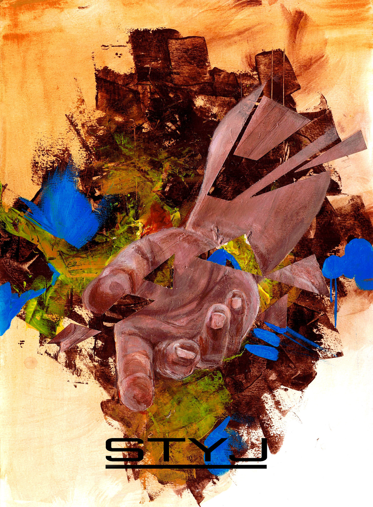
This was a REALLY fast piece just so you guys know. The hand's proportions are kinda poor just because i've been pretty busy with school lately and couldn't spend a lot of time on this.Anyways, so i was at portfolio day where a judge told me all my art works lacked a lot of meaning and were too boring. He claimed i was all based around technical skills and i should do more abstract art and try harder to connect with my audience....SOOOoooo ever since that i've been trying to do some more abstract work! but i don't really wanna be a complete sell out so...i still tried to mix in a bit of some stuff i would usually paint.
Okay this is acrylic paint on tabloid size water color paper. Took about 4 hours. The theme was kinda hard. Hope you guys like this favorite, comment, watch, give me feedback. thank you!
 (Smile)")
btw this is just the first one, i'm thinking to do a few and possibly a series of these so stick around!
Related content


Comments: 14

I'm here on behalf of :iconSelfTaughtArtist because your piece was in the group's critique requested folder.
Your stroke work is very nice, I like the roughness. I like the stark contrast of the blue you put in this piece. I wish you could have achieved the same effect with the hand, as well. The hand gets a little lost, i.e. earth tones on earth tones. If it were a complimentary color, I think it would pop out better. For example, in your piece [link] the primary color is a cool blue, but you put in warm red tones in the face, which creates more contrast.
As for what that judge told you, how your work "lacks meaning" and you "should do more abstract art and try harder to connect with your audience", I disagree. I'm no expert in art or an art judge, but all art isn't abstract and if you don't want to focus in abstraction then you shouldn't have to. I guess I don't understand what he meant, what's wrong with basing art on technical skills? Take the artist Chuck Close for example. Talk about technical skills. From what I've seen in your gallery, you've got a firm grasp on realism and technical art. I wouldn't pass up on that just yet.
👍: 0 ⏩: 1
edit: that link was wrong - it's supposed to be to this piece: [link]
👍: 0 ⏩: 1

wow that is very good advice! thank you so much. That's exactly what this piece was missing, complimentary colors in the hand. I didn't even notice that, but yea, it would make it look so much better! And wow, funny how you brought up Chuck Close, i am recently working on a self-portrait inspired by him! It's gigantic so...it's taking me a long time. Anyways thanks a lot for the advice/critique, and comments. Much appreciated!
👍: 0 ⏩: 1
No problem, can't wait to see the Chuck Close inspired portrait.
👍: 0 ⏩: 0

wow bro that is fuckin great!!! much respect for this work
 (Wink)")
👍: 0 ⏩: 1


