HOME | DD
 Subdesigned —
Why Not?
Subdesigned —
Why Not?

Published: 2011-03-04 23:01:26 +0000 UTC; Views: 14293; Favourites: 341; Downloads: 8
Redirect to original
Description
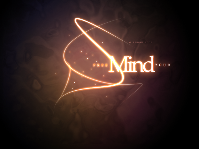
Stock bought from iStockphotoThis work has been featured in Advanced Photoshop .nl issue 33
")
Related content


Comments: 61


Nice image!
But what was the AE for? Couldn't you do it just as easily right in PS?
👍: 0 ⏩: 0


Congrats on the DD! I really like the effect, very stunning
 (Smile)")
👍: 0 ⏩: 0

Same here. I was confused at first O.o
👍: 0 ⏩: 0


He might not have been inspired by that.
👍: 0 ⏩: 0

Brilliant work this is. I too, love the blinding effect. It made me blink several times so that I could read the letters. What I also love is how the colors behind the words highlight it.
Awesome job. So now I'll have to take a look in your gallery.
👍: 0 ⏩: 0


reminds me when Alaztor talks at the opening from Shakugan no Shana xD
[link]
👍: 0 ⏩: 0


The question, I suppose, being "why space your letters like that?" Clever, I like it.
👍: 0 ⏩: 0


Very pretty.
There's a bar near where I live that's called "Why not?"
Haha, sorry for that random fact, just popped into my mind when I saw that pic.
Really nice, btw.
👍: 0 ⏩: 0

lovely it makes me think of glowing jelly fishes in the ocean
👍: 0 ⏩: 0


This is awesome ")
👍: 0 ⏩: 0


This just looks really really cool. I want to stretch out and touch it, or go closer to look, or SOMETHING! xD It just looks so real.
👍: 0 ⏩: 1


it took me forever to read it, I was retarded for some reason but now I love it! XD
👍: 0 ⏩: 1


Looks almost 3D-ish because of the light red blue colors on the letters. Nice job 
👍: 0 ⏩: 0


| Next =>