HOME | DD
 submicron — Module Logo preview

Published: 2013-12-28 03:20:31 +0000 UTC; Views: 2853; Favourites: 13; Downloads: 70
Redirect to original
Description
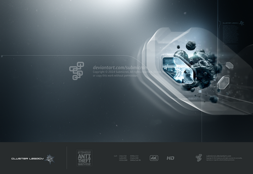
My personal logo. This logotype will replace my old logo which am hoping it will represent me in these ever changing times.
Related content
Comments: 25

That is very nice. Clean, techy, and not to cold feeling. Re: the profile image seen on your profile page..that is one of the most awesome pieces of art I have ever seen...anywhere. And it's amazing you can go from that, to this 
👍: 0 ⏩: 1

Oh, thanks. No one comments on graphic design anymore. You know that profile artwok started as a simple experimental design many years ago. Something about water that mesmerizes me.
Anyways, am almost done with an artwork I started 6 months ago so stay tume for that.
👍: 0 ⏩: 0

It seems very elegant and gives the feeling of great company. I like it alot.
👍: 0 ⏩: 1

Oh, thank you. You know that logo is being in my gallery for a few years now but all the sudden it appeared as if I just submitted it. DA sometimes. xD
👍: 0 ⏩: 1

You're welcome!. Well, they say it's never too late if happiness is good.
👍: 0 ⏩: 1

Very nice one! about the standards, they are made to be broken sometimes. nice catch Fernando
👍: 0 ⏩: 1

.. BUT the business card layout could use some help, as the spacing looks a little poorly thought out
👍: 0 ⏩: 1

You mean the spacing on each side? Well, I didn't want to center or have equal spacing throughout. But I guess if you follow a disciplinary standard approach then perhaps it may look a bit odd. Anyways, you should check out the spacing on the logo and letterhead design books I have. You'll flip out on those criterias. xD Anyways, thanks for your thoughts.
👍: 0 ⏩: 1

hahaha .. it's all good man, I only meant it lacked balance, i'm self taught mate .. no traditional anything with me
👍: 0 ⏩: 1

LOL. I actually went to a private college for 4 years to learn but the rest like you is self taught as well. What I've learn these past 23 years in graphic design is that its very subjective like any art form. In the end is the beholder who makes the final judgement. Though I take into account trends and such which I follow none. And yes, in many ways am traditional but I also experiment a lot with what's in front of me.
👍: 0 ⏩: 1

sounds great
.. me I just learned by bashing keys until something cool and creative appeared
👍: 0 ⏩: 1

Damn, man! LOL. That was funny at least you managed put a smile on my face. xD Happy New Year my friend.
👍: 0 ⏩: 0


