HOME | DD
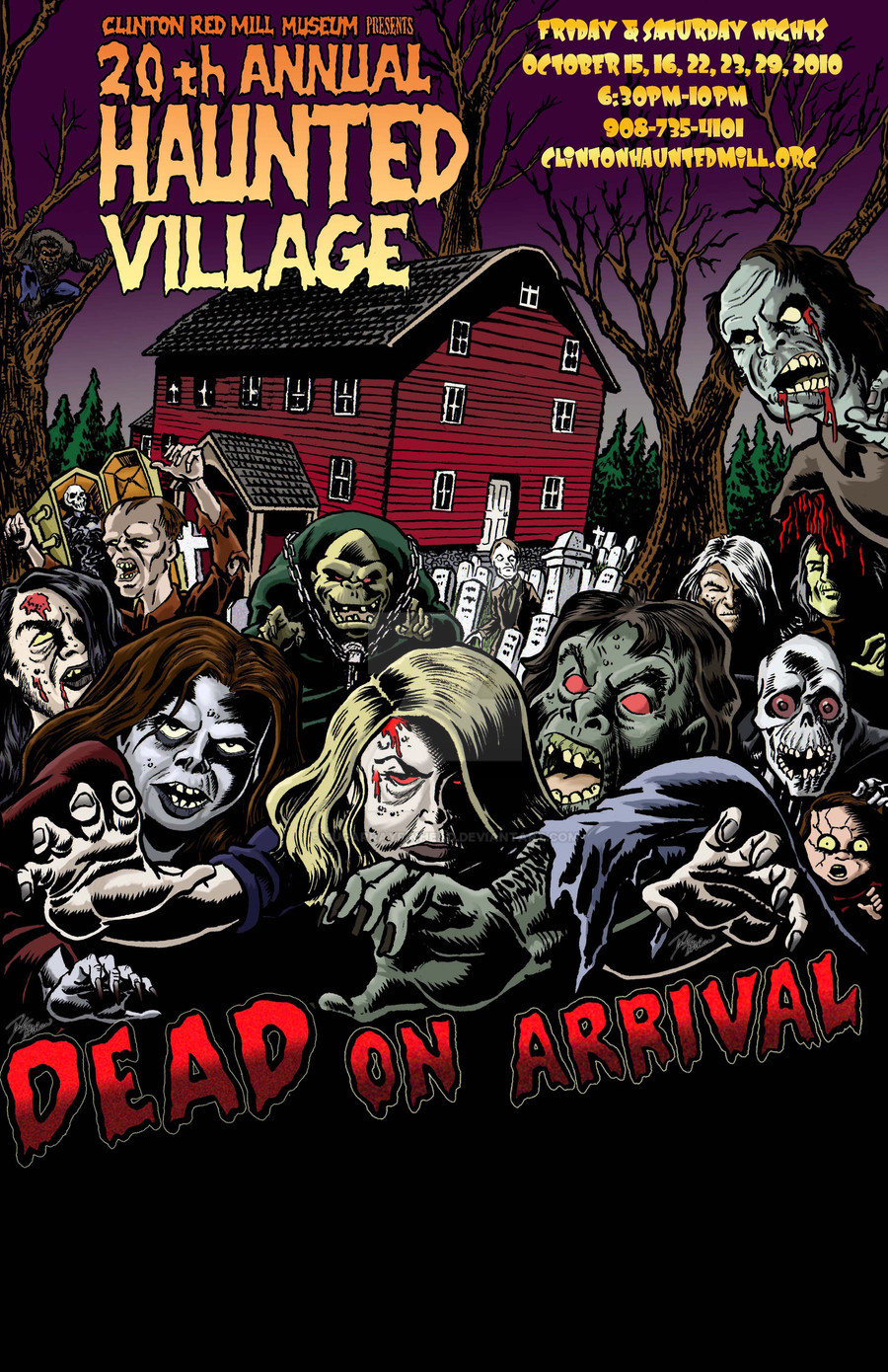
 sugarrayfinhead — Haunted Village 2010

Published: 2010-08-31 23:07:58 +0000 UTC; Views: 584; Favourites: 6; Downloads: 0
Redirect to original
Description
Here's my latest Haunted Mill Poster....minus the bottom 1/4 with names of sponsors. I will repost this when the sponsors are known. This piece was done with india ink, dip pen, brush and photoshop colors. If you like this image, there are three more Haunted Village Posters within my gallery.Doug Baron 8-31-10
Related content
Comments: 10

critiquing Doug Baron? Thats like telling Derek Jeter how to play baseball. Just kidding man...Where can I nab one of these?
👍: 0 ⏩: 1

I'll let you know how to nab one as soon as they are printed! Thank you for asking. As far as the lettering goes...I hand lettered the 20th Annual Haunted Village part...the rest are from Illustrator.
👍: 0 ⏩: 0

Give me a second critique when you're sober!
👍: 0 ⏩: 0

Love it, man! Very cool and freaky fun!
One gripe: The information up there in the upper right is very hard to read. Maybe it's just my monitor or something, but I gotta get up close and squint to read it.
Maybe a brighter outline around the letters? Maybe make the very minor glow around the letters brighter, and maybe something like a sickly green? I dunno, just spitballin'.
Otherwise, totally awesome!
👍: 0 ⏩: 2

I took your advice and changed the font. Thanks.
👍: 0 ⏩: 1

BADASS. Think it works better, but then, I'm biased.
👍: 0 ⏩: 0

On second thought, I think it's because the secondary color of the letters, the lower half of them, is the same purplish as the background sky. Remedy that, and I think the legibility increases a lot.
👍: 0 ⏩: 0

awesome doug. This is such a cool gig that you've got going.
👍: 0 ⏩: 0


