HOME | DD
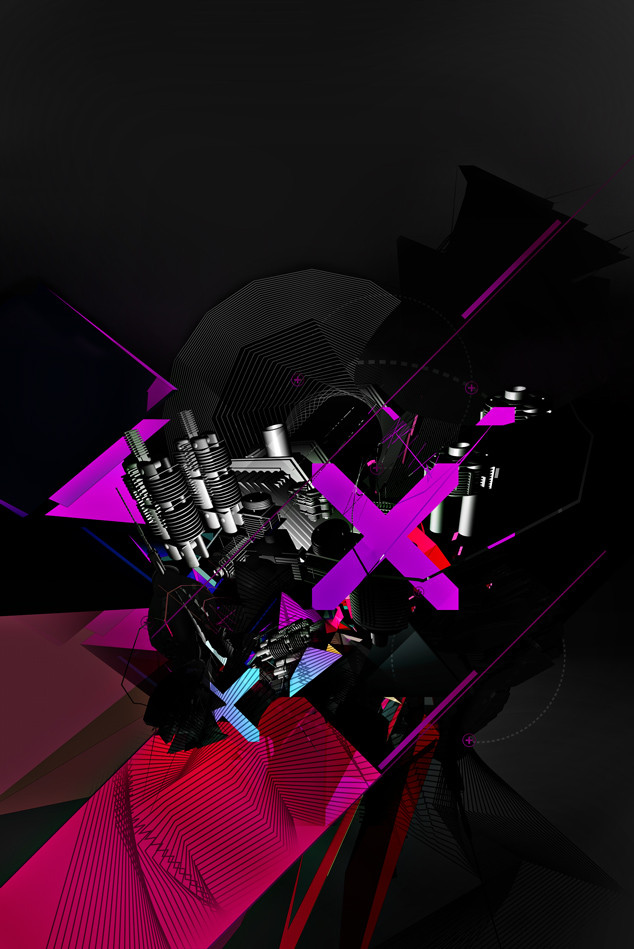
 sugarstack — Dope Train

Published: 2007-01-05 14:36:29 +0000 UTC; Views: 1924; Favourites: 54; Downloads: 0
Redirect to original
Description
Was making some Nigel Dennis inspired bright clean cutesy art, then decided to make it gloomy instead; bright clean and cutesy just isn't me (Wink)") .
. I think it's quite a bit different from the stuff i've been recently doing =]. Do you peeps like it?
stock from sxc.hu, apocryph and redheadstock.
Related content


Comments: 23

yeah i like the colors
but kinda strange style :]
good job anyways
👍: 0 ⏩: 0

the gloomyness definately works here
... there's a face in the middle!!
")
👍: 0 ⏩: 0


excuse the language, but this is fucking awesome bro. i think it'd be better with a light adjustment however  (Smile)")
👍: 0 ⏩: 0


very nice, awesome how chaotic but on the other side good composed ur work is.
👍: 0 ⏩: 0

one of my favorites from you so far, it's so different too. Love the grit feel to this.
👍: 0 ⏩: 0


now its a mix of bright and gloom

👍: 0 ⏩: 0


Nice one mate, one of my favs from you!...Maybe some typo wouldnt hurt?
👍: 0 ⏩: 1

Sadly, I suck at typography =/.
👍: 0 ⏩: 1