HOME | DD
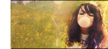
 sugarstack — Satur II

Published: 2006-09-12 21:43:51 +0000 UTC; Views: 796; Favourites: 22; Downloads: 13
Redirect to original
Description
My fucking pc crashed when I made this, all I could get was a screenshot of the original piece. Bleh.Re-realizing my previous satur concept. More thought was put into this in regards to, well, everything. Out goes the oversharpening, crappy background, unrealistic clouds, difference looking crappy in a ton o places, a million boxes covering up the picture and random messy grunge crap. i even rewrote the sugarstack text, lol.
Do you guys like this new version?
peace,
Matt
Related content


Comments: 8


 (Wink)")

Yo man i like this, and i still have the full size you sent me of this for that magazine thing. If you want it holla!
Much love
👍: 0 ⏩: 1

wow that was a longass time ago, what happened to that mag?
👍: 0 ⏩: 0

Hheheh by accident I had my two tabs open at the same scroll length... You didn't rewrite "Sugerstack"
Anyways, I do like the 2nd version, I would prefer some clouds and have around the same sharpen on the photo and text. Not so much the beizers and boxes, if at all.
Overall I think, yes, it is better but I would like to see some of v1 incorporated back into the remake.
")
👍: 0 ⏩: 1
crap, I must've been using the wrong layer when my pc crashed =/
👍: 0 ⏩: 1
Oh noes! And I thought you were ditching extra work ")
Maybe re-work v1 again into.... <_< ... >_> V3!!!

👍: 0 ⏩: 0

dont know quality is better yes. but it feels there is something missing. its a bit empty.. and the original flows better I think.
👍: 0 ⏩: 0