HOME | DD
 sulfar — Bane

Published: 2005-06-17 18:15:44 +0000 UTC; Views: 4096; Favourites: 24; Downloads: 54
Redirect to original
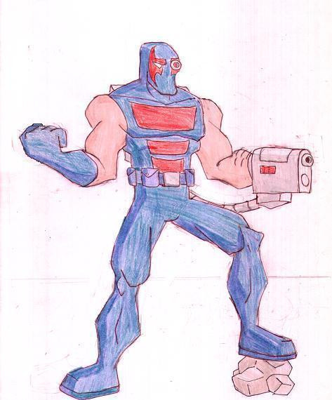
Description
I know I know... this is not how the actual Bane looks like...but its my version of Bane...Bane is one of those underrated villians in Batman comix...and so I thought I should put some spotlight on this guy...
and lets face it...not only the superheroes but the supervillians of the Batman series are quite cool...
EDIT: wanted to work on it li'l bit more...so I added some dark shades to it...hope I did 'em right
The earlier version has been moved in the scraps...You can check it out here [link]
Related content


Comments: 23


No wonder he broke Batman's back. Once again, I love it.
👍: 0 ⏩: 1

thanks...yeah he is pretty damn powerful...glad you liked it
👍: 0 ⏩: 1
hahaha...aite then...thanks for lovin it
")
👍: 0 ⏩: 0

Really nice shading work! I like the shading and muscle tone on the arms.
👍: 0 ⏩: 1
thanks...bane was a little tough to draw cause im not used to draw bulky bodies...
👍: 0 ⏩: 1
Welcome, yeah never attempted him myself. Yeah the muscles can be tough. Muscle magazines like Muscle and Fitness help. They give you a good look at the muscle tone. But I really like how it came out.
👍: 0 ⏩: 1
i'll check those mags now that you mention it...thanks
 (Smile)")
👍: 0 ⏩: 1
Oh your welcome, helps me a bit. I need to really do more of it. They do help, a lot of the comic drawing books mention that one these days.
👍: 0 ⏩: 0

A little to common thug looking for my tastes. Bane has always seemed deserving of a supervillainish look, in my opinion, be as he's nearly Batman's equal.
👍: 0 ⏩: 1
tru3...i think bane deserves more respect as a villian...i mean he is powerful and his attitude is cool too
👍: 0 ⏩: 0


thanks...i wanted to keep it simple...not too comic
👍: 0 ⏩: 1

great design, this looks better than most of the official ones!!
👍: 0 ⏩: 1
the official one is way too bulky and his figure is all distorted...I didn't want at all to make this dude to look like a cartoon so I gave him a more original look...
👍: 0 ⏩: 1

I think this is a good piece except you could use a little more contrast on the jeans area
👍: 0 ⏩: 1
yeah...you're right...I could go with some contrast but I'm already sick of this work...I've invested way too much of my time on it and I definitely don't feel like touching it again..grrrrrr
but don't worry...I'll definitely use your advice in my upcoming works
👍: 0 ⏩: 1
I know exactly how you feel lol
👍: 0 ⏩: 0
