HOME | DD
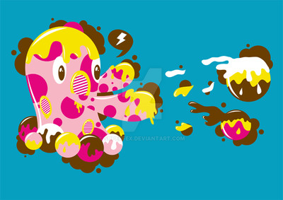
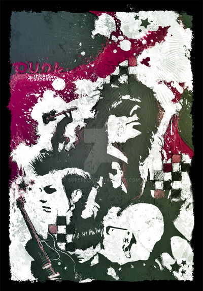
 SuperFex — WeatherGirl

Published: 2007-07-12 15:32:51 +0000 UTC; Views: 6258; Favourites: 117; Downloads: 0
Redirect to original
Description
Ok i did this for a art pack submission but im not entirely happy with it so ive put it up on here for your thoughtsCC is appreciated
Thankyou
For the ref image
[link]
Related content


Comments: 109


Congrats!!!
I've featured this creation in my July 2007 Visual Art Feature.
Check it here : [link]
This feature is also in the news so more views for you!!!
(fave the news article to get more expozure! [link] ).
Please check it to view other's art!
--
- Yellow Love Story Contest (based on Alice in Wonderland) : [link]

👍: 0 ⏩: 1

hmm well i would say that is damn cool but im not actually there :\
👍: 0 ⏩: 1
Yep because if you look at the journal title you'll see that i gave you the JUNe link and not the JULY's.. groumph°°°
[link]
If not yet done you can fave the news article to give more exposition to you and the other artists : [link]
--
- Yellow Love Story Contest (based on Alice in Wonderland) : [link]

👍: 0 ⏩: 0
Beautiful!!
--
New Contest : Yellow Love Story (inspired by Alice In wonderland)! Create and participate!
👍: 0 ⏩: 1


*also though- the black areas that are on her body (like at the top & around her waist) do confuse with the hair. im not sure if you were going for the effect of her hair sort of melding in with her body (to fit with the watery theme), which i would actually really like, but it didn't work here, probably bc those black splat type shapes are very different in shape & form than that of her wisping, curled hair- so they just end up adding confusion to the area, which becomes less clearly defined. Or, i wonder if they are more meant to be sort of shadows(?). in that case, black is way to harsh, considering there is no range in shades between the darkest grey/blue & the black- it's a huge jump. If you made them more of a darker shade of the blue/grey- more towards grey- it would work better, & that way we can percieve the seperation of her hair to her figure. or, like i said, maybe experiment with different ways of sort of melting of her hair into her body & you'll find one that works.
my 
👍: 0 ⏩: 1
haha thanks for the comment
its actually where i went wromg got all my layers muddled up
i am planning on sorting it out
just when i have some time
👍: 0 ⏩: 0
wow- really interesting & different. it's flowing & watery- like someone splashed water on the girl & her form begans to drip. perfectly illustrates the subject matter of a girl standing in the rain with her umbrella. i love the colors, & the composition- good design work & use of lines- esp the curved lines whipping out from the umbrella- it ties the whole piece together. i want to
👍: 0 ⏩: 0
PascalPixel [2007-07-28 15:10:58 +0000 UTC]
i think i'm going to be sick... its so perfect...
👍: 0 ⏩: 1
")
PascalPixel In reply to SuperFex [2007-07-28 15:43:16 +0000 UTC]
seriously... i'm too lame... gah.. i know... i just need a reference pic and some patience...
👍: 0 ⏩: 0

I love the simple and organic feel to the shading on the dress and the light blues in the background!
👍: 0 ⏩: 1

This is fantastic...you have some really lovely ideas.
👍: 0 ⏩: 1


")


really nice!
the text and the crosses spoil it though
👍: 0 ⏩: 0

ive got to say thankyou haha not you
👍: 0 ⏩: 0

good concept and overall composition, however, the X's seem to break from the overall fluid and curvilinear shapes and style. i'm wondering if maybe a less geometric shape might flow better with the piece.
👍: 0 ⏩: 1
thanks  (Smile)")
👍: 0 ⏩: 0


cooool cheers
long time no see
👍: 0 ⏩: 1
yeah i just read your journal
👍: 0 ⏩: 0


WOW
now thats something i didnt think id hear
im happy thankyou
👍: 0 ⏩: 0

This so captivating, ur concept of a melting face & hair is truely novel with the entire composition. luv it!
👍: 0 ⏩: 1
| Next =>