HOME | DD
 Suzanne-Helmigh — Painting a portrait (explanation included.)

Published: 2012-12-15 09:49:13 +0000 UTC; Views: 37039; Favourites: 721; Downloads: 1906
Redirect to original
Description
Here is the Borus portrait explained in steps. (Press download for bigger image.) 1. Linesketch, try to find the essence of the character in this phase.2. Add a layer underneath the lineart and start to bash in some starter colors.3. Add a layer on top of the lineart and refine the features, paint away all the line art or erase the lineart.
When that is done, merge the layers of the character (not with the background!)
4. Mirror the image. This way you can spot mistakes easier.5. Fill in the background and possible foreground. I also changed the colors here with color balance while having the character layer selected.6. Work on the lighting and keep in mind that there is also bounce light. You can see the blue hues on the face.7. Use your personal favorite paint technique to make colors blend, this can be done by a smooth or textured softbrush or with a etching pattern.In this step I also added something called a Rembrandt triangle. It's the triangle highlight underneath the eye to show a more accurate depth.
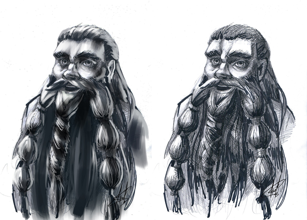
8. I wasn't satisfied with the face angle. It's never to late to alter your painting for a better image, don't be afraid to start all over. I used a photo of myself to reference the new angle of the face that was more interesting to me.
9. Refine the new look and work on some contrast.10. This guy's skin isn't smooth, but aged, tired and damaged, working on those details really adds up to the realism.I also enhanced the highlights to create more contrast.
 11: Extra edited step. The featured didn't line up with one another, making his face asymmetrical. The facial expression wasn't so interesting as intended so they had to be be made more pronounced. Another edit was done to the colours as well applying the old rule of yellow, Red Blue. (fine out what that is here: www.artinstructionblog.com/col… Done. Go through every detail and make the areas of less interest less detailed. You can use the blur tool and sharpen tool to enhance those areas. Moving the channels in your image can give it a slight 3D effect.
Good luck!! Let me know if have any troubles or questions
 (Smile)")
This entire progress can be found on my livestream channel.
www.livestream.com/helmighs/fo…
You can send in your work to: helmighs (at) gmail.com
for reviews and paintovers on 'What's up! Wednesdays.' livestreams
Ever Wednesday on 19:30 (7:30 pm) Amsterdam time.
Find out what time that is for you on : www.timeanddate.com/worldclock…
My website: helmighs.com
Official Facebook page of Caldyra: www.facebook.com/Caldyra
Related content


Comments: 40


I really like the first portrait but the new one is definitely better for an interesting character portrait. Really gives him character. Thanks for the inspiration!
👍: 0 ⏩: 0


Thank you very much!
👍: 0 ⏩: 1


favorite part: the lil self-portraits
nah seriously, thx for the nice step-by-step tutorial. really like it!
👍: 0 ⏩: 1
thanks haha yes those photos of me were necessary just pointing out how I used photo reference
")
👍: 0 ⏩: 0


question! i've been told by some other painters that it's preferable to at least lay down the background color first because it's easier to make the subject fit the background than vice versa. opinion?
👍: 0 ⏩: 1
I'd say, colors are always editable and I edit mine all the time
You should be stuck to the first colors you pick, especially not to the first background color you select.
👍: 0 ⏩: 1

What do you do to blend the brush strokes? Use the smudge tool or something else? I always have trouble with it.
👍: 0 ⏩: 2
I use various techniques. Sometimes I smudge with a blending toolbrush (for places that would only distract when detailed) other times I use a really roughly textured soft brush and occasionally I like to etch
👍: 0 ⏩: 1
Oops, never mind this.
👍: 0 ⏩: 0

Very cool tutorial! Thanks a lot! I usually don't make a layer above my lineart that I paint over, that's new to me.
👍: 0 ⏩: 1
its even easier to work with that layer on top when keeping the layer underneath as a mask or selection
👍: 0 ⏩: 1
Awesome that's a helpful tip! thanks for replying.
👍: 0 ⏩: 0


looks like a character you would find in Lord of the Rings or The Hobbit. Perhaps Aragorn's lost brother?
Awesome work.
👍: 0 ⏩: 1
That would be awesome! ")
👍: 0 ⏩: 0

awesome tutorial and also a very wonderful piece of art! congrats

👍: 0 ⏩: 1
Thanks
👍: 0 ⏩: 0

No problem
👍: 0 ⏩: 0

Man, I'm going to reference the shite outta this article when I finally get around to doing some portraits.
👍: 0 ⏩: 1
haha let me know when you do and if i can help you whenever you get stuck
👍: 0 ⏩: 1
I actually understand the basic techniques, at this point it's more a matter of practice, which I should have more time to do starting next week hopefully.
👍: 0 ⏩: 1


Interesting to see how you work
Just wondering... but on average... how many layers do you use on your artwork?
👍: 0 ⏩: 1
I merge a lot when I'm satisfied with things. I always keep a layer for the background and character separated, so a minimum of 2 to a maximum of 15 when I'm experimenting with color balance, or details etc. I have broken that rule at times though XD simply because I forget to merge.
👍: 0 ⏩: 1
Okay. Thanks for answering
👍: 0 ⏩: 1
No problem of course
👍: 0 ⏩: 0