HOME | DD
 Svendsen — One portfolio design
Published: 2009-06-07 09:30:12 +0000 UTC; Views: 16962; Favourites: 80; Downloads: 2868
Redirect to original
Description
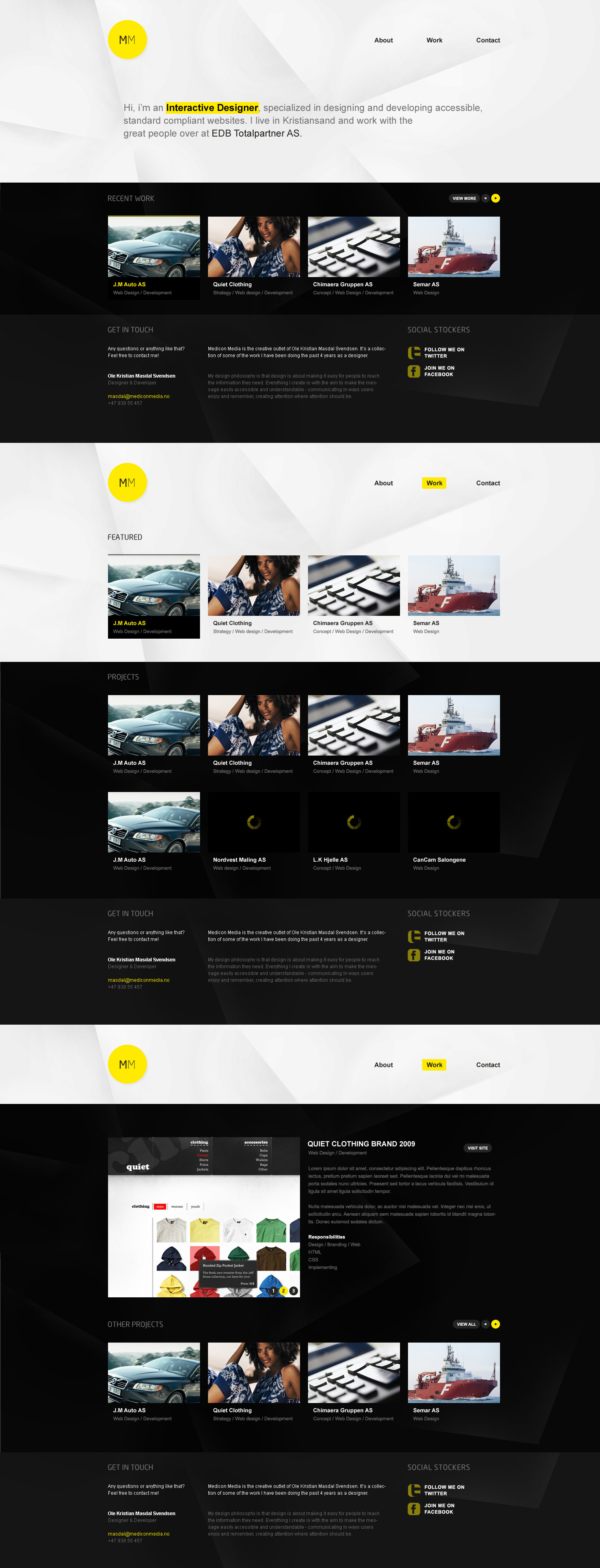
One of houndred portfolio designs.LIVE: [link]
[link]
[link]
[link]
[link]
Related content


Comments: 29


Amazing!
I love the strong lines and the spacy "calm" feel.
Really great job!
Cheers,
*ejsing
👍: 0 ⏩: 0

The header could have been smaller, but the rest of the site is clean and easy to follow, great work!
👍: 0 ⏩: 1

I've allready made it a bit smaller, so there's no more room for less whitespace now. But thx
👍: 0 ⏩: 1
 (Wink)")

Looks rather stunning, I especially like that way you arranged the hierarchy of pages, and it's rather rare to see stub pages used these days, but the way you've designed them makes them worth it.
The design also has rather a lot of depth to it, I'm unsure if this could be because of the background, or whether it's just a use of colours.
Great work
👍: 0 ⏩: 0


You know what, the colors here and the background effects make this to a really sweet one  (Smile)")
👍: 0 ⏩: 0


Sorry, but looks kinda boring and way too corporate.
Portfolio must look professional, but it has to appeal to feelings of your potential customer. Corporate look just doesn't fit here.
👍: 0 ⏩: 1
What is it that looks so much corporate in this design? any elements?
👍: 0 ⏩: 1
stock images on middle, bg lines bw contrast all together makes that look
my opinion only tho
👍: 0 ⏩: 1
Images from the projects that client has sent to me, and those lines in the background makes the site to be more alive, then it would be with just clean backgrounds.
but ait
👍: 0 ⏩: 0


Very nice design. I love this font in the menu and in the topics. What's the name of it?
👍: 0 ⏩: 1
The font in the menu and content is Arial, headings like "Recent Work" etc were Neo Sans
👍: 0 ⏩: 1
Thanks. Keep up the good work!
👍: 0 ⏩: 0

thats an awful lot of empty white space in the header man
other than that simply breathtaking 
")
")
👍: 0 ⏩: 1
Changed the top a bit. Just about enough white space.
👍: 0 ⏩: 1

the header is to big, but i like the overall look of it...
👍: 0 ⏩: 1