HOME | DD
 Svengraph — SvenGraph 3D Logotype
by
Svengraph — SvenGraph 3D Logotype
by

Published: 2009-11-07 16:41:06 +0000 UTC; Views: 10079; Favourites: 71; Downloads: 511
Redirect to original
Description
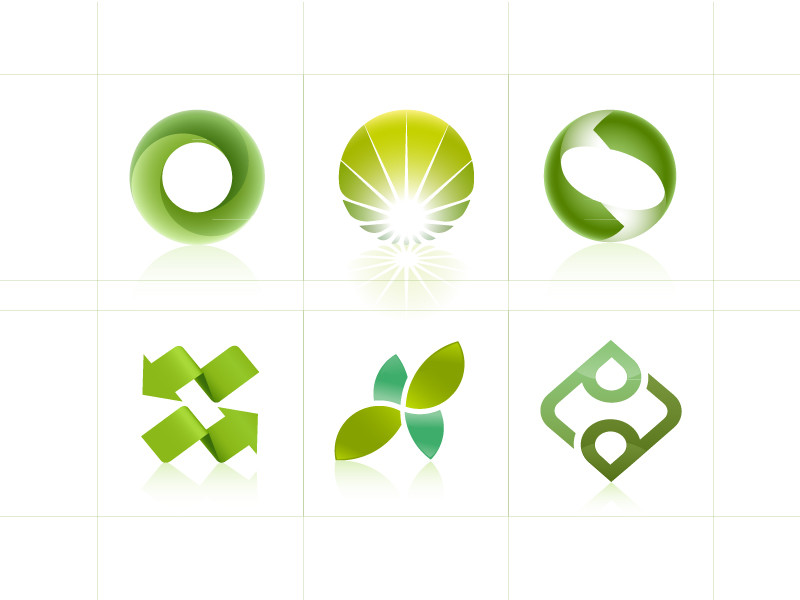
My Logotype (Smile)")
About 3h
Related content


Comments: 36


 (Wink)")


")


Uhm, i have used axertion tutorial
👍: 0 ⏩: 1

yes I know, that's why I said thanks man  - :P")
👍: 0 ⏩: 0

Great work as allways
I've tried making this kind of 3D logo, but i got stuck at the shiny edges. What is your method?
👍: 0 ⏩: 1

Nono, illustrator + photoshop
👍: 0 ⏩: 0

Impressive softness and transparency! I understand it's 3D, but I'd like to know your thinking behind why it's slightly slanted towards the right.
👍: 0 ⏩: 0


now that looks awesome!
i love the clean and glossy look!
👍: 0 ⏩: 1

Wow, it's so great, I love it!It's light and the shapes are very beautiful, good job!Uusally I could prefer the pink and violet version, but the brown and green version is harmonius, peaceful
+fav!
👍: 0 ⏩: 1


solita figatona!!!!!!!!!!!! cmq si vole il tutorialllllllllllllllllllll
👍: 0 ⏩: 1
Di questa tecnica verrebbe troppo complesso, se noti è diverso dagli altri ;D
👍: 0 ⏩: 0


il bordo della foglia in basso non ha la traccia
bello il resto
👍: 0 ⏩: 1
Non si vede molto, ma c'è
👍: 0 ⏩: 0
