HOME | DD
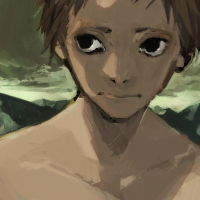
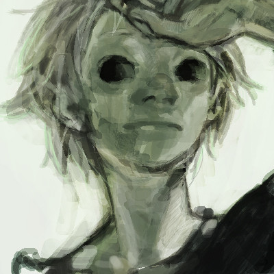
 sweetmoon — face2
Published: 2008-11-24 04:57:11 +0000 UTC; Views: 4864; Favourites: 219; Downloads: 155
Redirect to original
Description
I bought a new distplay. now I'm checking the colouring and contrast.at old display, this looks very pale.. how do you see at your state?
") I'd like you to tell me to kill time~ enjoy
I'd like you to tell me to kill time~ enjoy (Smile)")
Related content


Comments: 27

I don't understand Digital Media and don't know how you did this. All I know is I LIKE IT!!! It reminds me of oil painting, maybe impressionist style?
👍: 0 ⏩: 0

you know your painting reminds of of Basso~do you know her?
👍: 0 ⏩: 1


his eyes looks pretty big here...reminds me of L ^^
👍: 0 ⏩: 0

")

His skin is pretty decently rich on my monitor... not pale, for certain, but more of a neutral tanned color.
👍: 0 ⏩: 0

yeah, my current lcd monitor kills me. I think it has something like a 600:1 contrast ratio, and whenver I check something I made on my crt tv or lcd hdtv via my ps3, so many colors always look darker.
👍: 0 ⏩: 0

Argh!!
Can you teah me about the colors?
That's so great!!! >__<
👍: 0 ⏩: 0


On both of my monitors the contrast looks pretty similar to your other works, so there is a good range of values. Also the colors don't appear pale at all, they are rich neutral tones. Looks really great!
👍: 0 ⏩: 0

Color looks fine to me, deep, and not at all pale.
Samsung BW41 19" LCD, Adobe color profile.
👍: 0 ⏩: 0

not pale at all öö
rather greyish skintone, tending more to purple, less to red
well maybe the greyish touch makes it look pale 8D
anyway, he's adorable
")
👍: 0 ⏩: 0

It doesn't really look pale... if I was being picky and comparing it to your older (or rather, most recent) works, I might declare it looks a little bit dull in comparison? But not in a bad way at all! Its gorgeous infact! (Gorgeous and simple and bold as usual! 
And like everyone else has already declared, there's a lot of contrast!
👍: 0 ⏩: 0


The shadow are good also the colors of the face, but its seen the eyes looks a litle death ..
👍: 0 ⏩: 0


Your color choice is just terrific.
Those eyes look so deep
👍: 0 ⏩: 0

Looks fine on both of my monitors. The contrast is there and it's not pale at all.
👍: 0 ⏩: 0

doesn't look pale to me - the contrast and shading is lovely - stands out well on the background!
👍: 0 ⏩: 0


the contast is there
very obvious is back lighting XD
getting a new monitor?
👍: 0 ⏩: 1
the drawing do looks pale.....compare to the previous drawing..
👍: 0 ⏩: 1

thanks for the reply!
but actually, my drawing from long long time ago was looked like this very much
👍: 0 ⏩: 1
yeaaa but like it very much
especially the stroke you apply is the most attractive part of every oekaki
👍: 0 ⏩: 0