HOME | DD
 SwiftstarDawn — You Burn With Us
Published: 2010-11-22 19:48:16 +0000 UTC; Views: 1597; Favourites: 43; Downloads: 0
Redirect to original
Description
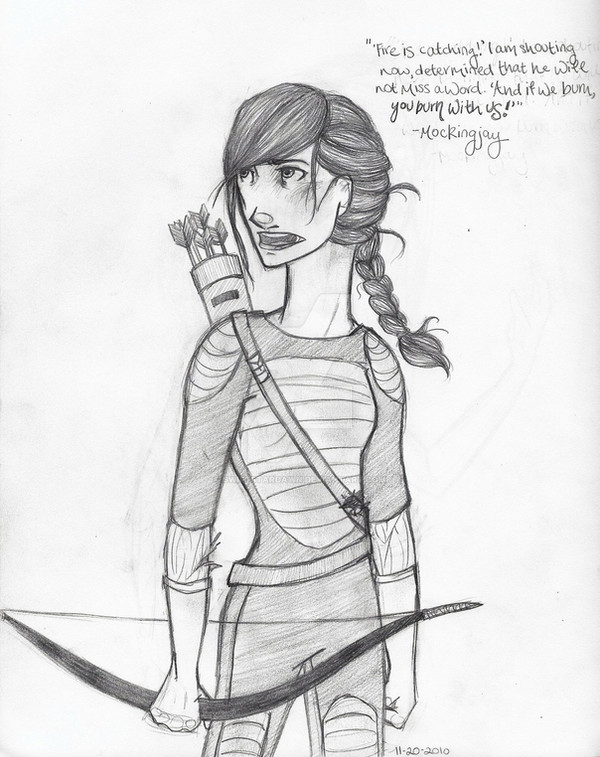
Because NOBODY HAS DRAWN THIS SCENE YETAnyway. I was practicing...something. I forget what. Either way, it became a Katniss. Looking all intense and stuff...I tried to get her Mockingjay costume accurate by the book, but also took some artistic liberty. I love the idea of the white sleeves under the black, and sort of imagined them a bit poofy, like birds' wings. So there you go.
plz to ignore her hands kthx
Katniss Everdeen, The Hunger Games (c) Suzanne Collins
Art (c) me
Related content


Comments: 15


Originality
Technique

Why am I writing so many critiques lately, you ask? Well, for one, I just get in these random moods, and for two, your art is fun to critique because you do so much of it, and the improvement is visible over a course of time. I'm actually going to try to stick with the stupid "out of five stars" system, so here goes.
(I chose this particular deviation because there are a lot of things that are definitely really good, but also a lot of things that could be improved, about it.)
Vision: I think you had a good idea going before you started drawing. It looks like the character, and her outfit, were planned, and you took your time envisioning the results, like you said in the artist's comments, ha ha. To point out something real fast, I love the hair - it looks textured and messy, just like her hair would be if she were, say, standing in a light wind, being all... Katniss... -y.
Originiality: Allllrighty, Swifty. I know, know, know you can do better than this! You had an idea for the outfit, but why didn't you take it further? And the pose - you do this pose a lot! Same for the expression! We've seen you do this kind of stuff before now, and before that, and before that. I can guarantee you that if you try something new in the way of pose or expression, your work will get a lot more interesting. There are some things about it that add individual flair, such as the motifs/stars on her quiver belt, the sleeves.
By the way, actually everybody's done this scene, like everybody I watch, but I'm not counting off for that because it's an awesome scene and everybody should draw it anyway. e.deviantart.net/emoticons/s/s… " width="15" height="15" alt="
 (Smile)")
Technique: Your hair and shading is brilliant as usual! e.deviantart.net/emoticons/b/b… " width="15" height="15" alt="
")
And by the way, kudos for the detail in the arrows.
Impact: As usual, most of your impact is at the top. Her face and hair draw a lot of the attention, especially because the hair is so dark - which is one of the reasons that I like that you made the bow as dark as it is, though perhaps it would be better if the "other dark object," so to speak, was vertical... but that's just a musing from me, and not supported by any rules of art that I know of. e.deviantart.net/emoticons/let… " width="15" height="15" alt="
")
Overall, this is a good piece. It depicts the character accurately and well, conveys emotion and her personality, and I believe accomplishes what you intended it to. e.deviantart.net/emoticons/h/h… " width="15" height="13" alt="

👍: 0 ⏩: 0


Very nice! The eyes should be a little lower in my opinion but it looks great!
👍: 0 ⏩: 1

i don't know you, buttttt eue kay, so, i reaaaally love the face and hair ;u; so pretty! i dunno what you dislike about the hands, i think they look pretty good <:
i would agree with the critique - she kinda shrinks from head down D: and the neck seems a bit far the the side, like a lot >A<
but otherwise, i like ouo what's it from?
👍: 0 ⏩: 1

Thanks so much! It's from The Hunger Games, novels by Suzanne Collins- which are AWESOME. You should read them
👍: 0 ⏩: 0

I love your handwriting! My only thing is her neck looks a little long and thick, but everything else looks fantastic
👍: 0 ⏩: 1
Thank you! Haha, I'm glad- I wrote that veeeeery early in the morning, so my handwriting was a little skewed. Thanks for the critique and fave
👍: 0 ⏩: 1
You're welcome!
👍: 0 ⏩: 0

I can't write a crtique so I'll right one in here.
I believe that this piece has wonderful detail and you as an artist has great potential. If you want to know how to make this piece better, I'd say practice on the propotions of the body. For example, the neck is too wide and long and the head is too large in comparison to her body. Also don't be afraid to widen her hips a tad or else she looks like bone.
👍: 0 ⏩: 1
Thank you so, so much, and thanks especially for the critique, it means so much! I'll keep all of that in mind
👍: 0 ⏩: 1

Thank you- and thanks for the fave!
👍: 0 ⏩: 1