HOME | DD

SwordfishKing — Jet Pack Retro Future

Published: 2012-01-07 16:09:13 +0000 UTC; Views: 5038; Favourites: 30; Downloads: 0
Redirect to original
Description 
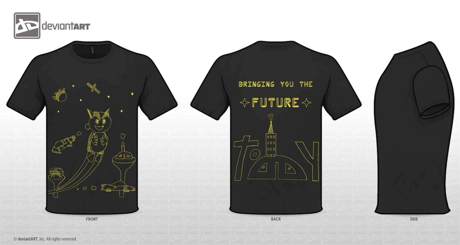
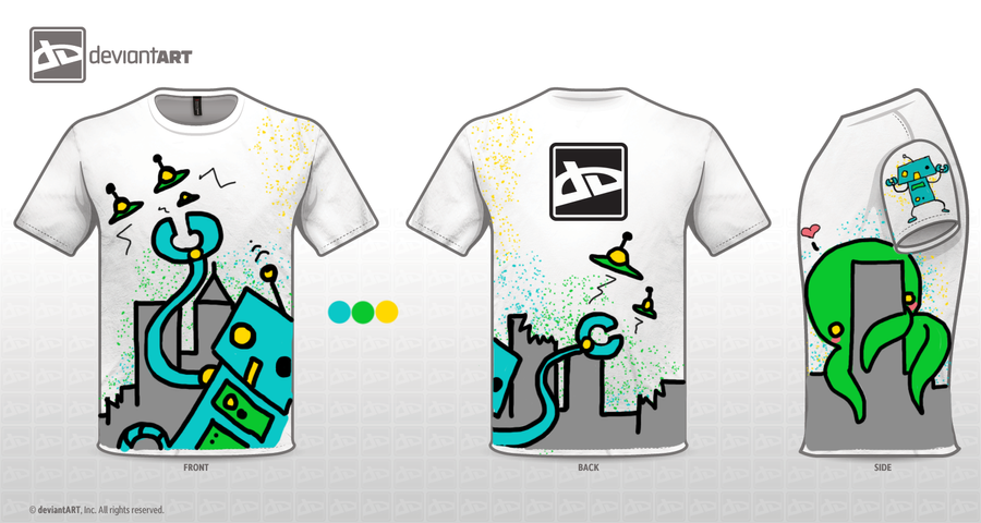
This is my attempt at the retro future contest. I like it. If you do too please click on "I'd wear this." Thank you all for your support!
Related content
Comments: 213

14th-division In reply to ??? [2012-01-09 22:40:28 +0000 UTC]

is a really nice design, i especially like the use of the DA logo on the back, also the lineart stile is cool ^^

👍: 0 ⏩: 1

SwordfishKing In reply to 14th-division [2012-01-10 00:24:41 +0000 UTC]

Thanks! That means a lot to me! I'm glad you liked it!

👍: 0 ⏩: 0

bewareofturtles In reply to ??? [2012-01-09 22:32:09 +0000 UTC]

Epic!<33

👍: 0 ⏩: 1

SwordfishKing In reply to bewareofturtles [2012-01-09 22:39:01 +0000 UTC]

Thanks I think you are the first person to call it "epic." Makes me smile, so thank you

👍: 0 ⏩: 1

bewareofturtles In reply to SwordfishKing [2012-01-09 23:00:07 +0000 UTC]

:3 it is really epic, youre welcome. hehe.

👍: 0 ⏩: 1

SwordfishKing In reply to bewareofturtles [2012-01-10 00:32:25 +0000 UTC]

👍: 0 ⏩: 0

liamsi4 [2012-01-09 22:25:22 +0000 UTC]

Awee Fella is using jetpack *O*
Thats so creative and unique :3
I love your design ^_________^

👍: 0 ⏩: 1

SwordfishKing In reply to liamsi4 [2012-01-09 22:27:56 +0000 UTC]

Thanks It was my first attempt ever at drawing Fella. Hopefully I didn't do too bad

👍: 0 ⏩: 1

liamsi4 In reply to SwordfishKing [2012-01-09 23:05:12 +0000 UTC]

Welcome :3
Hehe it was my first attempt at drawing Fella too on my design.
Your came out great,no worries :3

👍: 0 ⏩: 1

SwordfishKing In reply to liamsi4 [2012-01-10 00:31:52 +0000 UTC]

Yours looks like it was done by a pro

👍: 0 ⏩: 1

liamsi4 In reply to SwordfishKing [2012-01-10 14:50:55 +0000 UTC]

Ahh nah : p it really doesnt >.< but thanks thought =]

👍: 0 ⏩: 1

SwordfishKing In reply to liamsi4 [2012-01-10 16:59:30 +0000 UTC]

Well it does to me, but hey I guess pros are real people like you and me.

👍: 0 ⏩: 1

liamsi4 In reply to SwordfishKing [2012-01-10 17:36:20 +0000 UTC]

Hehe thats true xD

👍: 0 ⏩: 1

SwordfishKing In reply to liamsi4 [2012-01-10 23:27:08 +0000 UTC]

👍: 0 ⏩: 0

Proof-Of-Life In reply to ??? [2012-01-09 22:09:33 +0000 UTC]

This, my friend, is quite awesome.

👍: 0 ⏩: 1

SwordfishKing In reply to Proof-Of-Life [2012-01-09 22:23:56 +0000 UTC]

Thanks I appreciate that! Be sure to vote for it if you like it

👍: 0 ⏩: 0

NdYlu In reply to ??? [2012-01-09 20:30:54 +0000 UTC]

great idea the AD

👍: 0 ⏩: 1

SwordfishKing In reply to NdYlu [2012-01-09 21:25:01 +0000 UTC]

Thanks! I was pretty proud of it

👍: 0 ⏩: 0

linnzilla In reply to ??? [2012-01-09 19:37:57 +0000 UTC]

nice design! I love the text on the back! how "today" is written! genious! : D

👍: 0 ⏩: 1

SwordfishKing In reply to linnzilla [2012-01-09 21:25:25 +0000 UTC]

Thanks! You're too kind

👍: 0 ⏩: 0

neil1987 In reply to ??? [2012-01-09 19:16:31 +0000 UTC]

Interesting design, I like how you kept the colour pallet simple and incorporated the Deviant Art logo into your design.

👍: 0 ⏩: 1

SwordfishKing In reply to neil1987 [2012-01-09 19:23:38 +0000 UTC]

Thanks! I have always like the contrast between yellow and black.

👍: 0 ⏩: 0

Ariis In reply to ??? [2012-01-09 18:59:55 +0000 UTC]

Awesome too! and yes lol, our logos are familar, haha I really like how it sticks out. n_n thanks for checking out mine [link]

👍: 0 ⏩: 1

SwordfishKing In reply to Ariis [2012-01-09 19:05:31 +0000 UTC]

Anytime

👍: 0 ⏩: 0

montalvo-mike In reply to ??? [2012-01-09 11:59:00 +0000 UTC]

nice job. simple and to the point

👍: 0 ⏩: 1

SwordfishKing In reply to montalvo-mike [2012-01-09 17:58:15 +0000 UTC]

Thank you! That's what I ended up going for after I realized that it would take probably too much color to color it in.

👍: 0 ⏩: 0

Jitomate In reply to ??? [2012-01-09 10:13:42 +0000 UTC]

Nice, I like what you did in the back, good luck!

👍: 0 ⏩: 1

SwordfishKing In reply to Jitomate [2012-01-09 17:58:40 +0000 UTC]

Thank you! Good luck to you as well!

👍: 0 ⏩: 0

Kurara-Himura In reply to ??? [2012-01-09 10:09:07 +0000 UTC]

as i said... really nice!

👍: 0 ⏩: 1

SwordfishKing In reply to Kurara-Himura [2012-01-09 17:59:40 +0000 UTC]

Thanks Appreciate it! I like yours too! Great coloring!

👍: 0 ⏩: 0

PivotNaza [2012-01-09 05:29:52 +0000 UTC]

I LOVE, it`s simple and works very well and i really like what you did whit the deviantart logo.. congrats.

👍: 0 ⏩: 1

SwordfishKing In reply to PivotNaza [2012-01-09 18:00:19 +0000 UTC]

Thank you! Yeah the whole dA thing kind of just came to me while I was doodling a bit

👍: 0 ⏩: 0

SpaceView [2012-01-09 05:16:46 +0000 UTC]

i like the front, its really playful

👍: 0 ⏩: 1

SwordfishKing In reply to SpaceView [2012-01-09 18:00:40 +0000 UTC]

Thanks! I had fun with it for sure!!

👍: 0 ⏩: 0

kevpatterson [2012-01-09 05:16:46 +0000 UTC]

I like this but just a thought, maybe you should make the "o" in "today" a bit bigger and the "da" smaller and a bit to the right. I think that would make it easier to read and let it flow better. Just a thought. I'd wear it!

👍: 0 ⏩: 1

SwordfishKing In reply to kevpatterson [2012-01-09 18:02:33 +0000 UTC]

I do like that idea but I really wanted the "dA" logo to be the focus on the back. I also wanted to keep it centered if at all possible. I may toy around with that idea though. Thanks for commenting! I'd wear yours too! Just voted for another of yours! Keep the ideas flowing!!

👍: 0 ⏩: 0

poisonplum [2012-01-09 05:11:00 +0000 UTC]

i proli won't win because of the refs to robbie the robot but oh well

👍: 0 ⏩: 1

SwordfishKing In reply to poisonplum [2012-01-09 18:03:29 +0000 UTC]

Oh I didn't even realize haha. Yeah you might be right but I voted for you anyway

👍: 0 ⏩: 1

poisonplum In reply to SwordfishKing [2012-01-09 18:08:34 +0000 UTC]

thanks

👍: 0 ⏩: 1

SwordfishKing In reply to poisonplum [2012-01-09 18:12:17 +0000 UTC]

You're welcome

👍: 0 ⏩: 0

larsonkilstrom In reply to ??? [2012-01-08 22:21:23 +0000 UTC]

i like the layout and the incorporation of the logo. looks a little flat since its all just outlines. maybe use a second color to bring the foreground objects out from the background. nice job!

👍: 0 ⏩: 1

SwordfishKing In reply to larsonkilstrom [2012-01-09 01:06:13 +0000 UTC]

Ah that's a good idea! I may have to consider trying one out like that! Thanks for the compliment/comment!

👍: 0 ⏩: 1

larsonkilstrom In reply to SwordfishKing [2012-01-09 19:47:35 +0000 UTC]

no prob. good luck!

👍: 0 ⏩: 1

SwordfishKing In reply to larsonkilstrom [2012-01-09 21:35:39 +0000 UTC]

Thanks! You too

👍: 0 ⏩: 0

CosmicRamble In reply to ??? [2012-01-08 20:54:51 +0000 UTC]

It incorporates a lot of the retro stuff.

👍: 0 ⏩: 1

SwordfishKing In reply to CosmicRamble [2012-01-09 01:07:22 +0000 UTC]

Thanks! It was kind of hard to think of but after a little brainstorming it just kind of came to me

👍: 0 ⏩: 0

JRud52 In reply to ??? [2012-01-08 20:35:09 +0000 UTC]

cool design! voted!

👍: 0 ⏩: 1

SwordfishKing In reply to JRud52 [2012-01-09 01:08:23 +0000 UTC]

Thanks so much Just saw your second design and voted for it too! Did you like my idea of simple outlines then?

👍: 0 ⏩: 0

FISHYPAWNDZ In reply to ??? [2012-01-08 19:17:53 +0000 UTC]

yours is awesome too smart way to use DA u got my vote ;D

👍: 0 ⏩: 2

SwordfishKing In reply to FISHYPAWNDZ [2012-01-09 01:09:16 +0000 UTC]

Thank you so much! I appreciate that!!

👍: 0 ⏩: 1


<= Prev | | Next =>