HOME | DD
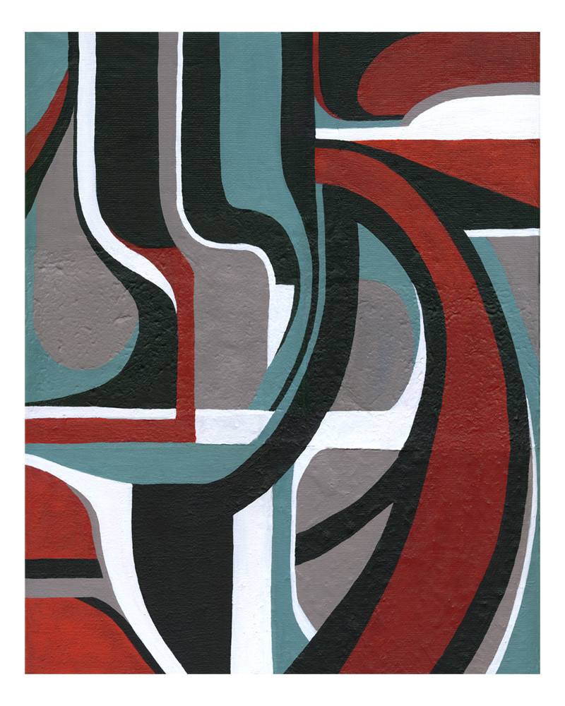
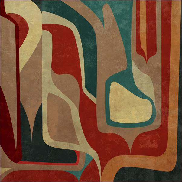
 Sya — Abstraction 2
Published: 2005-06-29 21:34:47 +0000 UTC; Views: 3578; Favourites: 63; Downloads: 272
Redirect to original
Description
For some reason, I really enjoy the concept of fluid lines of color flowing over and connecting different textures. It's quite an enjoyable challenge.Acrylic on 7 sheets of various hand made paper mounted on canvas.
The original 16x20 is for sale. The edges have been painted so a frame is not neccessary.
Related content


Comments: 50


Yes it is soothing. The color set is very classical.
👍: 0 ⏩: 0

this is really very nice- in fact i like both of your "Abstract" pieces- you did a great job breaking up the colors & shapes & keeping the movement (and therefore our eyes as well) flowing- in & out, over & under-nice, smooth transitions around the entire piece...the only thing that blocks that flow is the sudden stops between textures- (for instance- if you follow along the long, most prominent, red curve- it starts almost at the top of the painting & curves all the way down to the bottom- you have at least 2 sudden changes in texture.... same thing happens with the grey teardrop-like shape at the top of the painting, although, being that it is a smaller,less vibrantly colored shape, it is not as dramatically noticeable as the red curve).
The solution would be to let the individual shapes dictate the contours of the varying textures, and the sizes of these shapes, their colors, etc dictate which texture would fit most effectively with it- in other words, each shape is a different texture- as opposed to just putting blocks of texture on the canvas, you would cut the texture to fit the individual shapes.
Because vibrant red is the most noticable color to our eyes, the red curve, alog w/the other red shapes, would look great filled with a texture that is rough or very grainy, while smoother textures that are more plain would be good for the grey shapes- in effect pulling them back & allowing the brighter shapes to jump forward(or you could even play around with that idea & do the opposite & see what kind of effect it creates).
Regardless, it is still a great painting, and the texture thing is only a small thing that i noticed. And by the way, i love your gallery, though i'm not finshed yet going through it all- i think you have beautiful talent

👍: 0 ⏩: 0


Awesome stuff, I don't normally find traditional stuff I like.
👍: 0 ⏩: 1

i don't like the different types of paper that much...but the forms and colors are fantastic...beautiful modern art
👍: 0 ⏩: 1

Thank you! I handmade all the paper myself, so it probablky has more significance to me than to the viewer. I appreciate your comment!
👍: 0 ⏩: 2
ps: i see "....of various hand made paper..." sorry, i was very sleepy yesterday

👍: 0 ⏩: 1
hahah, no problem, I appreciate your honest opinion. The only thing I can say for it is that it looks cool in person. But I think from now on I will not mount more than one paper on the canvas to avoid overlapping problems.
👍: 0 ⏩: 0
oh, really...i don't know that...respect
👍: 0 ⏩: 0

That is Gorgeous, one of my Favorite overall color schemes.
👍: 0 ⏩: 1

I feel that the lines could be more fluid and the edges where the colors meet could have better craft. Having a similar style myself, I understand how hard that can be to do while keeping the fluidity in check.
Otherwise,... **gives two thumbs up** Nice choice of color as well!
👍: 0 ⏩: 1
thanks for your comment. The lines are irregular because there are 5 different types of paper and each one has a different knap to it, so there was no way to be more fluid than that. I found the challenge quite fun. If you saw the original, you might see what I mean by the different textures of the paper, but I reaize the scan doesn't show that very clearly.
👍: 0 ⏩: 2
Understandable  (Smile)")
👍: 0 ⏩: 1
I have a couple paintings in the works. One is almost finished tonight.
👍: 0 ⏩: 0

Very 'Native Canadian' in style. (my perspective). I find the use of different textures of paper appealing. Great work.
---

👍: 0 ⏩: 0


I love it, it makes me feel warm and in a special place.
👍: 0 ⏩: 0


This would make a very pleasing carpet design for an ultra modern house...
👍: 0 ⏩: 0


Excellent colors, excellent composition. And overall excellent piece!
👍: 0 ⏩: 0

Stacy...this a beautiful hard edge paINTING my friend...
S
k
o
t


👍: 0 ⏩: 0

This is great!!! I love the fluidity of the lines and how my eyes travel throughout this piece ... very cool clours as-well ... a 
👍: 0 ⏩: 0

o0oo I like! great color combo. Lines are awesome. *would hang it rotated cw so the red 'swoop' was going up and out ")
👍: 0 ⏩: 1
I'm asking $150 for the original and $50 for a 16 x 20 print. I've never sold my paintings before, but it's about time I did, I think.
👍: 0 ⏩: 0

That is really beautiful! How do you get the acrylic so uniform...Mine always look like chaos!
👍: 0 ⏩: 1
Acrylic can be used thick or watered down... I usually make mine watered down enough to be easily brushed on in layers, but thick enough to cover adequately. I use very controlled brush srokes. It's just a matter of artistic style. Your paintings are incredibly powerful and your brush strokes are different, but not of less significance.
👍: 0 ⏩: 1

wow fantastic my friend
great combination of colour, texture and pattern!!!

👍: 0 ⏩: 0

Thats really nice Sya, love the combination of colors & shapes
👍: 0 ⏩: 0

It's kool. Looks almost like some sort of native american art to me. the colors and patern and such.
👍: 0 ⏩: 1
yes, I agree with it having a native american tribal feel... it felt very calming and meditative to paint this. Almost like I was touching my ancient roots and memories. I'm glad that it has that aura about it! Thanks for your comment!
👍: 0 ⏩: 1
No prob. It's a beautiful painting.
👍: 0 ⏩: 0

I really like the way you did this abstract ... for one who dreams in digital, I can see evidence there in the more solid and un-mixed colors and more clear-cut edges
👍: 0 ⏩: 0

This is fantastic -- exceptionaly done. Now if I only had the moola.
You know a frame would be great for this as mounting it in any direction wouldn't matter because it will look good no matter how it is hung up.

👍: 0 ⏩: 1
Yeah, I didn't sign it on front so people can hang it however they like. This is the way I saw it in my mind though.
👍: 0 ⏩: 1
Before you sell it you should sign it on the front as all artists do.
👍: 0 ⏩: 1
Not all artists sign their work on the front, especially when the piece can be hung in different ways, it's up to the purchaser to decide.
👍: 0 ⏩: 1
You are so very right, I didn't think of the sig being upside down when looking at the painting --

👍: 0 ⏩: 0
