HOME | DD
 syarul — dock

Published: 2008-01-13 12:54:19 +0000 UTC; Views: 5276; Favourites: 130; Downloads: 166
Redirect to original
Description
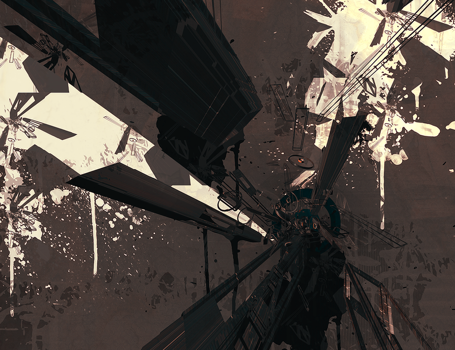
I had a fever today and still are =.= , though worthy of scratching my tablet pad yet. Work out from last speed painting. Back to my bed now.. ughhRelated content


Comments: 11

Really nice picture. Love the colours. Only one thing is bugging me... those stairs in the foreground are freaking massive. A person must jump and pull themselves up each step. Inless they are steps designed for mechs, they are definately too big. Alter that a bit and youve got a cool paint!
👍: 0 ⏩: 0


Ha! I wanted to comment on the rougher one already, suggesting to finish this up and now you did!  (Smile)")
The other background really was better though...
👍: 0 ⏩: 1

yeah, notice that. I mess up to much this :/
👍: 0 ⏩: 0


")

I like this one better, no doubt. The piece is more understandable now, you can actually SEE that this is a futuristic hangar. The only thing you missed in this one was the background like annisahmad said.
The other had those other distant elements wich really gave depth to the image.
But i really like this one, maybe you should try to give some texture to the floor, just so that it doesn't look so flat.
keep up the great work! i love your style
👍: 0 ⏩: 1

👍: 0 ⏩: 0

hope you feel better.
the speedy had better overall colors/values. it looked more... persuasive. i don't think you should have tried to detail the bg/sky.
just remember that every lit surface is never really one consistent value and is almost always gradiated to some length.
you've also seperated the piece into two, with the red and the blue. bringing in a tinge of other colors, or even merging the two colors would help.
keep on pumping this stuff out. really love your colors in your speedies
👍: 0 ⏩: 1
thanks~, hopefully so. And yeah I shouldn't have detailed the bg's and the red/purple seem of quit a bit. Probably just my head can't think very straight right now...ughh =.= If I have time I work on it next time <3
👍: 0 ⏩: 0