HOME | DD
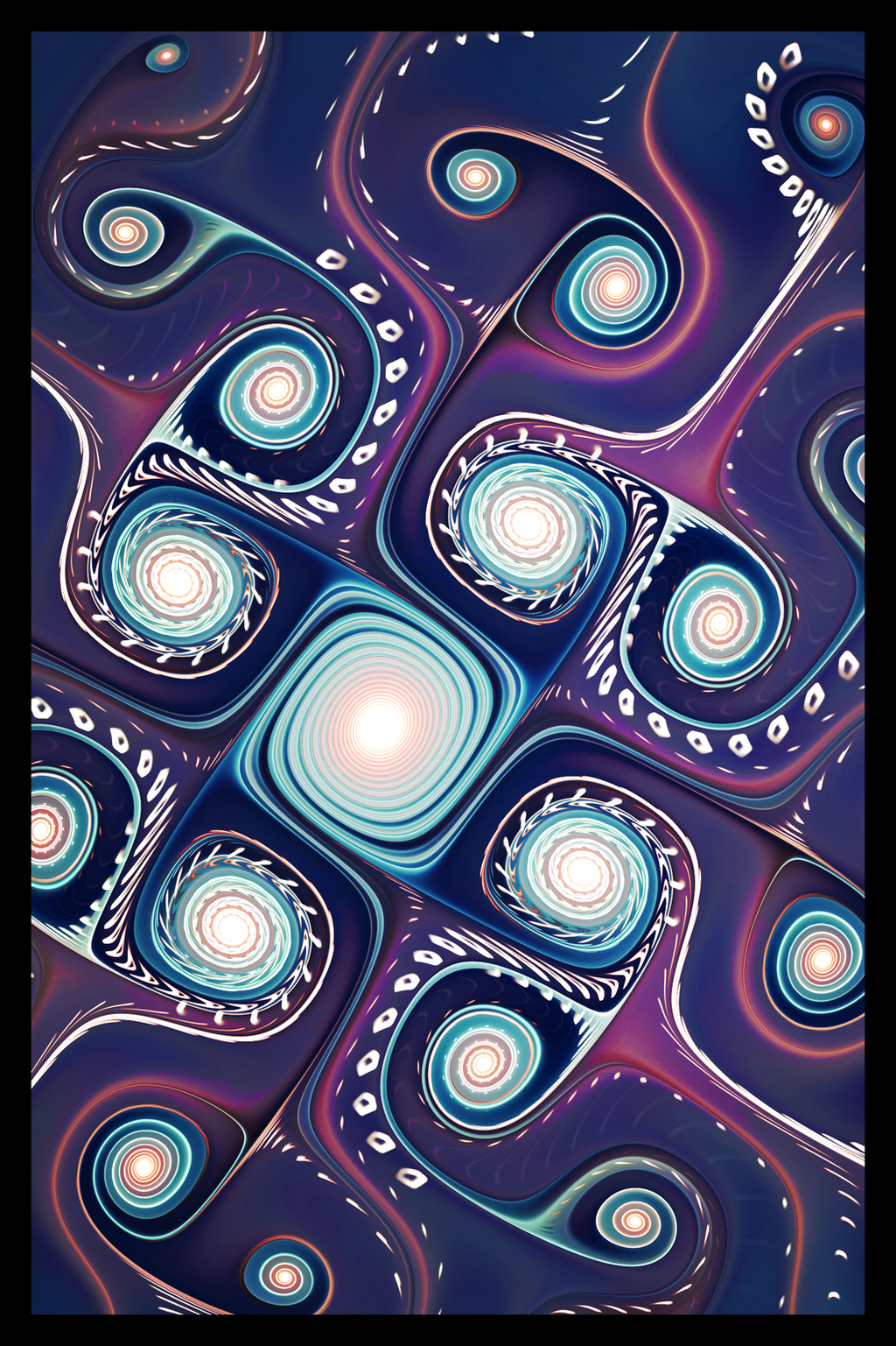
 SymmetryBox — Vortex

Published: 2014-03-28 20:54:26 +0000 UTC; Views: 3167; Favourites: 128; Downloads: 0
Redirect to original
Description
I haven't been feeling inspired lately, which has resulted in less activity in my gallery, but here's something") hope you like it!
hope you like it!
Related content


Comments: 16


beautiful work! would feature it on facebook, but i'm not sure if it's a chaotica render, pls lemme know if it is
👍: 0 ⏩: 1

Thank you!  (Smile)")
👍: 0 ⏩: 0


I LOVE YOUR ART,so beautiful touch, lovely colors and amazing abstract
👍: 0 ⏩: 0

Love the abstract feel of this one. And the gradient is gorgeous

👍: 0 ⏩: 0


The colors and blur are very nice. I might be partial to a different framing and a little bit more sharpness, but there are many parts of this that I really enjoy looking at
👍: 0 ⏩: 1
Thank you 
👍: 0 ⏩: 1
Definitely, I notice the sharpness now. I don't know if you use Chaotica or if you're using Apophysis, because I recently have been using different sharpness settings on Chaotica that I find to be a bit more effective for this type of fractal.
I'd be tempted to say that lowering the blur slightly would add some sharpness without losing the depth that I like in this, as when I tend to work with blur, there seems to be a very fine line between what keeps the interesting points sharp enough and what blurs them too much (sometimes I work on the 0.00025 range with blurs, it can be that finicky!). It's rather tricky, and sometimes a rather tedious process to have to add and remove blur on every individual transform to see which one keeps the most sharpness in the details but still blurs enough to have the effect you would like.
dl.dropboxusercontent.com/u/94… are a few things I personally would be interested in trying out. The stuff circled in black indicates interesting sections of the image that I am using as guidelines for framing, and the squares indicate possible framing that I would try experimenting around with. Take of it what you will; I'm very obsessive-compulsive about framing and sometimes spend way too much time trying to do it and end up with worse results than before I start
")
👍: 0 ⏩: 1
I also tend to drive myself crazy with framing, that's why I was like "let's just leave it like this" this time ")
👍: 0 ⏩: 0