HOME | DD
 synax444 — Lost in Bitterness...

Published: 2009-11-27 17:40:56 +0000 UTC; Views: 15627; Favourites: 878; Downloads: 797
Redirect to original
Description
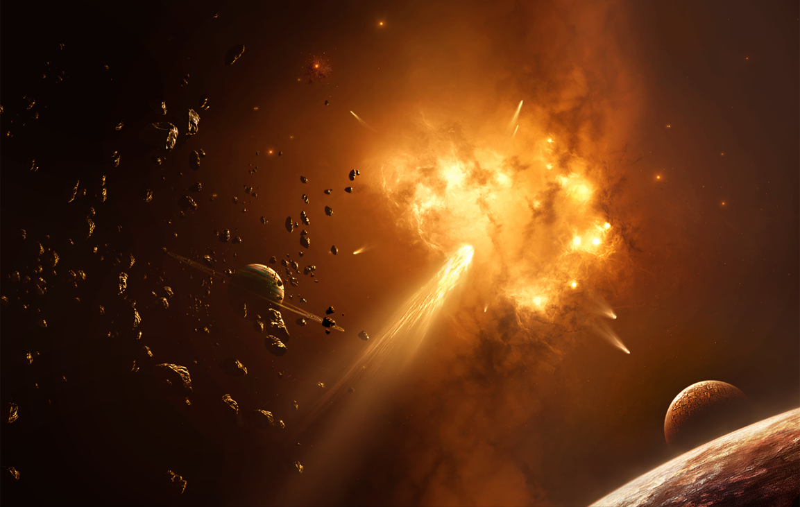
Have not had any crazy ideas lately, and its been a while since I've done a plane old space piece...Seeya
 My artwork is not stock and it is not to be re-uploaded, edited, or used anywhere in any way without my permission. Please respect that, thank you!
Related content


Comments: 240

Perfect thanks a lot man! This really strives me to make some unique stuff, thanks again for taking the time to write this...
👍: 0 ⏩: 1


Overall

Vision
Originality
Technique
Impact
Hey, of course I can write a critique! Sorry it took me a while, had a busy few days.
Anyhow, the first impression is definitely a positive one. The piece radiates a quite vivid feeling, which certainly is due to the many colours and also the light. I particularly enjoy the big planet and the area around it, especially the left. The way the blues of the space background contrast with the deep warm tones of the planet is just beautiful.
One thing that strikes me is the lack of an atmosphere, and I'm not sure if I like that. The planet needs no huge atmosphere, but I think a subtle indication of it would help ti fit it better into the piece, because right now its edge is rather sharp.
Also you might want to try and let the light which comes out from behind the underside of the planet bleed into the planet's edge a little. Just like if you watch a rather low sun from behind a sharp corner of a building, you will likely get a flary effect in your eye, causing the impression of the light being partly over the edge.
On to the nebulae. Overall it is not bad I think, but what I miss is a major structure or form, if that makes sense. It does appear a little like various textures and cloudy images blended together, which all have a seperate flow. And don't forget, the nebulae is a major compositional element in your piece. Done well, it will help to guide the eye up to your selling point, the planet.
What you could do is to try and sketch out the overall flow of the nebulae first, before you go into doing a polished version of it. And also keep in mind that some denser clouds might partly obscure the stars, which will give you a bit more variety. I think your stars look good, but they're visible pretty much everywhere in the space. Don't be afraid to hide them in places.
Mostly I think the nebulae needs work in the bottom two thirds. The top part where it approaches the small planets looks really sweet in my mind and doesn't need much of a change. Especially the colour interaction there is nice.
And last but not least, working our way down to the land...I'm generally note a huge fan of terragen, but I think your terrain in itself looks quite good and does its job in framing the image. It does certainly feel rather dead though in comparison to the rest of the image. Probably because it has mostly this brownish tone. I would certainly keep it subtle though, it's not the focus of your piece. But maybe add some detail in the shadows. I know that a celestial body without atmosphere would get a rather harsh lighting, but considering there are pretty much three light sources for the main planet, I think you can take some artistic license and give the shadows just some subtle detail, to add some interest. Plus that allows you to reflect a few more colours into the landmass.
Considering the height of your image it would maybe be nice to have something shooting up on the right side, towards the planet. Be it a comet or space craft or something. Needs not be discernible, just some subtle thing in the far background to help kick the eye back up to the planet. Or maybe a reworked nebulae will solve that, too. Or maybe a distant bunch of asteroids floating around, just something to get your eye moving again.
But yeah, overall I think this is quite well done. Am glad you went for some bold colours, rather than just an overall hue or tint. And the level of detail in both your main planet and the star field is very nice.
Well done!
Daniel
👍: 0 ⏩: 1
Wow.. the exact kind of advice I was looking for, I cant thank you enough!

👍: 0 ⏩: 1
You're quite welcome, am glad if it was helpful
👍: 0 ⏩: 0

Overall
Vision
Originality

Impact
On first sight you can see a lot of color variations that gives this artwork life. The colorful nebula is a center of image and planets on the top and terrain on the bottom gives this artwork good composition.
Now some words about technique.
Big planet has very good texture but I'm not sure about its lightning - light also comes from bottom so there shouldn't be shadow. The other planets are much better.
Terrain is a classic work in terragen but good made. Color of terrain fits to colors of image.
Nebula is a precise work and has fantastic variations of colors and has depth, that's one of most important things on nebulas.
So it's very good Space Art piece which interrests mainly with wide range of colors
👍: 0 ⏩: 1
Thanks very much for this critique, I really appreciate it! ")
 (Smile)")
👍: 0 ⏩: 1
 (Wink)")


All my work is Photoshopped.
👍: 0 ⏩: 0

Love all the colors and it is just Amazing hun!
👍: 0 ⏩: 0

Wow ! That's amazing, definitely adding to my Favourites list !
👍: 0 ⏩: 0
It is spacescapes and research like this that heptates, nonates or even yattates it's way past everyday experience and is where thorough knowledge is created thanks.
👍: 0 ⏩: 0


Dude no way! Never say that D: I love your work.
Thanks though bro!
👍: 0 ⏩: 1

Oh yes it does. I admit defeat. It kicks ass. BUT, im cooking up a new piece, and its pretty great looking so far.
👍: 0 ⏩: 1
I cant wait for it man.....
👍: 0 ⏩: 1
I already finished it! Its "Realm" my newest. My dream is to get it as a DD. Worked so hard on it.
👍: 0 ⏩: 0


gracious, glorious and gorgeous. Such great use of depth, color, literally everything. I think the hardest thing about space art is making the scene feel like you are actually in it, and you've achieved that here. Bravo.
👍: 0 ⏩: 1
Wow, that really means a lot, you're comments are very appreciative, thank you for taking the time to leave such encouraging words..
👍: 0 ⏩: 1
You're welcome, I usually leave legit comments. I think sometimes people take them the wrong way, I'm always aiming for uplifting and constructive.
👍: 0 ⏩: 1
Dude, your comments are the best! 
👍: 0 ⏩: 0


This looks like it is right out of the Hubble!
You have a great eye for capturing the wonder of the universe 

👍: 0 ⏩: 1


It's so beautiful. We feel like being in the middle of the space.
👍: 0 ⏩: 0
| Next =>