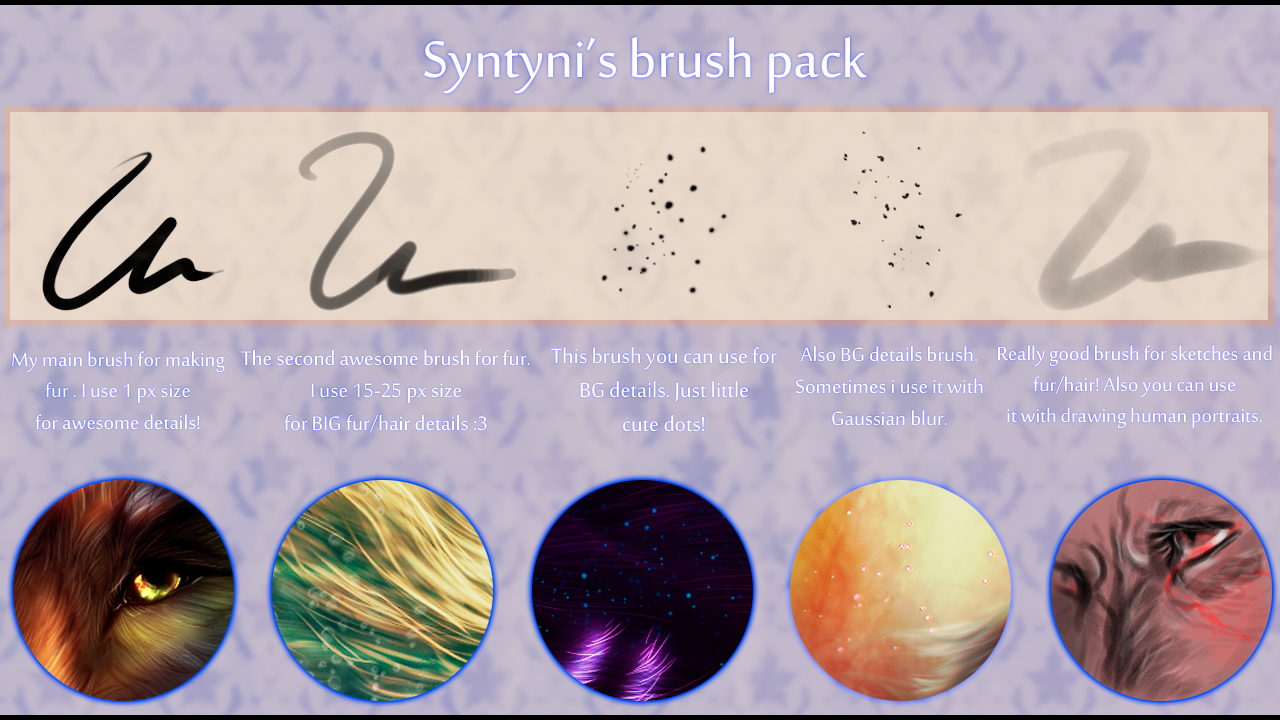
HOME | DD
 syntyni — Icy expanses

Published: 2013-09-21 10:01:56 +0000 UTC; Views: 846; Favourites: 67; Downloads: 2
Redirect to original
Description
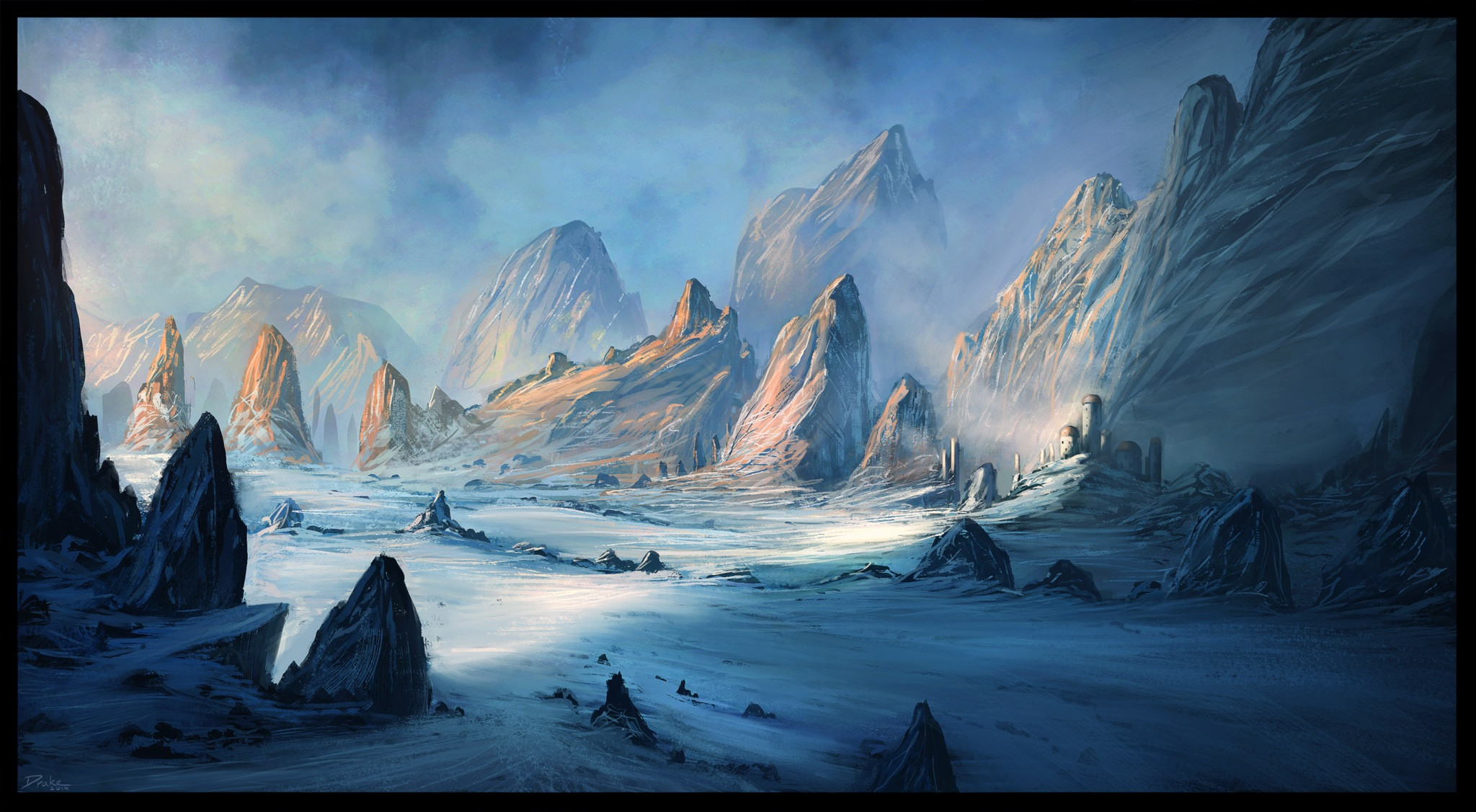
WOW! I HAVE DONE MY FIRST CONCEPT ART!!!I'm so happy) and I liked it^^ I want winter sooo muuuuuch
hope, you like it too^^ please, criticize, because I know NOTHING about concept art)
My artworks
WIP
Related content


Comments: 8

Overall

Vision
Originality

Impact
What I really love about this work is how clean it is, how well put together it looks. There aren't any bits which seem out of place, and the overall polish is very nice. I love the colour palette too, and how well the light and dark, shadow and light fit together.
I absolutely adore the flying snow flecks! They look superb. I've tried snow in digital drawings a couple of times before, I could never quite get the right amount of flakes in. Either I had a whole blizzard, or they were barely noticeable.
Another thing which is just so well done in your work is the contrast between the background and the foreground. Those moons, the crater, the jagged pieces of ice? Just perfect.
But what I love the most about your work is how I can look at it and instantly go "brrr!" I can practically hear the howling wind, feel the snow whipping against my face.
Though one thing - I'm not sure if you were aiming for this effect, but the whole thing seems a little bit blurry. In my mind, snow is linked with roundness, but add ice and wind, and it should be all sharp edges and cracks. The edge of that crater seems a little too soft, like it's been like that for a while. The icicles and pieces in the foreground too - a little too rounded.
But then again, it adds a feeling of age to the picture, a feeling of fatigue. No, that's not quite the right word... More like weariness, or desolation.
I'm not quite sure what the two flying things near the right are. At first, I thought they were roses. Then I thought they were spaceships. Maybe a bit more clarity there would help.
Another thing - I can't quite picture how exactly the landscape is set out. I looked at it, and my first thought was that it was the bottom of a canyon. Then I looked at the sky and two moons, and I thought, no, it's the tip of a glacier with a crack down the middle. Then I looked at the sides, and I thought, no, it's a cave in the middle of a cliff.... With a crack down the middle... But it looks like there's a drop on the other side of the crater... But... But... No... The front right ice jag is blocking it... Maybe it's a U shaped path! Which leads to...
So I got myself quite muddled on that.
Overall, I love it! It's amazingly well put together, and has brilliant technique. e.deviantart.net/emoticons/s/s… " width="15" height="15" alt="
 (Smile)")
👍: 0 ⏩: 1

your critique really helps me) yes, I know my mistakes about vision and how this landscape is set out)
thank you ^^
I'll work with landscapes and concept art more^^
👍: 0 ⏩: 1
Glad you found it useful!
Again, I loved it! And I really look forward to seeing more of your work!
👍: 0 ⏩: 1
thx^^
it means a lot for me!
👍: 0 ⏩: 0

Awesome art, would u mind if i use it to my facebook cover
👍: 0 ⏩: 1
hmmm...I'll think about it)
thank you
👍: 0 ⏩: 0

This looks really awesome! ")
👍: 0 ⏩: 1
Thank you, I will consider it^^
👍: 0 ⏩: 0