HOME | DD
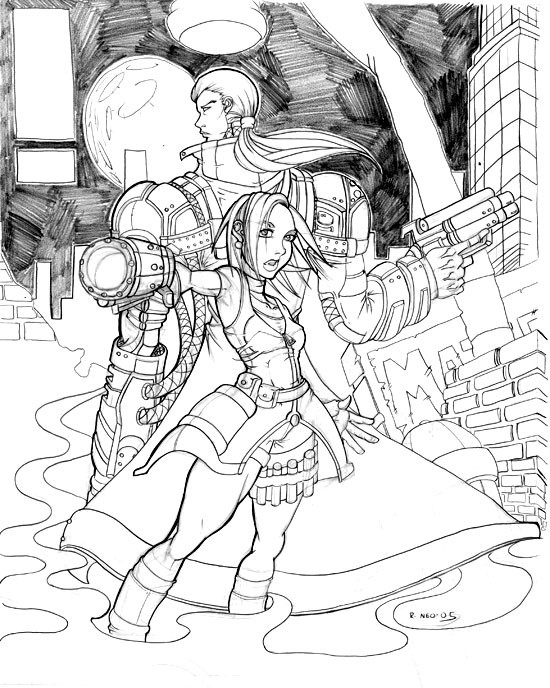
 Syphron — OS Siekera and Syphron Ver.2

Published: 2005-03-18 13:39:50 +0000 UTC; Views: 418; Favourites: 6; Downloads: 53
Redirect to original
Description
hmm for some reason the first version is'nt showing up on my screen or i can't see it at all, so im gonna resubmit it--heres an edit version that was gonna be for the edit of the first submission so you guys get to see the edit--the blue penciling is gone and the pencils are a bit cleaner for viewing so i hope you enjoy this version better


Art by Me!
Medium: Blue non-photoblue pencil (removed from scan), finished F Pencils
Siekera and Syphron are (c) of Randall M. Middleton and OS
Related content
Comments: 14

Hyaaaaaah. Everyone I know has superior inking skills. >.< You and Musada have me so whipped in that department, not to mention your styles kick major arse.
Nice picture, it seems almost like the cover to a comic minus those two little boxes that are normally filled in, in the top, left hand corner! ^_^;;;; Yes, I'm a lower level comic geek. Though I've only brushed a few, Tarot, Namor(the newer series Greg Horn has illustrated a few covers for), Buffy... Etc...
👍: 0 ⏩: 1

yeah i wanted a some-what comic feel to this pic i may redraw it because there are things in this pic i SO wan't to improve on, but thanks for the comment
👍: 0 ⏩: 1

The sign of a true artist is that they are NEVER satisfied with their work and always see room for improvement. n.n No problem, comments are the life blood of our online work.
👍: 0 ⏩: 1

amen to that lol i always redraw my pics because they generally look better (that's not always true lol) and things are corrected
👍: 0 ⏩: 0

I really like this picture overall as a composition. I'd love to see you add textures to the materials. Really make it jump out at the audience more. Maybe some metallic shading on Syphron, along with giving the bricks a few cracks and splits to add to the feel of a battle scene. Anyway, be easy and be in the Light.
👍: 0 ⏩: 1

thanks Mat ol buddy ol pal--lol yeah this is really a ROUGH believe it or not the real deal will be dramatic just you wait, you've heard of project REDO have'nt you lol heh you'll see
👍: 0 ⏩: 0

must say that nice i cant say anything bad about it .....man that nice
👍: 0 ⏩: 1

thanks, it would've been better if you did that way i could improve it on a future redo, thanks anyway for the comment
👍: 0 ⏩: 1

its cool and the gang man ....awsome pic... wish I could draw this well.
👍: 0 ⏩: 1

it's not as hard as you think, i did'nt think so as well
👍: 0 ⏩: 0

argh this site needs to make up it's mind NOW i see the first version after i resubmitted it, it was either the site or the cpu i was on--sorry for any confusion you may encounter
👍: 0 ⏩: 0


